Custom Set Conumdrum. (1 Viewer)

Quicksilver-75

4 of a Kind
Joined
Aug 1, 2014
Messages
6,287
Reaction score
12,094
Location
Great White North
So I have been designing a set in my head for a couple years now. A set I go back and revisit a few times a year. Each time, I do a complete flop on the previous iteration.
I want to do a set on the LCrown. In doing so I very much want(ed) to keep it as close to a true vintage look as possible. Sadly, Classic can't do the shallow TRK type spots and can really only emulate and pies and tri's. 14's make the spots too deep. 12's just look awful. V's are too different from the BCC / TRK style.
So, would you just accept it and make a set using pies, tri-moon and 3916's or make a set that compromises and uses both new and old elements and thereby offers a greater pool of spot offerings?
 
I think if you're really going for a vintage TRK vibe you would need to stick with the available spots that could pass for TRK.

But if you're just going for a general retro/vintage look, choosing a muted color palette and simpler spot patterns could work well even if it is not exactly faithful to actual TRK edgespots.

I think the inlay artwork would factor heavily in the equation.

Do you have any mockups you can share?

Visuals would really help folks make recommendations.
 
Here are some mockups.
b26f7b0f-86f6-41f6-a3dd-3b6f0cd58f96.png


0c6a58a5-fdfe-4f6d-b69b-e8b0d0d364c5.png
 
I think tri moon is waaay overrated as a spot pattern. Perhaps it is an unfortunate association, but I always see a toddler's inflatable ball when it pops up.

Do you really need 6 cash denoms? If you ca shave it down to 5 or even 4, then your retro feel is more achievable with classic spot patterns.
 
I went through the same conundrum as the OP. I elected to make do with the closest TRK-ish colors and edge spots as I could. I think the results speak for themselves.

You can’t go wrong with simple retro colors and simple spots, but as @Josh Kifer ‘s Chipdusts proved, you can also take lcrowns in a totally different direction and knock it out of the park. But at the end of the day, do what makes you the most happy!

Full story here: https://www.pokerchipforum.com/thre...crown-hotstamped-cash-set.65515/#post-1302649


IMG_4148.jpeg
IMG_4481.jpeg
IMG_4483.jpeg
IMG_4486.jpeg
IMG_4487.jpeg
IMG_4489.jpeg
 
Last edited:
Yeah, few CPC colors are a great match. I tried building a set but wasn’t happy. But then I took a different approach- go with a modern take and use everything available.
 
I think tri moon is waaay overrated as a spot pattern. Perhaps it is an unfortunate association, but I always see a toddler's inflatable ball when it pops up.

Do you really need 6 cash denoms? If you ca shave it down to 5 or even 4, then your retro feel is more achievable with classic spot patterns.
This set design has a partner. One of us wants cash and the other a tourney set.
 
I’ve always loved your Silver Tounged Devil design and the retro feel. This will be an epic set.
In keeping with that, maybe a hand-lettered denom, like many of the old casinos did? I know it’s not as clean, however…
This response has been the most helpful input I've ever received. It woke me up to re-looking at some original Chips and zooming way in to study the imperfections of the process.

Thanks!
 
This response has been the most helpful input I've ever received. It woke me up to re-looking at some original Chips and zooming way in to study the imperfections of the process.

Thanks!
It certainly wasn't an exact science, lol.
compilation1.jpg

The magazine and newspaper ad headlines of the time were done the same way too. I guess it was the only way to get the typeface you wanted in the space you had.

Images courtesy of Chipguide.
 
It certainly wasn't an exact science, lol.
View attachment 1165788
The magazine and newspaper ad headlines of the time were done the same way too. I guess it was the only way to get the typeface you wanted in the space you had.

Images courtesy of Chipguide.
I'd take these hand drawn denoms any day over modern typefaces if possible. Always loved how creative they get with everything
 
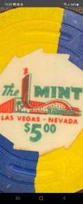
Well this is where I'm at. Honestly, I'm LOVING this new direction. I've tried to emulate the stamped look of early chips like The Mint. (Easily some of my favorite chips)
The final files will also use a sponge texture to emulate the blotchy tones of the stamping.

Screenshot_20230528_102955_Chrome.jpg20230718_115608.jpg20230718_115626.jpg
 
Well this is where I'm at. Honestly, I'm LOVING this new direction. I've tried to emulate the stamped look of early chips like The Mint. (Easily some of my favorite chips)
The final files will also use a sponge texture to emulate the blotchy tones of the stamping.

View attachment 1165915View attachment 1165916View attachment 1165917
These are awesome examples! The Mint used two-color printing...and what youre seeing is that slight, out-of-registration print, which also gives it that classic look. The printing almost looks like an old matchbook cover.
I was re-creating a Flamingo inlay a while back and used the out of registration effect here:
flamingo_crop.jpg
 
Last edited:
If going old-school like that, maybe consider doing some faux offset printing, where the placement of certain colors would be a little off on some inlays? A lot probably depends on how intricate your artwork will be, as well as CPC’s willingness to print different versions of the same inlay.
 
This is one of the first LCrown sets I’ve ever seen and really loved. I’m not a fan of the mold so even the well-designed sets don’t catch my eye. But THIS… my hat is off to you, friend. Absolutely stellar. I can’t say I love the light blue and light chocolate $1 by itself, but every other chip is so good that I can’t even fault it. And it works with the set and the retro feel.

I used to have a customer at one of my first jobs - he was a very small doctor, an old man with a fondness for women of all kinds but particularly Eastern European women. Back then, I was seeing several girls at a time, not something I do anymore. He would always call me the Silver Tongued Devil when I told him my stories and that was sort of our running joke. Thank you for making me think of my friend!
Thanks for the compliments. The set as it sits right now is also very different. In fact, only the $25 is unchanged. Lol
 
Nice design. To be honest, the mold around which you are "building" this chip doesn't seem to matter that much. What I mean by that is the design, colors, spots are the first thing that draws my eye. I do like the L crown mold though but not exclusively. By the way, aren't The Silver Club chips yours? That is one of my all time favorites! So it's hard to imagine you could go wrong with much of anything. :tup:
 
This is one of the first LCrown sets I’ve ever seen and really loved. I’m not a fan of the mold so even the well-designed sets don’t catch my eye. But THIS… my hat is off to you, friend. Absolutely stellar. I can’t say I love the light blue and light chocolate $
I agree completely with the exception of I love the light blue and light chocolate. Retro AF
 
Nice design. To be honest, the mold around which you are "building" this chip doesn't seem to matter that much. What I mean by that is the design, colors, spots are the first thing that draws my eye. I do like the L crown mold though but not exclusively. By the way, aren't The Silver Club chips yours? That is one of my all time favorites! So it's hard to imagine you could go wrong with much of anything. :tup:
The Silver Club chips are mine, yes. So were the Devils before I sold them and the artwork to a couple here on PCF. I've always regretted it. Everyday I would stare at the poster in my games room and cringe. So I reached out to them and asked if they would have any qualms with me redoing them. In an effort to keep the originals sacred, I went as far as using a new font and arrangement, new denom and loosely based the setup enough so I could create a logo design that sort of predates the originals.
 
Last edited:
Splendid! Love the 1 and the 5! And this 25! :love:

Your work on the inlay is phenomenal, you totally nailed the modern-vintage look and feel.

My only reservation would be the 500… On a purely subjective way, I think your last White one is better. But also I think the Black plus the three colours spots make it stand out weirdly among the others.

Edit: Aaargh, I did not noticed the last one was also a 500… So I vote for the White/Pink.
 

Create an account or login to comment

You must be a member in order to leave a comment

Create account

Create an account and join our community. It's easy!

Log in

Already have an account? Log in here.

Back
Top Bottom