Custom Design: Infinity Club Secondary Set (1 Viewer)

buzzmonkey

Flush
Joined
Jun 29, 2020
Messages
1,505
Reaction score
2,912
Location
USA
So I'm looking to make a custom BR Pro tourney secondary set to put in play for secondary games while the main game is still running. I am not an artist by any means, but I can fumble my way around Photoshop well enough. I've put together a quick mockup but it just looks too sterile to me. Thought I'd put it up here for some feedback/ideas. My plan is to incorporate 2-3 colors per denom (ex. black/blue/pink for the 100). I want the set for November, but have just had a mental block in the creativity department.

1659392418596.png


The background is based on some custom dealer buttons I made this year:

1659392470691.png


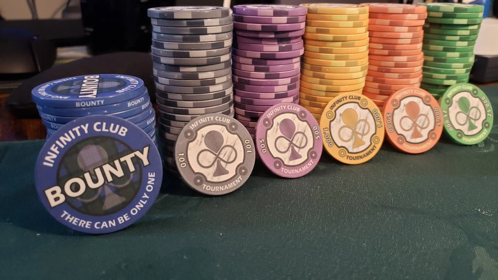
And here are some shots of my primary chips, which were more of a monochrome/solid inspired set:
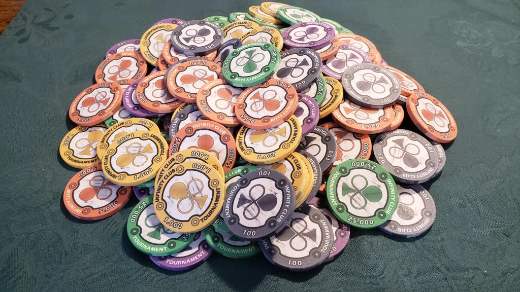
1659392532987.png

1659392548243.png
 
I really like the inlay and how the gray club is partially seen. Is the black (smaller) club stretched vertically?

Maybe make the gray club the color of the chip? I wouldn’t go too crazy.
 
My current plan is to have the background logo be a shade of the base color, then the text be two colors that match the edge spots. I'll do a color mockup soon.
 
I'm not happy with any of the designs I've come up with. I'm thinking of just using the design on my primary set and adding some colored edge spots and matching color on elements of the face instead.
 
So this is a very crude mockup based on the proofs of my primary set. I'm very happy with the 1k yellow. The shades might need tweaking on the 100 black/grey.

I'm not completely certain on the 500 purple, but definitely like the green and maroon. Just not sure if the shade of purple is too dark. I may go lighter on the base purple.

The 5k orange looks good, but I'm not certain on the black. It feels like there should be more color, but the pumpkin look is kind of cool to me.

Definitely up for feedback if anyone has any.

1661715053138.png
 
I really like the edges on your primary set - and saved the image from the OP a while ago in the "ideas" folder for a set I'm looking at building.

I find it difficult sometimes to pick the main colour out of some of the really busy edges I've seen but understand wanting to jazz the monochrome style up a bit - hopefully there's a happy medium in there somewhere.
 
Went with a lighter base on the purple for the 500. The samples showed the red didn't quite stand out enough from the base purple. Trying to decide on a darker/deeper red or peach. Thoughts?

1664747851708.png
 

Create an account or login to comment

You must be a member in order to leave a comment

Create account

Create an account and join our community. It's easy!

Log in

Already have an account? Log in here.

Back
Top Bottom