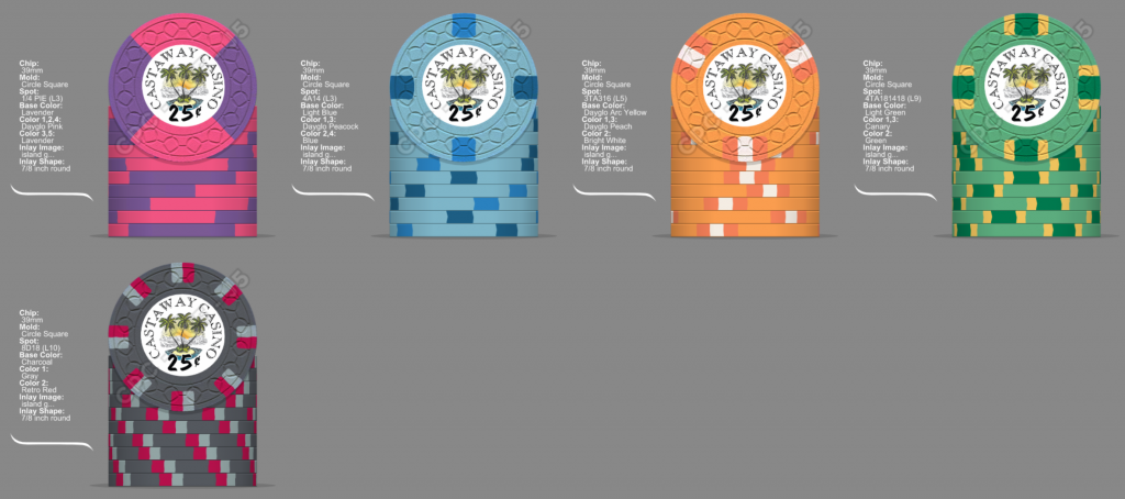
Rbonus012
Full House
Also thought about using Arc as a base for the $5. I am losing my mind lol 

I like this better except the hundo. Dont like gray on charcoal
Yeah better
Try it? Depends on the color combosI agree. Thoughts on switching the $5 from 4d14 to 3TA316? Work or no with 4A14 $1..
You're on your way to Cali progression now. Switch $25 and frac base colours.
These colors are crazy and I love it! The spot progression on these are great.
I’m loving this thread, I’m going for semi-Cali colors for my beach theme, and feeling your frustration with the blues and oranges to get “island-y” is exactly what I’m dealing with (except I want vibrant AF beachy)
Love the colors! Only comment I have is that between the $5 and $25 you've got orange-ish in two consecutive chips, and the spots are very similar. Maybe this works?Been sitting on these colors for a couple days now. Still waiting on an inlay but I am liking these colors.
Only thing I might need to think about is the shade of green on the $25 edge spot. Maybe something darker? Retro or dark green. Don’t want it to be super heavy is the only thing.
View attachment 671974
Been sitting on these colors for a couple days now. Still waiting on an inlay but I am liking these colors.
Only thing I might need to think about is the shade of green on the $25 edge spot. Maybe something darker? Retro or dark green. Don’t want it to be super heavy is the only thing.
View attachment 671974
You've got a CPC colour sample set, right?
Dark Green is very dark indeed, almost black. I was going to have a Green base chip, but changed to Light Green once I really saw how dark regular Green is (but I did keep it as an edge spot).
Love the colors! Only comment I have is that between the $5 and $25 you've got orange-ish in two consecutive chips, and the spots are very similar. Maybe this works?
View attachment 671984
These are fantastic and the chip color scheme goes really well with the inlays!Latest mock-up
View attachment 675627
Amazing! Really well done all around. Classy as hell. Dibs on a sample!Latest mock-up
View attachment 675627
Huge improvement on the inlay. Winning!Latest mock-up
View attachment 675627
Just using A-mold for the mock ups! These will be going on CSQ and the deadline is the end of this month to get orders in.Are you set on the A - Mold? Have you looked at others?
Haven't really looked into another option just because I really liked how the white looked. Any ideas? Always open to seeing. @JeepologyOffroad got me hooked on the butterscotch color that I am now using on the $25Have you tried any other spot colours instead of white on the $5?
Try the tri moon shape for the $5 aligned to the spotsJust using A-mold for the mock ups! These will be going on CSQ and the deadline is the end of this month to get orders in.
Oh yeah well aware of this difference. Using lavender and DG pink on my frac too.
I think you gotta go standard pink on yours with that 1. Love that 1 with the light blue base. Light blue is so damn good
I have been going back and forth on this one for a while. I think that standard Pink definitely fits in better in the lineup and theme I am going with. Dayglo pink is so damn bring in person, but dayglo and lavender look so well together.
