CPC mockup - Island Theme (1 Viewer)

Rbonus012

Full House
Joined
Feb 4, 2020
Messages
4,567
Reaction score
13,316
Location
Harrisburg, PA
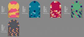
Need some help from you guys. I have so many different mock ups right now it is crazy. Looking for suggestions as what works and what doesn't. I am not happy with the $100 and am having a tough time finding something I like. Right now I just have a dummy inlay in the spot while I am waiting on the finished product.

Looking to keep a more mute color palette if possible. If you have questions just post them in the thread :)

Okay let me hear what you all got! Maybe a sample will be given if your idea is chosen in the end ;)

1616876952126.png


1616611158407.jpg
 
Maybe keep the colors the same but switch the spot pattern between the 25 and 100? I think it might progress a little better that way. But I honestly think you’ve got some great colors picked out for your theme!
 
Maybe try dayglo peacock and tiger on the $100? Tiger might be too flashy compared to the rest of the set, but the lighter blue I think would look better against the charcoal. I would second that swapping spot patterns between the green and charcoal chips would probably work better.
 
I think the $100 would be to flashy then. I also don't like how the $5 and $25 seem so close together in edge spots this way.

1616881959192.png
 
First mockup looks just fine, but if you don't like the spot on the $100, see how a 818 or 814 spot looks there.
 
You 're on a good path.
However:
Even Light Green needs Blurple or Purple; not Lavender edge spots for true contrast.
Similarly, Charcoal would need either Light Blue or DG Peacock for edge spots.
 
Imperial blue base on the 1, peacock and light blue spots, 5 keep the white spot, 20 light green base, blurple spot with DG pink
100 charcoal with tiger and retro blue ?
 
Also if you negate the arc yellow spot on the 5 and use maroon or chocolate you can use arc yellow on the hundo instead of tiger if you wanted.
 
I'm confused by the concept. You want "island theme" but mute colors? Island carries the connotations of bright, sunny, water, boat drinks....

Your changes have definitely improved the set, but I would go another step farther and brighten up the blue chip spots. Maybe white and yellow, or orange, or peach might work well.

edit- go back to the light blue chip. The darker blue doesnt fit.
 
Inlay is going to be more of a old school theme. Not a fan of the super bright.
I'm confused by the concept. You want "island theme" but mute colors? Island carries the connotations of bright, sunny, water, boat drinks....

Your changes have definitely improved the set, but I would go another step farther and brighten up the blue chip spots. Maybe white and yellow, or orange, or peach might work well.

edit- go back to the light blue chip. The darker blue doesnt fit.
The problem with light blue is its almost gray in real life
 

Create an account or login to comment

You must be a member in order to leave a comment

Create account

Create an account and join our community. It's easy!

Log in

Already have an account? Log in here.

Back
Top Bottom