CPC - Broken Shield's Color choices (1 Viewer)

What option

  • Option 1 - Mix

    Votes: 6 54.5%
  • Option 2 - Non

    Votes: 1 9.1%
  • Option 3 - Weigthed

    Votes: 4 36.4%

  • Total voters
    11

Gunnar

Flush
Joined
Jan 28, 2016
Messages
1,761
Reaction score
4,044
Location
Iceland
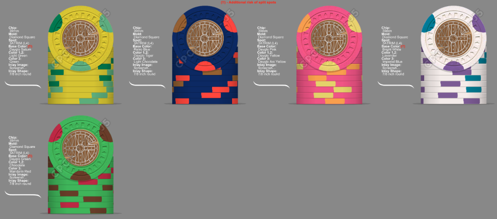
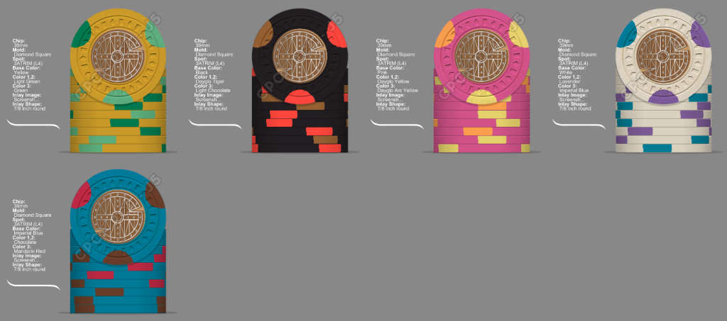
So Im completely torn on colors here, set is 25-100-500-1k-5k
I really like black chips and I really like bright white. At the same time I really like to go all weighted or not. I have gone back and forth but these three are the options. All feedback well appreciated, inlay is double sides so value will be on other side and I know the shield is not in the center of the chip.

Option 1 - Mix
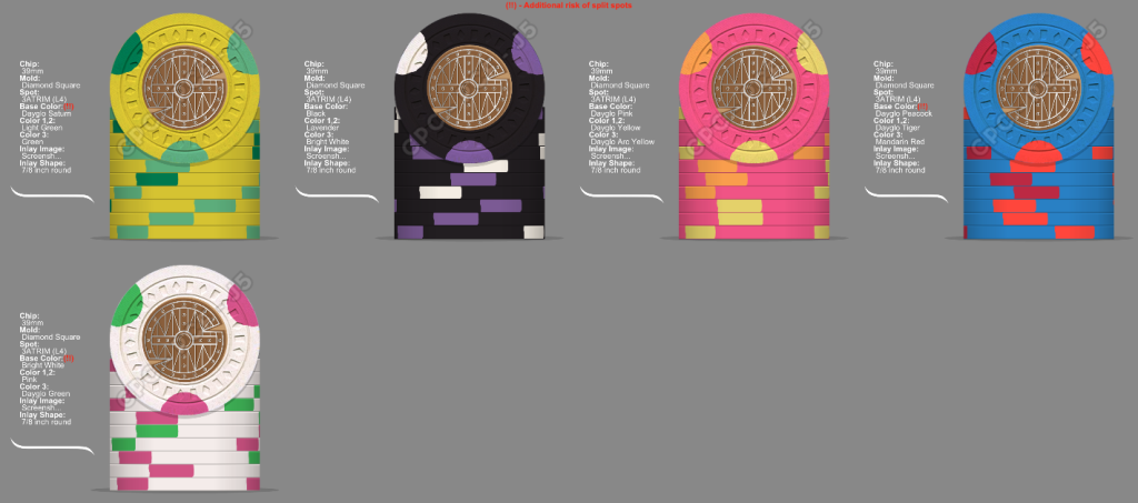
BrokenMix.png


Option 2 - Non Weighted

BrokenBright.png

Option 3 - Weighted
Brokenheavy.png
 
Set 3 for me!

That said I got hung up on the not mixing weighted and not weighted together and after several sets from CPC, in play and overall look it doesn't make a difference. I say don't limit your choices because of it.
 
Set 3 for me!

That said I got hung up on the not mixing weighted and not weighted together and after several sets from CPC, in play and overall look it doesn't make a difference. I say don't limit your choices because of it.
Im mainly worried about the brass flakes but maybe that is just not an issue... :)
 
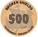
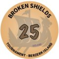
Im not the best AI designer, not even close but threw up these inlays to get a better feel. Red background as cloth would be red.
Im going for a vintage style, Im wondering if I should go more or less brown in the background?
BROKENSHIELDSINLAYS.png
 
I really love color matching when done right, but doing it right is hard. Some minor tests with the shields and then the boat as well. All feedback welcome
Colorbacks.png
Colormatched.png
 
Broken Shield vs Broken Shield's
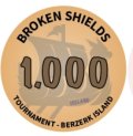
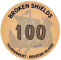
Brown vs Black letters? Berzerk Island is the location of the tournament should that be there? Tournament or Poker tournament? Some thoughts going on here.
INLAYTESTS.png
 
Inlays:

I’m torn on the ship color matching. I think you lose something there.

Have you tried to color match the denom over a standard ship color?

Chip colors:

I have two white chips that I love. But there’s a contingent that’s anti-white and pro-bright white due to the look and brass corrosion (which I haven’t experienced).

The weight difference is so subtle- go with the colors you like.

Pink is an odd base color. I find retro lavender close but supremely better as a base color.

Spot colors:

I’m a vintage fan as well, but I find a bit of contrast does wonders. You’ll also find some really brilliant colors on vintage chips from some manufacturers.

The only thing that jumps out at me is what you noticed- the presence of chocolate on 2 chips. Have you played with butterscotch or maroon? Butterscotch would trigger a shift on one of the other yellows, though.

I really like the 2 + 1 style. And it’s a legit vintage use.
 
PS. DG Saturn is… not what you think. Do you have a sample set?
 
Inlays:

I’m torn on the ship color matching. I think you lose something there.

Have you tried to color match the denom over a standard ship color?

Chip colors:

I have two white chips that I love. But there’s a contingent that’s anti-white and pro-bright white due to the look and brass corrosion (which I haven’t experienced).

The weight difference is so subtle- go with the colors you like.

Pink is an odd base color. I find retro lavender close but supremely better as a base color.

Spot colors:

I’m a vintage fan as well, but I find a bit of contrast does wonders. You’ll also find some really brilliant colors on vintage chips from some manufacturers.

The only thing that jumps out at me is what you noticed- the presence of chocolate on 2 chips. Have you played with butterscotch or maroon? Butterscotch would trigger a shift on one of the other yellows, though.

I really like the 2 + 1 style. And it’s a legit vintage use.
Yeah Im a little torn with the color matching as well, there has been a lot of going back and forth today.
For colors, I really like pink poker chip, I have some samples for most of the colors yes.
I have DG Saturn en the whites for example and I know what is going on there.
 
Gunnar's Broken SHIELDS
I don´t know why it was so stuck with me that the comma should be there...
 
Color matching is still a headache the shield's side will always need color matching I think.(see I can use it correctly)

But the boat is a good question.
Screenshot 2023-02-25 at 18.43.37.png
 
Coming back to this, the size of the shield and uniformity of the shield and face colors gives me some pause. Perhaps more edge or other color added to the shield (e.g., center, bosses, even lines), or a color gradient rather than all light orange brown across all denoms? Just a thought….
 
Last edited:
Coming back to this, the size of the shield and uniformity of the shield and face colors gives me some pause. Perhaps more edge or other color added to the shield (e.g., center, bosses, even lines), or a color gradient rather than all light orange brown across all denoms? Just a thought….
Yeah that might be true, maybe there is best to make the shield a little bit smaller to get more Color around it. What do you think about Color of the ship?
 
The denom faces are likely to be face up in a pot at the end of a hand, so I think they need to be more differentiated somehow. They currently are very similar colors and shading to each other. I’m not a designer with a solution, just offering an idea!

View attachment 1087799View attachment 1087802
View attachment 1087800View attachment 1087801
I agree, that why I tested Colouring the ships behind the denomination. Losing the brown and using just the lines is also growing on me for the shield side, but it is quite a lot of color for what I wanted to start with.

I appreciate the feedback! ☺️
 
What are your thoughts?
My thoughts are getting closer and closer with every feedback and testing.
I added a 25k chip to make sure that the set supports third table, I added a Shield master chip that can be bounty but I like the idea of winners getting to keep one. This is a special event set hosted few times a year.
I moved the pink color onto the white chip and set Lavender on the 500 chip.
I made the back shield smaller and color matched the shield but kept the background the same, color matching the value is making me like this a lot.
With25k.png
 
Looking good! With the color changes you have made on the shield, I now think the ring around the shield may be too big.
 

Create an account or login to comment

You must be a member in order to leave a comment

Create account

Create an account and join our community. It's easy!

Log in

Already have an account? Log in here.

Back
Top Bottom