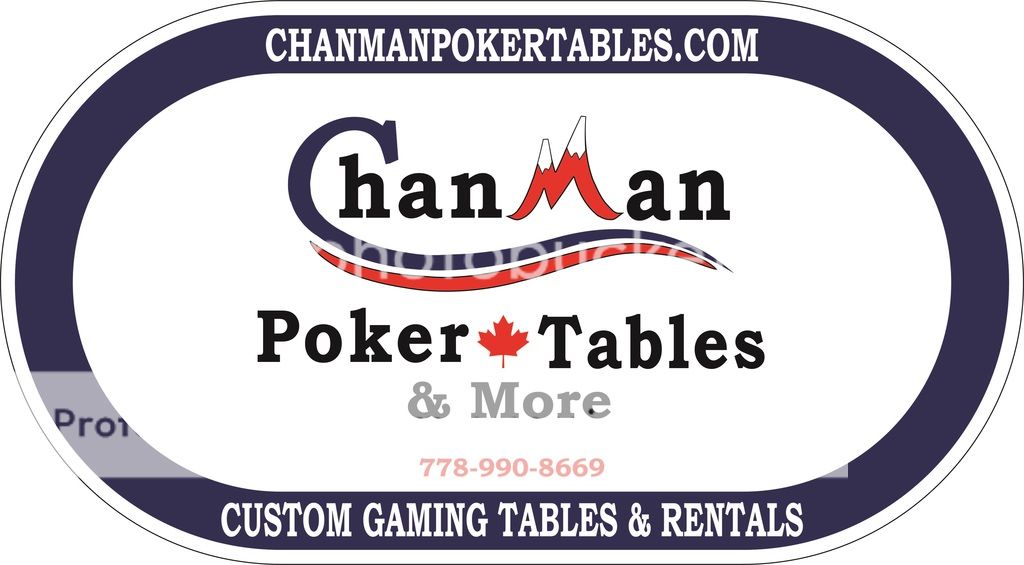
Chanman Poker Tables is rebranding (1 Viewer)

I'll put you down for a sample chip when I get a set done up.
 
Don't lean either mountain peak in the "M". The left one looks fine, the right one looks a bit too much Dr. Zeuss. Other than that, great that you are keeping ChanMan and I think these would make fabulous dealer buttons.
 
A few tweaks I made myself. This will be the general logo and the 2nd one will be when I use it and want my phone number on it.


I have a 4'x8' trailer which I use to haul around my rental tables. I'd like to put this onto the trailer as it doesn't have any advertising on it yet. Would it be strange to blow this image to 3'x3' and stick it on the sides of the trailer?

Looks like this but without the front spare tire:

$_35.JPG
 
Last edited:
Maybe make a version in the shape of an oval poker table to better cover the side of the trailer. And use the poker chip version for the rear.
 
Great idea.

The doors on the back have a lot of hardware. It's going to be tricky to get a decal on the back..

2014_Wells_Cargo_6x10_SA_RVN_Cargo__Enclosed_Trailer_VE7o32.jpg
 
Oval version on both sides, smaller chip version on rear left door. You ~can~ fit a larger one around/under/over the hardware, but it's a real PITA. Smaller version will look fine.
 
Some more tuning up. This one would go on the side of the trailer. I darkened the blue a little too.

 
Last edited:
looking good, but i would still mess with the text along the bottom. even a smaller font to prevent the need to curve would be better imo.
 
Yeah or just keep the letter size and sizing as is (but straightened out) and just make the overall "table" size bigger so the ends don't start curving until after the text. Then if there looks like there is too much white area at the ends you can add a maple leaf at each end and remove the one in between "Poker" & "Tables".
 
Also make sure the image is able to be blown up without pixelization of a "fuzzy" look as it gets jumbo-sized.. Vector graphics is a key here.
 
Yeah the images are all vector images. My program is having trouble exporting jpgs lately for some reason.

I think I'm ok with the white space on the sides. I tried a version with the maple leaf on the sides instead of the middle but it doesn't look as nice to me.

Here it is with straight text


And here's a revision from p5woody
 
definitely straight text. i also liked 72o's suggestion of moving the maple leaf to the sides rather than the middle.
 
I'm hesitant to suggest it because it's often overused, but maybe you could put a fan of cards or just a pair of aces in the white spaces. It doesn't read "poker" or "gaming" until you get to the "poker tables" line, which takes a little too long for something that should grab your eye when you drive by the parked trailer. I vaguely get "hockey rink" from glancing at the shape, possibly reinforced by the maple leaf.
 
I'm hesitant to suggest it because it's often overused, but maybe you could put a fan of cards or just a pair of aces in the white spaces. It doesn't read "poker" or "gaming" until you get to the "poker tables" line, which takes a little too long for something that should grab your eye when you drive by the parked trailer. I vaguely get "hockey rink" from glancing at the shape, possibly reinforced by the maple leaf.

He's in Canada. Everything reminds them of a hockey rink. Hockey, ovals, sports, the simple words like "cup", "stick" or "icing". Even an Indian's head in profile, though they may not like the last one...
 
Though some fanned cards or some suits would go great with the theme, I'm hesitant to add more graphics and I want to keep it simple. I will play around with some though to see how it looks.

And yeah, we loooove our hockey! Go Canucks go!
 
Phone # in red "pops" more. Since it's for the side of a trailer, I would also outline it in black, in case the sun fades the red - assuming you ever get sun between the raindrops.
 
Looking good. Straight text and red phone number look sweet. Maybe stretch the table just a little more. It looks like it gets a little too close to the letters at the curves.
 
If you go with the red phone number, let me know. I am pretty sure that I still have some reflective vinyl kicking around. That stuff works amazingly well. (It's the same stuff used on RCMP cars)

Mike
 
Here's a few more variations. It's getting away from the basic look I want but not too far. Thanks for the offer Racer96 but I will be getting this done from the sign shop across the street who does vehicle vinyls.


I like the top a lot. The club and spade are too busy for the rest of the design.
 
I like the first one. Obviously it's going to be less basic, because this is more than a logo for the trailer, it's a full-on advertisement. You want it to be eye-catching as someone is driving by.
 

Create an account or login to comment

You must be a member in order to leave a comment

Create account

Create an account and join our community. It's easy!

Log in

Already have an account? Log in here.

Back
Top Bottom