You are using an out of date browser. It may not display this or other websites correctly.
You should upgrade or use an alternative browser.
You should upgrade or use an alternative browser.
Chanman Poker Tables is rebranding (1 Viewer)
- Thread starter T_Chan
- Start date


chipjoker
Flush
See, I told you the mountains leaning to the right are best.....
These are looking awesome....
These are looking awesome....
I like the first one. Obviously it's going to be less basic, because this is more than a logo for the trailer, it's a full-on advertisement. You want it to be eye-catching as someone is driving by.
And with that in mind, I think the phone number needs to be a LOT bigger. Not for the standard logo, but for a rolling (or parked) advertising billboard, the contact info needs to really stand out and not get lost as you speed away....
atomiktoaster
Full House
Yeah, it could be double the font size on both, if the round is a business card.
Poker Zombie
Royal Flush
On the chip, like all chips, it needs to be printed "at size". This is the only way to see if text and other elements are big enough.
If it were me, I'd also print out the trailer logo at size, but I'd have to steal a lot of paper and scotch tape from work...
If it were me, I'd also print out the trailer logo at size, but I'd have to steal a lot of paper and scotch tape from work...
Ask the shop if they have reflective vinyl. (They should) It really is the best for this application. They should have blue and red, and possibly even black.
When I did all the signs for our race cars, they were always in reflective. It photos like crap, but is amazing.
Mike
When I did all the signs for our race cars, they were always in reflective. It photos like crap, but is amazing.
Mike
RowdyRawhide
Full House
^^^^yep^^^. Maybe space the heart to the spade and the club to the diamond and the space the spade and diamond accordingly.Looking great. The poker chip version looks solid. Ship it. For the poker table version, i would maybe spread out the suits more around the curve to fill the area better.
^^^and yup^^^. I would use the "poker [leaf] tables" size font for the phone number. Especially for the trailer logosAnd with that in mind, I think the phone number needs to be a LOT bigger. Not for the standard logo, but for a rolling (or parked) advertising billboard, the contact info needs to really stand out and not get lost as you speed away....


Mental Nomad
Full House
Your wife is right - a wrap with a photo of your work is excellent, because your work is so good. Pictures worth a couple words, or something.
But the text needs work, and the chip is still good for other purposes.
But the text needs work, and the chip is still good for other purposes.
Poker Zombie
Royal Flush
I see the wrap and think: Do they have chairs too?
Mental Nomad
Full House
I see the wrap and think: I want me some of those drink carts...
And more...
And more...
chipjoker
Flush
I see the wrap and say " Im glad those arnt DICE chips....oh and "Damn fine table"..
Poker Zombie
Royal Flush
+1 to the "no dice chips" imagery.
OP
OP
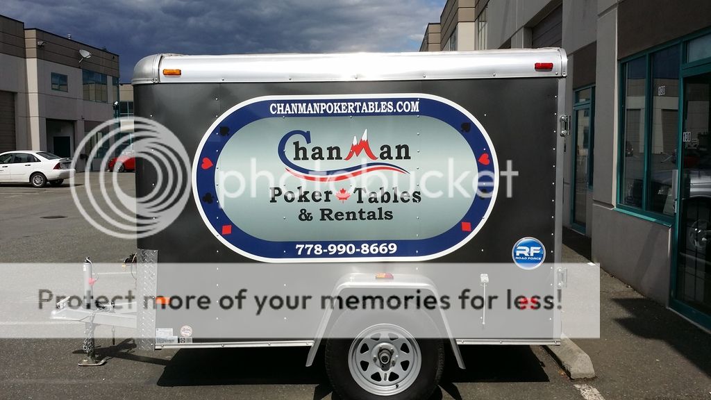
Well I pulled the trigger on this and decided to go with the oval logo on the sides with a round logo on the back. Mainly due to cost, the full vinyl wrap was 3x the cost. No pic of the back yet but they kind of goofed it up a bit putting the logo too low. I'll try to post a pic soon. I did a full sized circle on the back, not just 1 door.
I changed up the logo a tiny bit as it was getting a bit too crowded and from the start I wanted to keep it simple.
Here's the side though:
I changed up the logo a tiny bit as it was getting a bit too crowded and from the start I wanted to keep it simple.
Here's the side though:
chipjoker
Flush
Supper awesome, looks really nice. Better than the full photo, I think.
The only suggestion I have is to outline the club and spade suit images with a white border so that they stand out better against the dark blue background. Just figure out the proper thickness until it looks pleasant to the eye. (If you have already done this, just enlarge the size of the border.)
OP
OP
Thanks Inlver, I realized that after the decal was applied. The spade and club are a bit hard to see, especially with lower lighting. On the back of the trailer there is actually a faint white outline around all the suits. I am going to change the artwork file though so that the outline appears for the future.
Similar threads
- Replies
- 0
- Views
- 146
- Replies
- 8
- Views
- 622