DonkeyKing
3 of a Kind
Caught in between these 2 designs.. All suggestions/criticism welcome.

Hard to say without seeing the set.Caught in between these 2 designs.. All suggestions/criticism welcome.
I personally like the design on the right. The colors are more predominant against the chip and they follow a color wheel pattern. I’d definitely be interested in seeing the rest of the set!
Also, if you're a fan of the yellow/orange combo, then you might like something like this?
View attachment 165909
See attached.I also think the design greatly depends on how it meshes with the other chips in the set. Otherwise folks are providing input without all the facts.
Yes, I just don't know if it blends well with purple. I am partially color blind on Blue and Green if the shades are darker (Dark Blue vs Dark Green) seemed to be the same for me.Is the one on the left supposed to mimic the German flag? Given your inlay, it makes a heck of a lot of sense.
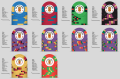
I don't understand the spot progression for the set. The $1 and the $5 have the same spot pattern. Then the $25, $100, $500 all progress with each having more complex patterns. But then the $1000 is the same as the $500. And the $5000 is the same as the $100.
I think spot pattern progression is all very subjective and there's no right or wrong way to do it. I'm just curious about yours.
Yes, I just don't know if it blends well with purple. I am partially color blind on Blue and Green if the shades are darker (Dark Blue vs Dark Green) seemed to be the same for me.
That ain't never stopped nothin. For the record, I prefer the one in the middle.Otherwise folks are providing input without all the facts.
I don't understand the spot progression for the set. The $1 and the $5 have the same spot pattern. Then the $25, $100, $500 all progress with each having more complex patterns. But then the $1000 is the same as the $500. And the $5000 is the same as the $100.
I think spot pattern progression is all very subjective and there's no right or wrong way to do it. I'm just curious about yours.
Thank you for your candid advice.That's actually pretty cool, and I don't think I've ever seen that done. It's like they're all 312's, but then they get more and more interesting. I like it!
 y) :thumbsup:
How about this?
How about this $1 $5 combo?Try changing the $5 spot to either white or blurple. Both are high-contrast -- white lightens up the set, and blurple darkens it. I'd also change the $5000 center spot color to peacock blue with arc yellow and dg saturn accents.
- Don't use duplicate colors on the $1 and $5 (either change the $1 base or the $5 spot).
- Don't use near-identical spot colors (especially using the same spot pattern) on the $500 and $1000 chips.
- Large green spot on the $5000 is butt-ugly (also matches the $25 base chip color).
Keeping in alignment with your quasi-312 pattern, I'd swap the $5000 and $1000 chips, and then alter the canary chip to be a 3TA316-spotted $5000 (so two of each spot pattern, with the canary cherry on top).
View attachment 166036
I like it alot, although @Poker Zombie will be hatin' on that $5 chip shortly.
I agree. That would be my next project..Go T2000 and T10000 instead of T$1000 and T$5000. It's the wave of the future.
I don't understand the spot progression for the set
From a progression standpoint
I like it alot, although @Poker Zombie will be hatin' on that $5 chip shortly.
Go T2000 and T10000 instead of T$1000 and T$5000. It's the wave of the future.
Go T2000 and T10000 instead of T$1000 and T$5000. It's the wave of the future.