Couple of questions on Modia(no!) decks (1 Viewer)

ChaosRock

4 of a Kind
Supporter
Joined
May 5, 2013
Messages
5,839
Reaction score
10,734
Location
Pure Michigan
I'm in the process of taking stock of all my playing cards. It's been much more of an undertaking than I originally thought. As discussed with another member, given the amount of chips and cards I own, opening up a large card room might not be a bad idea. Bonus of possibly getting an in with GPI! :wtf: More realistically though, hosting way more often might be the way.

Anyways, in doing the above, I came across a couple of discrepancies on Modiano decks.

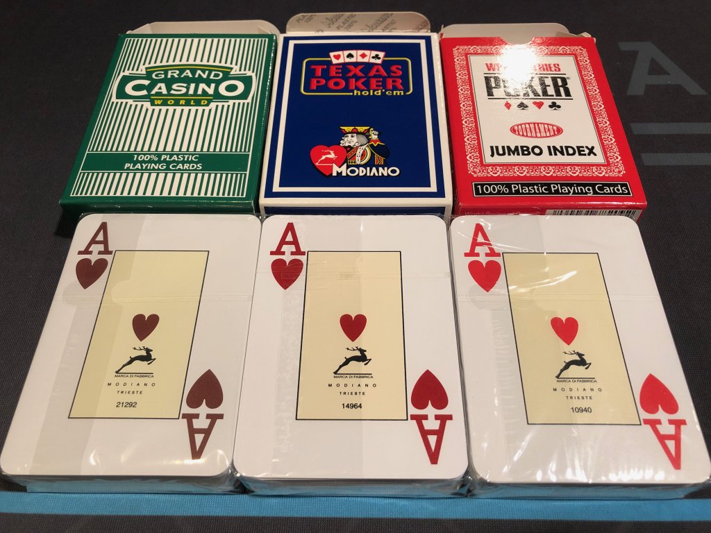
First, red ink shade. As you guys can see in the pic, I could spot three different ones. I thought there were only two, the Security shade and the Regular shade. Do you guys have any insight on it? Is it just that the brighter shade in on a special deck made for the WSOP?
IMG_3892.jpeg


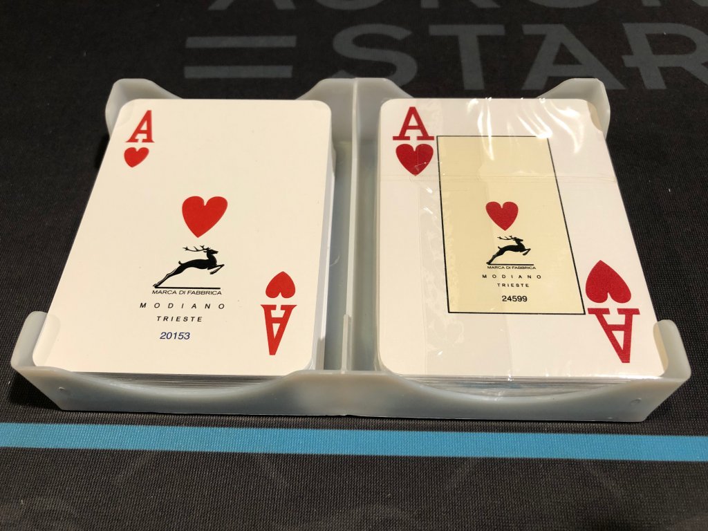
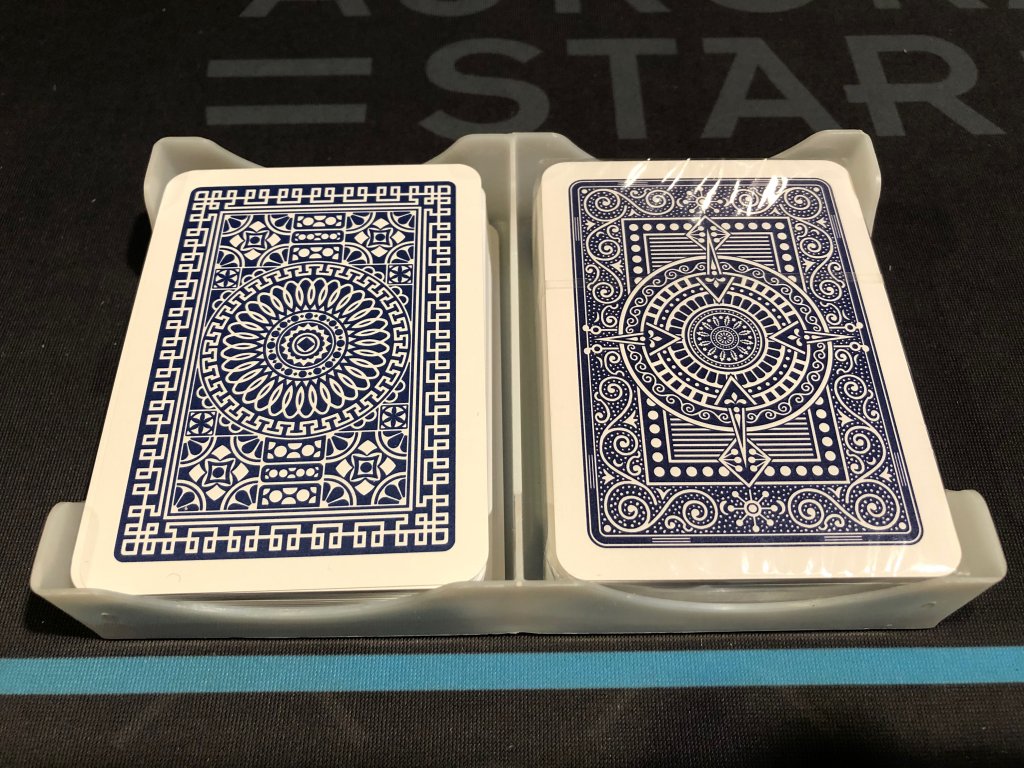
Second, I realized Club Poker decks have a different font than the others above, not to mention the absence of the yellow box for the number cards. For some reason I had never paid much attention to it before. As you can see, Club Poker is on the left and Texas Poker on the right. I even considered the possibility of that set-up being Regular index as it is a bit smaller than the jumbo, however, when comparing the actual Regular one (from a bridge deck and with the same font) one can see it is indeed a Jumbo (or any other name) index. Not too mention the shade of red seems to be another one, a fourth, in addition to the three above, in between the Texas Poker's and the brighter WSOP's. Do you guys have any info on this differences?
IMG_3941.jpeg
IMG_3942.jpeg
IMG_3945.jpeg
 
Card printing houses usually offer different shades of red (i.e. cherry red and the darker casino red) seen in your photos. The shades used depend on the request of the purchaser, or if used for commercial purposes, depends on what they happen to use to print the run. Lots of casinos prefer the darker reds because the brighter reds aren't as easily read on security cameras, or something to that effect.

For the home game, brighter reds are easier to differentiate from across the table, but I personally like darker reds for the authentic casino look.

As for the Club versus Texas poker runs, it just seems to be a case of different card face art being used. The former looks to be more of a blackjack index that has the appearance of a standard index card from most card rooms.

Yep, there seems to be the case on both issues.

There only super bright red shade I could spot on the Modianos was on the WSOP deck. Very likely a custom request as you pointed out. Not dissimilar to what happens on Fournier 2818 vs Fournier WSOPs.

On the font, yes, it is definitely different face. Never thought Modiano would have two designs though. I wonder if there is any other cards, printed by Modiano with a different branding, that uses the same one. In other words, I wonder if Modiano leveraged that face design from someone else.
It wouldn't surprise me based on their previous business practices :rolleyes:

But yeah, printing houses and manufacturers change and alter their designs ever so slightly all the time. You mentioned Fournier, take them for example. Their recent runs have their card pip fonts a bit thicker than with older runs that have thinner pip fonts. And that's even among the same Fournier 2800 cards. I don't have photos as I'm out, but perhaps someone else can chime in.
 
Interesting post from a few (?) years ago on Modiano PIP sizes.
https://www.pokerchipforum.com/threads/anyone-own-modiano-club-bridge-jumbo-index.4045/post-18998

But yeah, printing houses and manufacturers change and alter their designs ever so slightly all the time. You mentioned Fournier, take them for example. Their recent runs have their card pip fonts a bit thicker than with older runs that have thinner pip fonts. And that's even among the same Fournier 2800 cards. I don't have photos as I'm out, but perhaps someone else can chime in.

I recently purchased Fournier 2818 that have a thinner pip font, which surprised me. I didn't realize that they were older stock. I definitely prefer the thicker version. I'll post a picture later today. Just have to dig them out.
 
Interesting post from a few (?) years ago on Modiano PIP sizes.
https://www.pokerchipforum.com/threads/anyone-own-modiano-club-bridge-jumbo-index.4045/post-18998


I recently purchased Fournier 2818 that have a thinner pip font, which surprised me. I didn't realize that they were older stock. I definitely prefer the thicker version. I'll post a picture later today. Just have to dig them out.

Fantastic! I searched inside all the main card threads, but forgot to just do a simple search, lol! Great find, man.

That actually gave me the idea of looking into other Modiano printed brands and check the faces. I'll do that later today.

I would love to have all those decks open to check which stocks they are printed on but most of those decks are closed, unfortunately. I wonder how many different stocks I could find. One day...
 
Last edited:
@CdnBeerLover : After reading that '14 thread, I went and checked Club Poker bridge size vs poker size. Definitely bold font on the poker size vs thinner font on the bridge. It seems the pips are a bit different as well. On the poker size, the spade is the fat italian one and on the bridge, it is a little thinner and it seems the difference is more than simply the fat one stretched out. It's clear looking where the stem meets the inverted heart.

IMG_3946.jpeg
IMG_3947.jpeg
 
Last edited:
The medium index is "poker index". IMHO the best index of all, larger print which is easier to read for the 'older' folks but not as big as jumbo, which is terrible for mixed games with more than two cards in your hand.
 
The medium index is "poker index". IMHO the best index of all, larger print which is easier to read for the 'older' folks but not as big as jumbo, which is terrible for mixed games with more than two cards in your hand.

Yep, I see where you're coming front, Rob. Maybe Modiano should have used the 'poker index' on their Texas Poker line as well. Since, well, it's called Texas POKER!

I still prefer the jumbo myself, unless @inca911 is dealing the game from the middle of the table. When the board is on the opposite side of the table from where I'm seating, I find it easier to see the Jumbo index, personally.
 
@ChaosRock Let me know if you want to move any Jumbo Index Modiano setups. Those look sweet!

They do look sweet, man. Not planning on letting them go at this point, Perry, but I'll keep you in mind if things change.

Now, speaking of moving cards, after I'm done with my inventory check, I might have some Regular Index set-ups and decks for trade and/or sale.
 
In regards to the spade shape, Modiano may of reworked it after their short/disastrous run as the WSOP supplier (they didn’t even last one year). One of the chief complaints from the players that year was the spade was too fat, and looked too much like a club from across the table.
 
In regards to the spade shape, Modiano may of reworked it after their short/disastrous run as the WSOP supplier (they didn’t even last one year). One of the chief complaints from the players that year was the spade was too fat, and looked too much like a club from across the table.

Who supplies WSOP and strip casinos these days?
 
Just pulled out the WSOP decks (they were the official supplier in 2015). It appears these setups also had the light red ink. Also looked at the spade and club, and it didn’t look that bad to me.
I always like the font on the club setups. They were really one of the more eye appealing in appearance. I just couldn’t stand the way they bow lengthwise with moderate use. Between that and the Desjgn debacle, is reason why this WSOP setup is the only Modiano setup I have left.
F6BA4C06-8F99-4D5F-AFEE-9BF2AFCDB445.jpeg
67B0C5BB-0519-41CB-9DF5-6493B2183729.jpeg
C9E61B11-5B7D-4142-AA92-06BA86FEC3F5.jpeg
0BFACE57-66D4-45C3-AF95-B135D665EF0B.jpeg
 
Who supplies WSOP and strip casinos these days?
Currently, the WSOP is using Copags.
Most of the strip uses Kem, but it’s definitely mixed, especially the more you get off the strip. This is what I remember, but I haven’t been to Vegas since the pandemic. Many poker rooms have closed, and I haven’t played off the strip in awhile.
 
Just pulled out the WSOP decks (they were the official supplier in 2015). It appears these setups also had the light red ink. Also looked at the spade and club, and it didn’t look that bad to me.
I always like the font on the club setups. They were really one of the more eye appealing in appearance. I just couldn’t stand the way they bow lengthwise with moderate use. Between that and the Desjgn debacle, is reason why this WSOP setup is the only Modiano setup I have left.
View attachment 760200View attachment 760201View attachment 760202View attachment 760203

I remember the debacle, Andy.

The pips look very similar to the ones on Club Poker bridge size, including the thin fonts. Are those bridge?

It's so funny as this is the official picture from Modiano on those WSOP cards. The spade looks absolutely atrocious and not too dissimilar to the ones on the Club Poker poker size (although they below seems to be bridge, doesn't it?). It is bolder also :

Screen Shot 2021-08-21 at 12.32.43 PM.png
 
I remember the debacle, Andy.

The pips look very similar to the ones on Club Poker bridge size, including the thin fonts. Are those bridge?

It's so funny as this is the official picture from Modiano on those WSOP cards. The spade looks absolutely atrocious and not too dissimilar to the ones on the Club Poker poker size (although they below seems to be bridge, doesn't it?). It is bolder also :

View attachment 760457
Yeah, the official 2015 cards are bridge.
And yes, that spade looks different from the picture I took.
 
Here's the difference in the Fournier pips. The pip is definitely thinner on the newer set on the left. I don't know if it's only the special decks (EPT, WPT, WSOP, etc) that get the "thick" pips, but I definitely prefer the thicker version.

Fournier_PIP.jpg
 
Need a little help with cards identification, guys. Don't want to start another thread just for that so hopefully somone looking here will have the answer:

No clue if the below cards are Dal Negros or not. Based on the face of the :ah: they could possibly be Dal Negros. However, there is no branding on it, for one, and the printing is just a tad bolder than the Dal Negros below. Also, the top of the A is flatter, so not quite the same font. Maybe some sort of Cartamundi? That face with no branding seems to suggest that...

Maybe based on the back design you guys can identify the cards? It is in a Fournier Congress case btw...

This is the set up I'm looking for some clarity on:

IMG_3991.jpeg
IMG_3990.jpeg


Those are some Dal Negros for comparison:

IMG_3989.jpeg
IMG_3988.jpeg


I'm gonna tag a few folks here, my apologies if I'm bothering you: @JMC9389 @CdnBeerLover @Geremie @Thomacetti @pokerplayingpisces @surfik
 
Last edited:
They're in a Fournier case but the back art kind of looks like a Kem. Not sure...
 
They're in a Fournier case but the back art kind of looks like a Kem. Not sure...

Yeah, I should have mentioned I was the one who put them on that Fournier case. It was a few years ago that's why I do not remember which cards are those. I hadn't thought of KEMs but it is definitely possible.
 
Last edited:
They're in a Fournier case but the back art kind of looks like a Kem. Not sure...

On the right is a Pre-USPC Ken face. Not a match but not quite sure if KEM updated their pip design. (I love that KEM's heart btw although the pointy bottom might get a bit too close to Diamonds)

81A73D5C-1687-44EB-BF1F-9835CD3F7129.jpeg
 
Last edited:
Sorry bro, can't help ya. All of my Modiano decks hit the circular file cabinet long ago on principle.

I hear you, Dave, lol! No more Modiano purchases for me either since that debacle with Jason but, I still own a bunch from back in the day. Sunk cost I guess, I'm still gonna put them in play.
 
Need a little help with cards identification, guys. Don't want to start another thread just for that so hopefully somone looking here will have the answer:

No clue if the below cards are Dal Negros or not. Based on the face of the :ah: they could possibly be Dal Negros. However, there is no branding on it, for one, and the printing is just a tad bolder than the Dal Negros below. Also, the top of the A is flatter, so not quite the same font. Maybe some sort of Cartamundi? That face with no branding seems to suggest that...

Maybe based on the back design you guys can identify the cards? It is in a Fournier Congress case btw...

This is the set up I'm looking for some clarity on:

View attachment 762251View attachment 762252

Those are some Dal Negros for comparison:

View attachment 762253View attachment 762254


I'm gonna tag a few folks here, my apologies if I'm bothering you: @JMC9389 @CdnBeerLover @Geremie @Thomacetti @pokerplayingpisces @surfik

And I think @Old State owns (or used to own) the cards I'm trying to identify.

Can you post a pic of the Ace of spades? That's usually where you'll see any distinction. The back design is similar to KEM circle backs but definitely not the same. Might just be an off-brand. KEM cards have a pretty un-mistakable feel to them, if you've ever handled KEMs before you'd know pretty quickly if these were KEMs.
 
Can you post a pic of the Ace of spades? That's usually where you'll see any distinction. The back design is similar to KEM circle backs but definitely not the same. Might just be an off-brand. KEM cards have a pretty un-mistakable feel to them, if you've ever handled KEMs before you'd know pretty quickly if these were KEMs.

I would, Matt, however, the decks are cellophane wrapped. I would have no issue whatsoever opening them but, I am considering selling some of my Regular index sets and the above might be on the list.
 

Create an account or login to comment

You must be a member in order to leave a comment

Create account

Create an account and join our community. It's easy!

Log in

Already have an account? Log in here.

Back
Top Bottom