links_slayer
4 of a Kind
solid frac, imo.

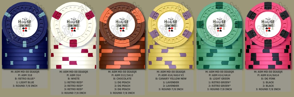
CPC has this edge spot listed on their website as a level 2 if all the spots are the same color.Keeping the all-quarter inch spot progression alive: Maybe see if CPC can bring this spot pattern back?
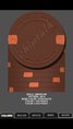
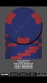
View attachment 2287
CPC has this edge spot listed on their website as a level 2 if all the spots are the same color.
All in all, what do YOU prefer?

The 318 frac would be awesome, if you're willing to pay for it (it's a level 4 chip I think...)
Split spots in this set are not sitting well with me at all though. Not retro. OP bottom mockup is still the best IMO.


I agree with Ben regarding split spots, and prefer the 614 hundo. My mockup from post #22 but use a 218 frac and 314 $1?
these are tough. i like the 312 $5, but am not into the 412 quarter..
How about -
Move the $2, 414 v2 spot to the $25. Then 318 and 314 for frac and $1.
If the deuces get made go with half pies for them.
Split spots in this set are not sitting well with me at all though.
In luv. Order 'em.a little something like this? i can dig it.
In luv. Order 'em.
I agree with Ben regarding split spots
I don't understand why the ds18 don't get more love, they are among my favorite spot patterns!
")
Perfecto = perfecto.
If you went that direction Jack are you thinking 2 - color spots for some chips?
If you went that direction Jack are you thinking 2 - color spots for some chips?

Split spots in this set are not sitting well with me at all though. Not retro. OP bottom mockup is still the best IMO.