retro design - all same spots or simple progression? other criticism also welcome (1 Viewer)

Which spots do you prefer?

  • Top row - all the same

    Votes: 16 40.0%
  • Bottom row - simple progression

    Votes: 24 60.0%

  • Total voters
    40
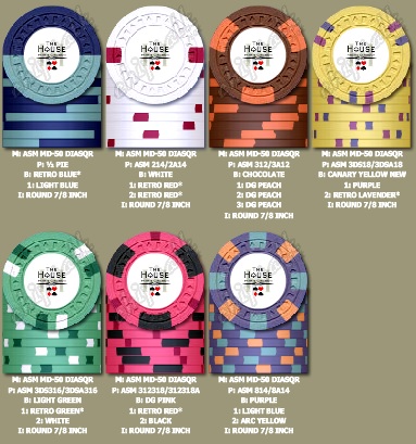
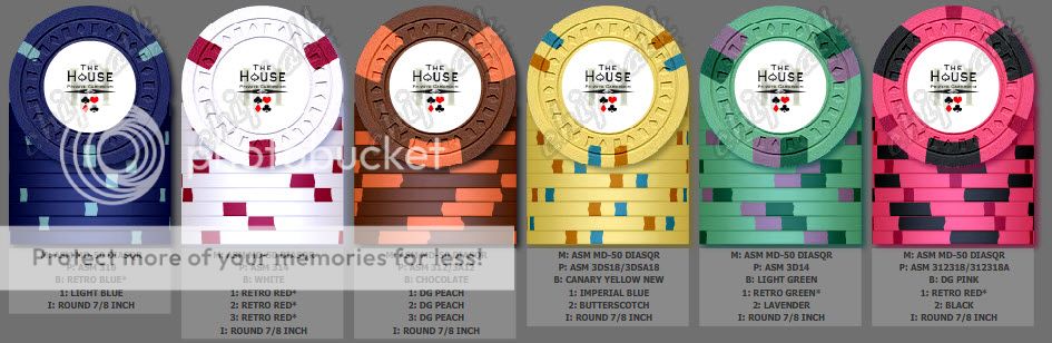
The top row is out, right? It's a complete snooze-fest.

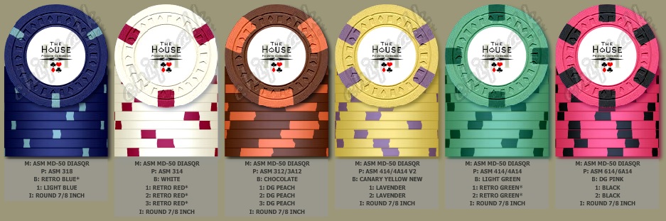
I really like the 2-spot $1s and $2s.

top row not out entirely. might be reinstated if i get on board with the scroll mold to do oversized chips for $20+ denoms in which case all 39mm chips would be 314 and all oversized chips would be 514.

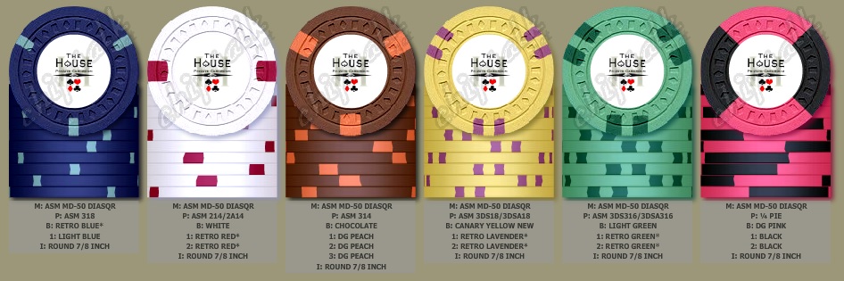
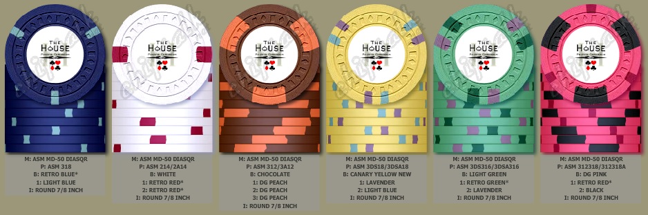
yeah i think i should change back to 214 for the last few mock ups. i dig the two-spotters, too. might look a little funny with a 318 -> 214 -> 312 progression, but wtf.
 
You're not worried about the 43mm chipping problems that have been reported? Talk to Jose. He scared me off...
 
You're not worried about the 43mm chipping problems that have been reported? Talk to Jose. He scared me off...

no. i had a color sample set of 43s, shuffled the hell out of them, and let little kids play with them on hardwood floor and never saw even a single chip from any of the edges. if i dig the scroll mold, i'm going to get 43s for all $20+ denoms.
 
no. i had a color sample set of 43s, shuffled the hell out of them, and let little kids play with them on hardwood floor and never saw even a single chip from any of the edges. if i dig the scroll mold, i'm going to get 43s for all $20+ denoms.

I'm told the problems were in the edge spots. If your samples were solids, I strongly suggest you talk to Jose.
 
I'm told the problems were in the edge spots. If your samples were solids, I strongly suggest you talk to Jose.

i think i did once before, but i will again. i'll also speak with David before i make any order and make sure there's a QC guarantee, which i expect will not be a problem.
 
i think i did once before, but i will again. i'll also speak with David before i make any order and make sure there's a QC guarantee, which i expect will not be a problem.

If I hadn't been scared off the scroll mold, I would have loved checking it out for oversized options...
 
If I hadn't been scared off the scroll mold, I would have loved checking it out for oversized options...

You still have time...

Speaking of - you need to restart your design thread on this board. Lots of decisions yet to make...
 
a little something like this? i can dig it.

D1Nk4cR.jpg


This is is the best line up so far. The only one letting the set down to me is the $20 but that's more personal preference, reminds me of the LA lakers too much.

Would you you be opposed to using charcoal, maroon or butterscotch spot instead?
 
This is is the best line up so far. The only one letting the set down to me is the $20 but that's more personal preference, reminds me of the LA lakers too much.

Would you you be opposed to using charcoal, maroon or butterscotch spot instead?

thanks, stocky! i'm pretty much limited to a blue (imp or reg) or a purple (purp, lav, retro lav) for the $20 spots due to the other colors in the set imo. maybe charcoal would work, but maroon would be too close to both the choc and the red of the $5 and $1 respectively and butterscotch too close to the choc.

i'm still leaning toward the split spots, but i'm not set on anything yet. i might just let it lie until i get the artwork commissioned and completed then revisit with the actual inlays.

adkfQij.jpg
 
A 3 spot version. I was torn on the $25 spot - could use 3D14 or reuse 3v12 since the $20 and $25 won't see play together.

jbutlerretro3_zpsd9fec209.jpg
 
Last edited:
i'm digging the 312318 hundo, Chris. a good way of incorporating the 1/2" spot in another chip. would prob go 3DSA318 for the $20 using imp blue and lavender.
 
You still have time...

Speaking of - you need to restart your design thread on this board. Lots of decisions yet to make...

I plan to get it rolling again over here. Just been really busy. The contract my startup landed went live the day before I flew to DCS. I'm just scrambling a little until we get it under control.
 
i'm digging the 312318 hundo, Chris. a good way of incorporating the 1/2" spot in another chip. would prob go 3DSA318 for the $20 using imp blue and lavender.

I love that combo but maybe I'm a progression nit since it seemed to me to bump the 3 color $20 and $25 chips up quite a bit, but maybe it'd be ok. I guess I'm very decisive on this lol. Here's another:

jbutlerretro4_zps1df5f504.jpg
 
what do you think about this iteration, Chris? i don't mind the $20 and $25 sharing the lavender spot since they'd never be on the table together.

veering well away from the retro nature of the design at this point, but no harm in experimenting...

iclCf64.jpg
 
I like it but maybe it's the lavender that's getting me. I sorta like this as a bridge:

jbutlerretro5.jpg
 
Still can't "view all with info" but consider this my kickstarter. :cool:

jbutler_retrobazillion.jpg
 
courage i'm right there with you. i had basically those same colors, but with the following changes:

214 pattern on the $1
3DS16 pattern on the $25 (i'm kind of stuck on the spots for the $20 and $25 being as close to the same as possible)
invert the red/black color positioning on the $100

i had been using a 6A14 for the hundo, but i think i prefer your version above. you should pair up with J5 to offer spot consulting services when he does designs :)

You're most kind, Jack, but I was too lazy to check our emails to pull up the latest lol. I also need to learn Illustrator or some tool that lets me do some better work. I like the above ideas a lot and it got me thinking... if you go with close matching spots on the $20 and $25 chips and use black inlays with white ring such as the Mapes (white ring is off color here), you can get closer to a sweet retro look while still utilizing the sweet 1/8" spots. Only the hundo would bomb the table, and it has permission. :D

Pull out your sample set: the retro lav and lavender spots on the $25 look too close in chip factory, but IRL are sweet, and better than using purple imo. jbutler_retrobazillionand1.jpg
 
loving the alternate, love the way black and charcoal compliment the canary
 
Courage's post #79 $20 and $25 are the absolute nuts for this set IMO. Personally I like a 314 $1 better than 214, but you can't go wrong either way with my buddy Retro Red. ;)
 
what do you think about this iteration, Chris? i don't mind the $20 and $25 sharing the lavender spot since they'd never be on the table together.

veering well away from the retro nature of the design at this point, but no harm in experimenting...

iclCf64.jpg

This is pretty close to perfect IMO.

Jack is this something you are looking on moving forward on? I didn't read the whole thread so I may have missed it but what are your plans on the inlay?
 
This is pretty close to perfect IMO.

Jack is this something you are looking on moving forward on? I didn't read the whole thread so I may have missed it but what are your plans on the inlay?

i've almost pulled the trigger a couple of times, but i'm waiting on a potential development in mold availability before i commit. which reminds me, i ought to check in with my sources to see where that might be.

i have pretty specific plans for the inlay. the mapes inlay used above is probably a good placeholder as i'm envisioning a similarly ink-on-paper look for mine, but with a small splash of color in one spot. i'll get John on the job as soon as i make a mold decision.

with courage's and others' counsel, i think i've settled on the below:

cxTJF0G.jpg


with a breakdown of:

200 (.50)
1000 (1)
1200 (5)
100 (20)
400 (25)
100 (100)
20 (500)

i'll be taking a look at all the purple/lav/retro lav combos for the $20 spots since courage mentioned above that he thought lav and retro lav worked better in person than on the chip factory. i'll have to scrutinize my color samples before making a decision.
 
I agree with courage regarding the retro lav/lavender they work much better irl

Great looking set so far,
 
i've almost pulled the trigger a couple of times, but i'm waiting on a potential development in mold availability before i commit. which reminds me, i ought to check in with my sources to see where that might be.

i have pretty specific plans for the inlay. the mapes inlay used above is probably a good placeholder as i'm envisioning a similarly ink-on-paper look for mine, but with a small splash of color in one spot. i'll get John on the job as soon as i make a mold decision.

with courage's and others' counsel, i think i've settled on the below:

cxTJF0G.jpg


with a breakdown of:

200 (.50)
1000 (1)
1200 (5)
100 (20)
400 (25)
100 (100)
20 (500)

i'll be taking a look at all the purple/lav/retro lav combos for the $20 spots since courage mentioned above that he thought lav and retro lav worked better in person than on the chip factory. i'll have to scrutinize my color samples before making a decision.


I think you're overlooking the great advice above to switch the retro red and black on the pink chip. Other than that, these look great.
 
The $5 is an absolute Killer. One of the best color combos in the CPC palette IMO. Personally, I would go with a 212 spot for the $1, and for whatever reason I would want the $20 as 3DS316 spots, to be on par with the $25. Thats just my OCD though.
 

Create an account or login to comment

You must be a member in order to leave a comment

Create account

Create an account and join our community. It's easy!

Log in

Already have an account? Log in here.

Back
Top Bottom