It is time to vote for the 2023 PCF Custom Chip Set Hall of Fame!
If you read nothing else, please read these two points!!!
Current PCF HOF Sets
All sets currently in the PCF HOF can viewed here: https://www.pokerchipforum.com/resources/categories/hall-of-fame.6/
Hall of Fame (HOF) Purpose
The purpose of the Hall of Fame is to recognize significant achievements in the creation of custom poker chip sets. This recognition comes from the votes of the PCF site membership, in collaboration with the work of a selection committee that solicits feedback from the membership and nominates sets for a formal vote. The committee is comprised of current PCF members, and the committee’s nominations do not necessarily equate to choosing the most popular sets. There is no quantitative way to assess the merits of a poker chip set; therefore, it is up to each committee member’s qualitative judgement on whether a set should be nominated for public voting. As poker chip sets are a very personal creation, in no way should a lack of nomination be viewed as any criticism on the quality of a member’s custom set. The entire HOF process is solely intended to celebrate and augment the enjoyment of our hobby.
The HOF Committee Membership
The committee is comprised of a chairperson, and a group of members. The chairperson’s role is to facilitate the HOF nomination process, and the committee’s role is to determine those sets that merit consideration for a full site vote. There was no formal membership selection process for the current committee members, it simply self-manifested. When a current committee member wishes to step down, they can select their replacement. If a replacement is not selected, the current committee members will debate and offer a seat to a replacement member. It is the intent that the members rotate every few years, to harvest the best ideas from a diverse group of people. Current HOF committee:
Custom sets made by current or former PCF members are eligible for consideration in the HOF (permission from the owner is required for nomination). There is a one year “cooling-off” period from the date a set is revealed before a set is eligible for HOF consideration, intended to prevent short-term hype from influencing the process. Custom sets are eligible for nomination for a period of four years. The 2023 nominee class includes sets revealed from January 1, 2018 through December 31, 2021. Once a set has exceeded the eligibility period, it is no longer up for consideration. However, the HOF committee may nominate a limited number of “expired” sets for legacy consideration (i.e., to correct a previous oversight). The general process is as follows:
Without further ado, here are this year's HOF Nominees........
2023 PCF Custom Chip Set Hall of Fame Nominees:
If you read nothing else, please read these two points!!!
- When voting please MAKE ALL YOUR SELECTIONS AT ONE TIME!!!! Once you hit “Submit”, you will NOT be able to go back and edit them!!!
- You may vote for as many or as few sets as you like. This year’s committee has recommended that two sets be enshrined in the HOF.
Current PCF HOF Sets
All sets currently in the PCF HOF can viewed here: https://www.pokerchipforum.com/resources/categories/hall-of-fame.6/
PCF HOF Sets
| Year | Set | Owner |
|---|---|---|
| 2015 | Le Boudoir | Nicolas M |
| 2015 | Lady Luck | Abby99 |
| 2015 | Duy's Palace | Viet Rounder |
| 2015 | Club Courage | Courage |
| 2015 | The Hitching Post | Mr Tree |
| 2015 | Black Cat Club | Toby |
| 2015 | Hungry Frog | Meatboy |
| 2015 | 3 Putt Poker | Links_slayer |
| 2015 | Redbelly Poker Room | Redbelly |
| 2015 | Truman's House | Bergs |
| 2016 | Suicide Queen | k9dr |
| 2016 | Colony Club | Puggy |
| 2016 | The Boulevard | bmichaelthorn |
| 2016 | Chateau de Noix | bivey |
| 2017 | The Cedar Room | toad94 |
| 2017 | Iron Bank | k9dr |
| 2017 | Silver Dust Casino | toad94 |
| 2018 | Knollwoods | 72o |
| 2018 | The Capital Room | joshuadalton |
| 2018 | Pillage & Plunder | Ronoh |
| 2018 | Paymaster | Mr Tree |
| 2019 | Bicycle Shack | kmccormick100 |
| 2019 | The Club House | Rhodeman77 |
| 2019 | Rosie's Bayou | slisk250 |
| 2020 | Bill's Haus of Bluff | Chippy McChiperson |
| 2020 | Bubb's Poker Den | ChaosRock |
| 2020 | Motswari Lodge | perthmike |
| 2020 | Speak EC | krafticus |
| 2021 | The Armory | Psypher1000 |
| 2021 | The Barrel House | Irish |
| 2021 | Broken Bell | Tommy |
| 2022 | The Ambessa Poker Room | SpaceMonkey |
| 2022 | The Rainier Room | madforpancakes |
| 2022 | Story Hill | MarquetteMonkey |
Hall of Fame (HOF) Purpose
The purpose of the Hall of Fame is to recognize significant achievements in the creation of custom poker chip sets. This recognition comes from the votes of the PCF site membership, in collaboration with the work of a selection committee that solicits feedback from the membership and nominates sets for a formal vote. The committee is comprised of current PCF members, and the committee’s nominations do not necessarily equate to choosing the most popular sets. There is no quantitative way to assess the merits of a poker chip set; therefore, it is up to each committee member’s qualitative judgement on whether a set should be nominated for public voting. As poker chip sets are a very personal creation, in no way should a lack of nomination be viewed as any criticism on the quality of a member’s custom set. The entire HOF process is solely intended to celebrate and augment the enjoyment of our hobby.
The HOF Committee Membership
The committee is comprised of a chairperson, and a group of members. The chairperson’s role is to facilitate the HOF nomination process, and the committee’s role is to determine those sets that merit consideration for a full site vote. There was no formal membership selection process for the current committee members, it simply self-manifested. When a current committee member wishes to step down, they can select their replacement. If a replacement is not selected, the current committee members will debate and offer a seat to a replacement member. It is the intent that the members rotate every few years, to harvest the best ideas from a diverse group of people. Current HOF committee:
- @Irish (Matt) – chair
- @Chippy McChiperson (Bill)
- @JeepologyOffroad (John)
- @MarquetteMonkey (Andy)
- @Sprouty (Bryan)
Custom sets made by current or former PCF members are eligible for consideration in the HOF (permission from the owner is required for nomination). There is a one year “cooling-off” period from the date a set is revealed before a set is eligible for HOF consideration, intended to prevent short-term hype from influencing the process. Custom sets are eligible for nomination for a period of four years. The 2023 nominee class includes sets revealed from January 1, 2018 through December 31, 2021. Once a set has exceeded the eligibility period, it is no longer up for consideration. However, the HOF committee may nominate a limited number of “expired” sets for legacy consideration (i.e., to correct a previous oversight). The general process is as follows:
- The HOF committee will solicit ideas from the site membership for HOF consideration in the first half of the year, including legacy sets.
- Using the opinions of the membership and their own personal beliefs, each committee member provides an independently created list of sets to the chairperson. Note that PCF moderators and admin have no prior knowledge or input regarding nominations.
- The sets are compiled by the chairperson, and the committee privately debates the merits of those sets. Eventually, sets that merit formal nomination are determined by an internal voting process. Members of the committee may recommend and vote for the nomination of their own sets; however, members of the committee are strongly discouraged from promoting their own sets (i.e., other committee members should do all the talking). The chairperson is responsible to discourage all forms of self-promotion.
- Once formal nominations are completed, notification is provided to the set owners. The creator of a set must formally agree to inclusion of their set in the HOF process, and a draft write-up of the set with pictures is requested to facilitate the voting process.
- After owner consent and information are obtained for all sets, the final list is subject to a public membership vote where the top sets will be inducted into the HOF. Voting is open for 2 weeks to established members - 30 days with a minimum of 30 posts. The number of sets for induction will be determined by the committee, based on the quality of that year’s nominations. This year’s committee has recommended that two sets be enshrined in the HOF. The quantity of PCF votes for each set is public; however, the ballots are secret.
Without further ado, here are this year's HOF Nominees........
2023 PCF Custom Chip Set Hall of Fame Nominees:
- The Bone Yard @liftapint
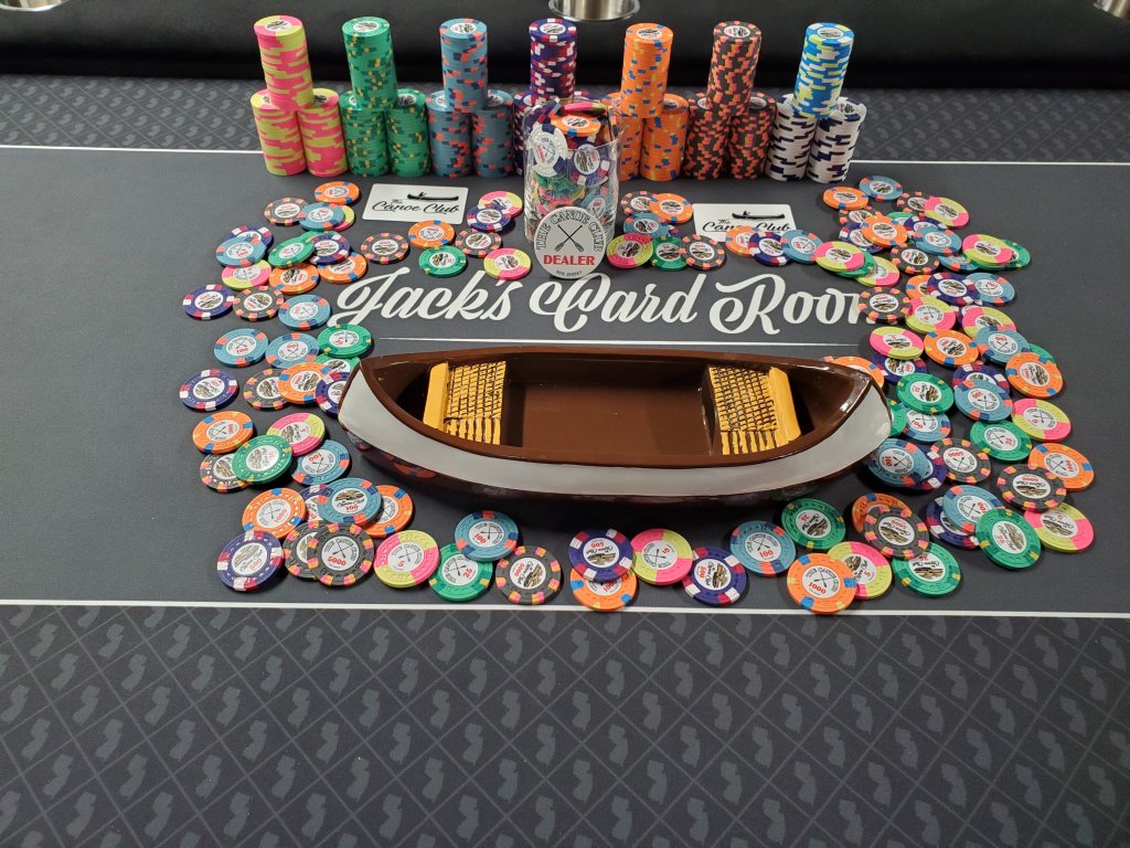
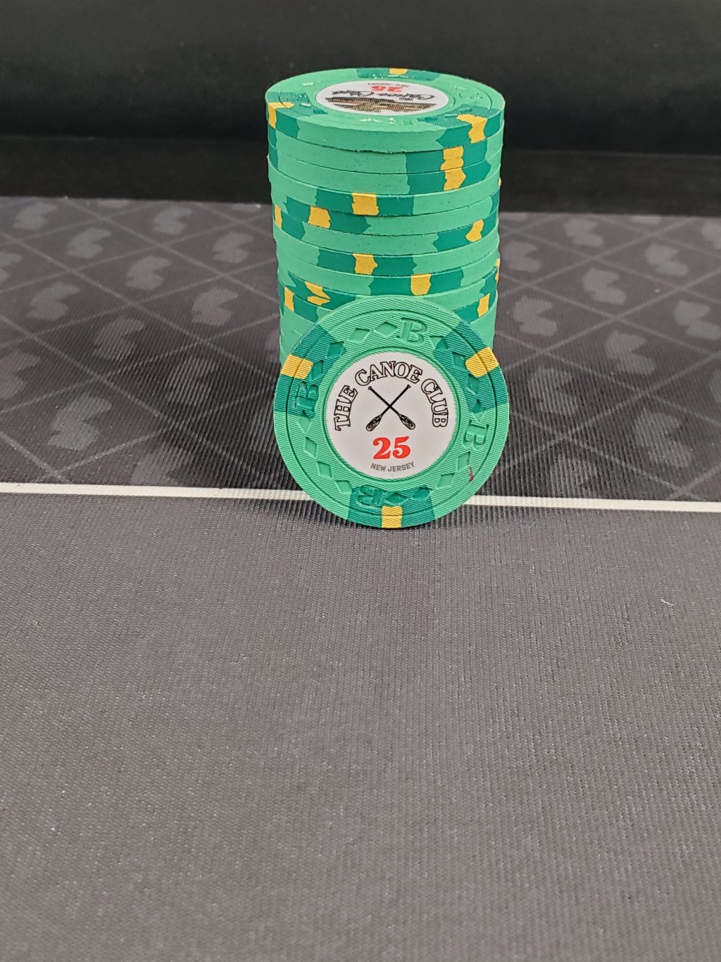
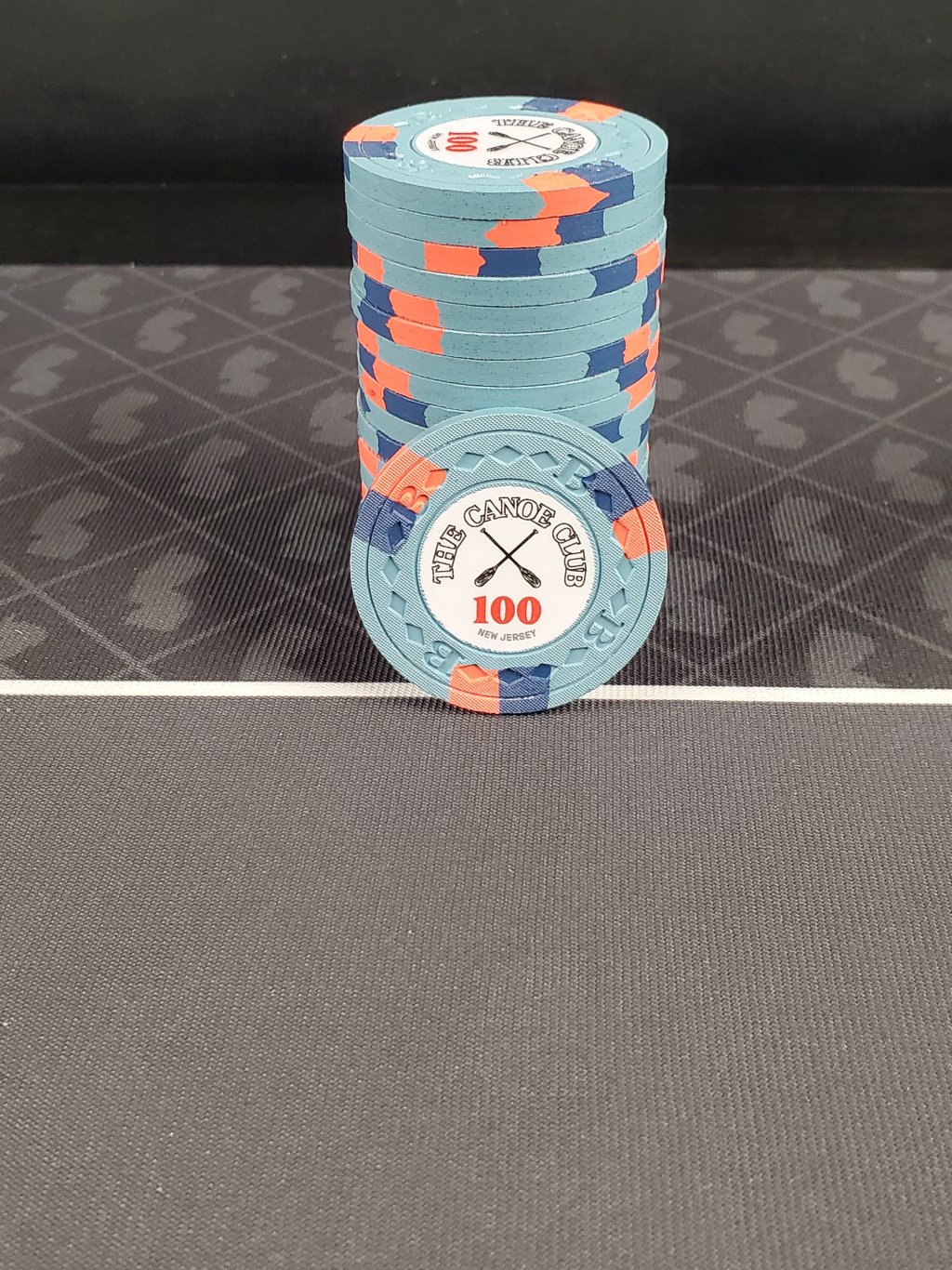
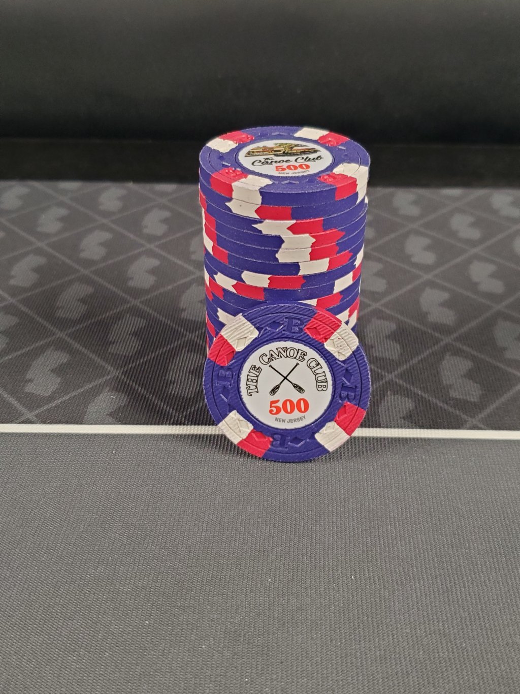
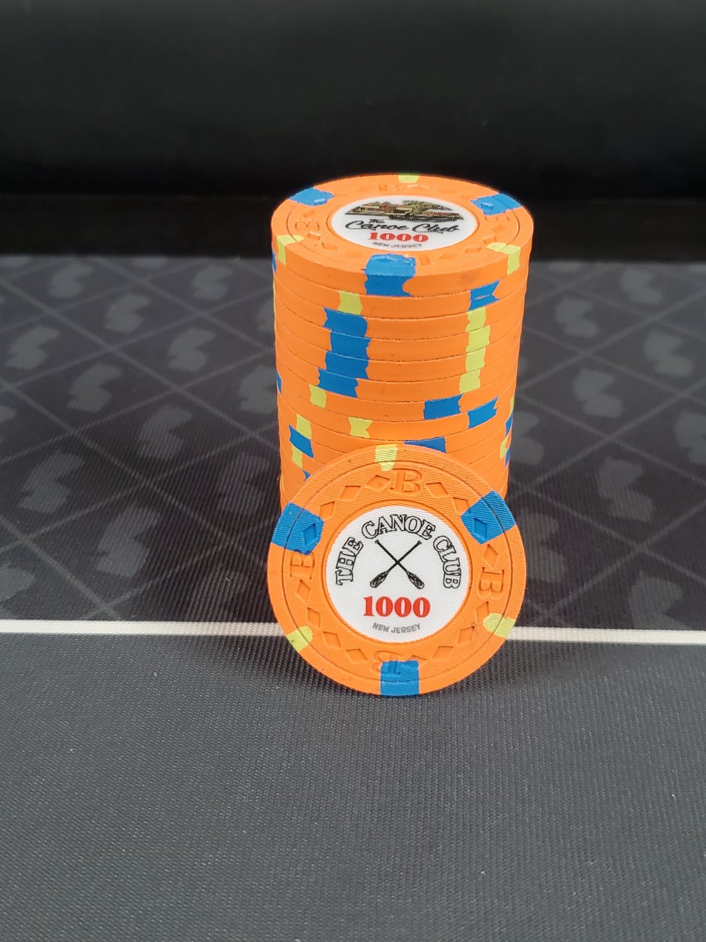
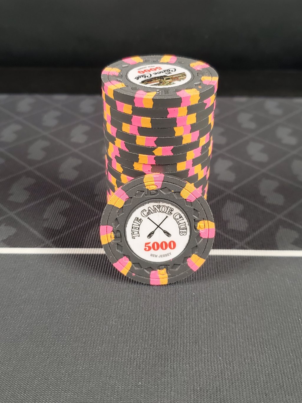
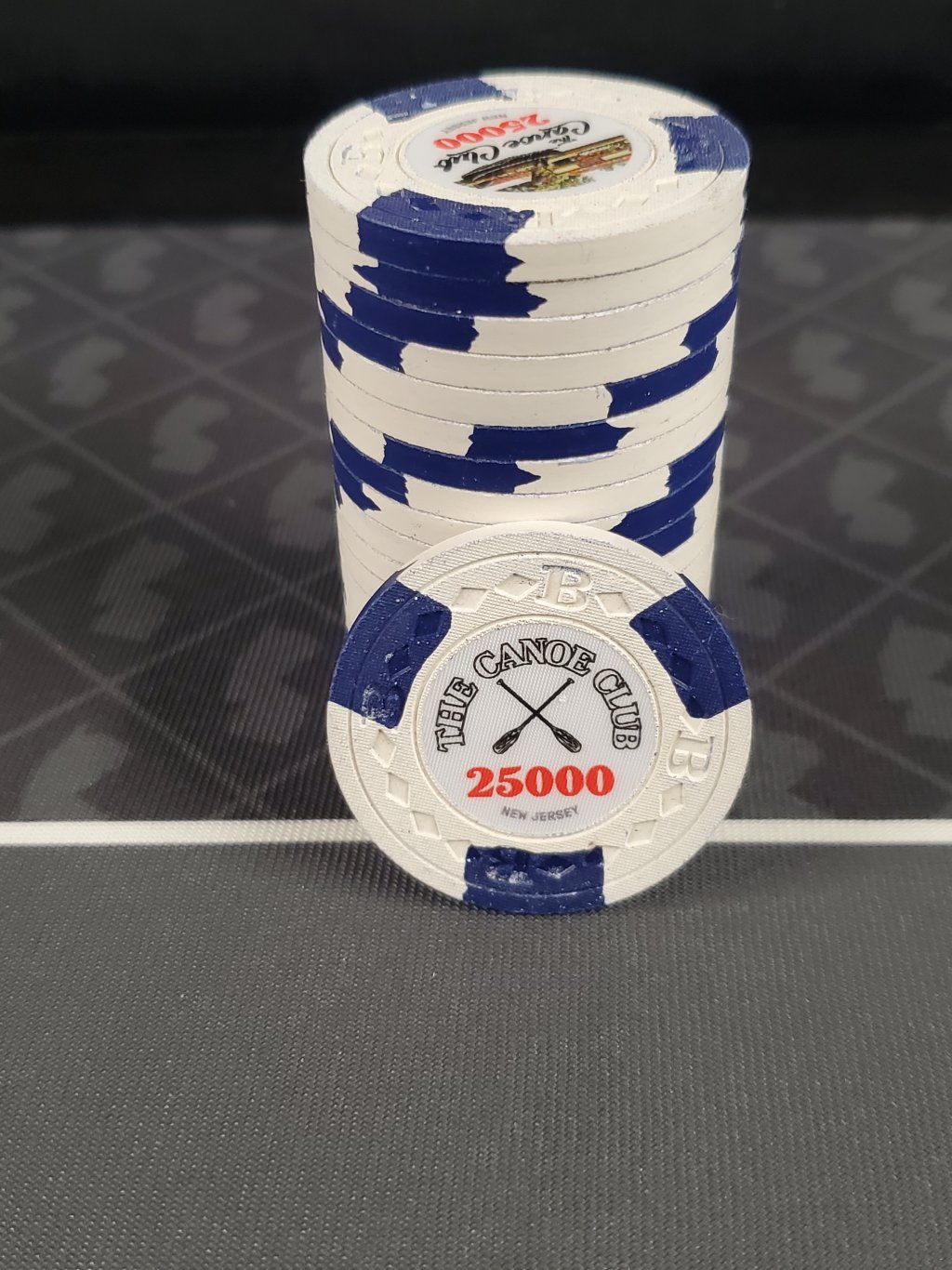
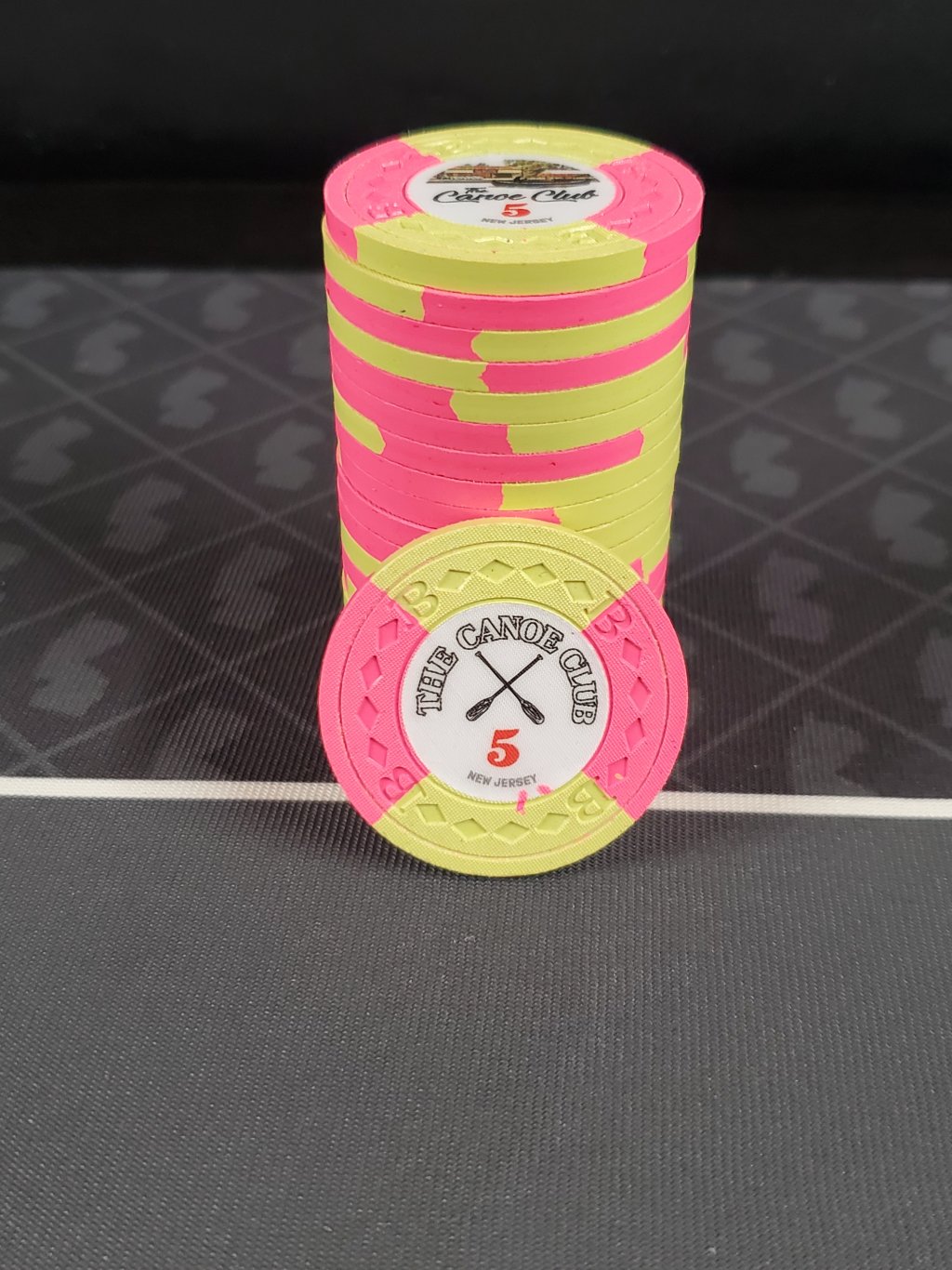
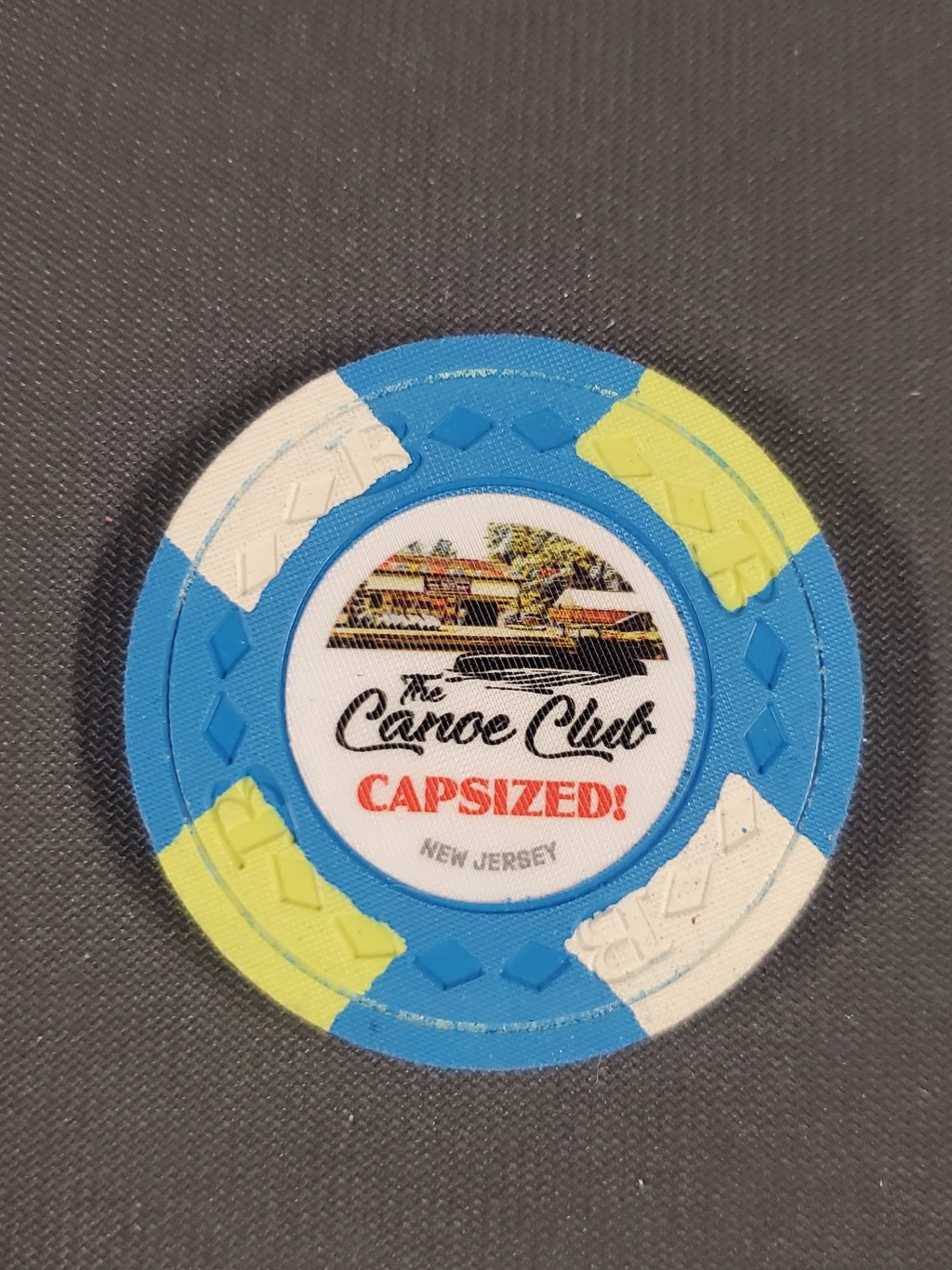
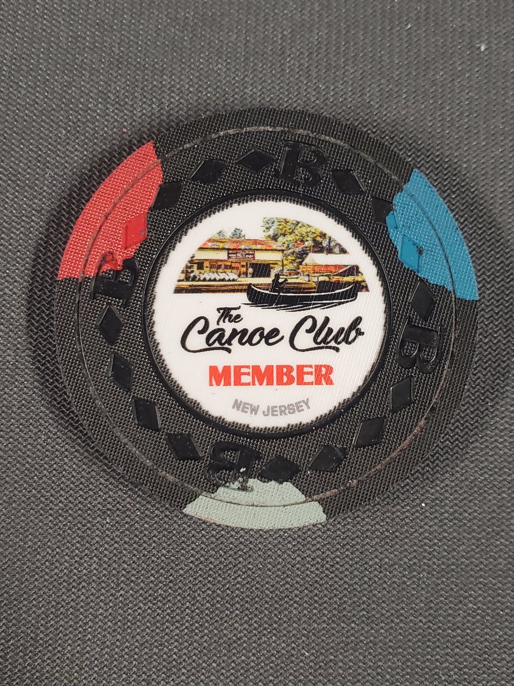
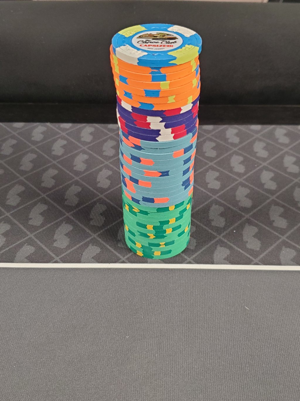
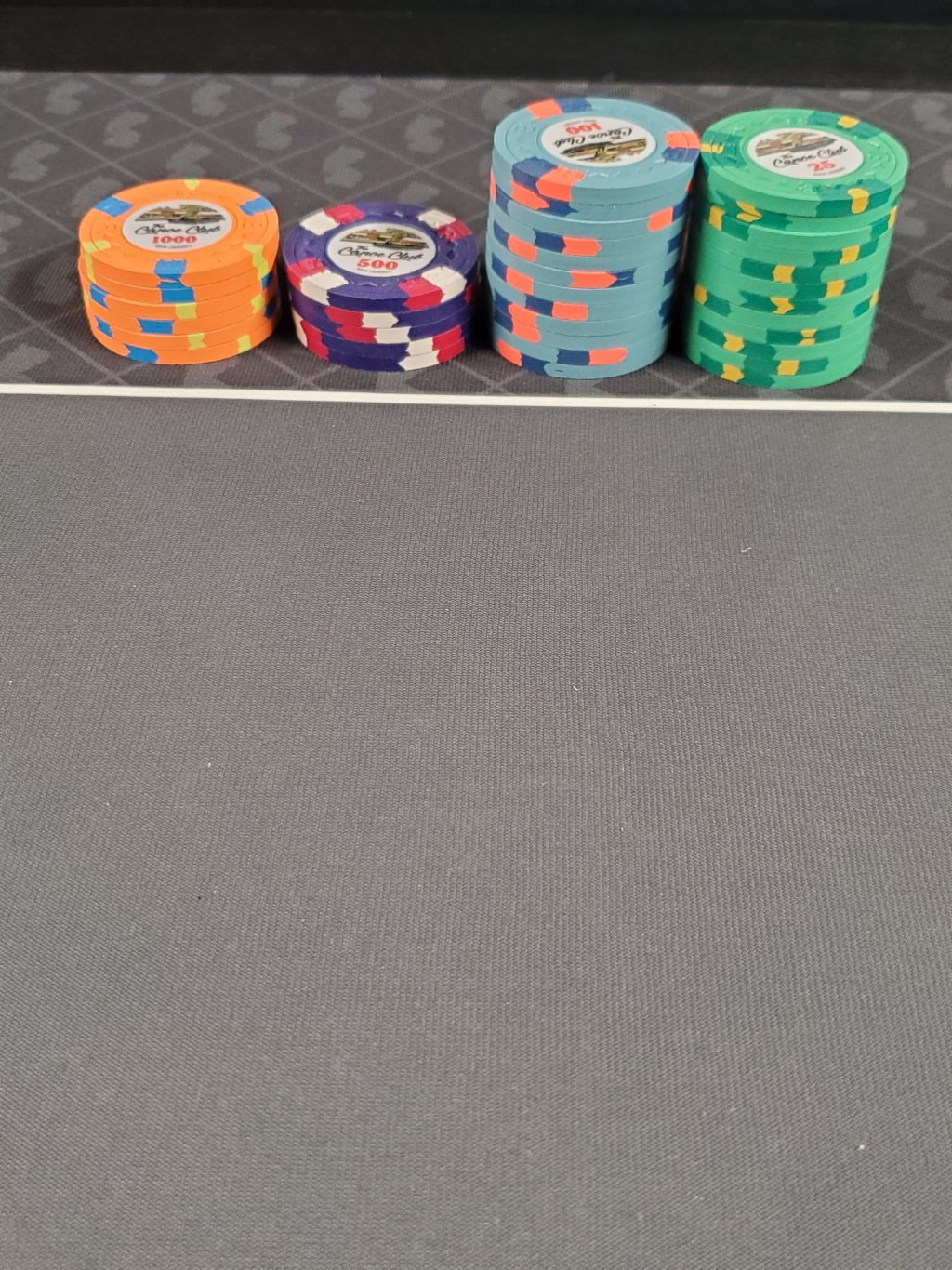
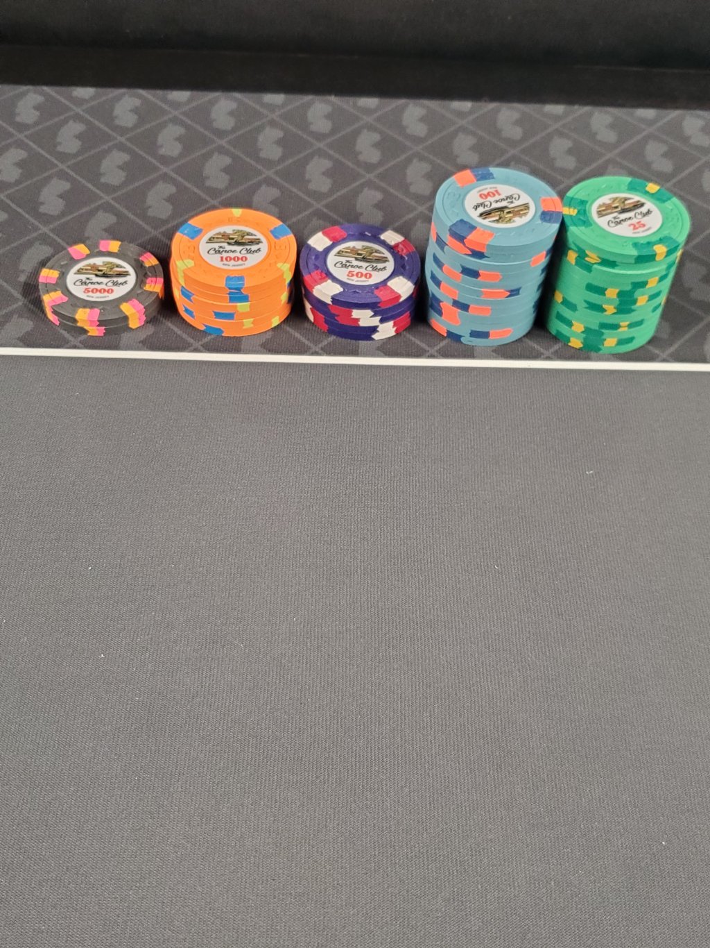
- The Canoe Club @JMC9389
- Chessie's Cove @kirchhausen
- Le Gold Luxury Hotel & Resort @LeGold
- The Poker Lab @Hornet
- Willie's Treasure Trove @Sprouty

 these chips man, well done and great back story! " -