Zmasterben
Flush
WSOP Card Usage - Rio Years
In 2005 the World Series of Poker, the most important event in all of poker, moved away from the Binion's Horseshoe casino for the first time all the way to an off-strip casino known as the Rio. Since the move, the WSOP has used different cards every year. The tournament coordinators have chosen multiple vendors to provide their cards over the years. Some have been well received by the players; others have been disasters. Here is a brief history of the playing cards used year to year at the Rio during the World Series of Poker.
2005 - Copag Red and Black
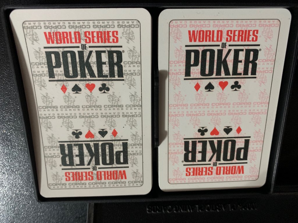
Before the move, Binion's had been using KEMs exclusively during their tournaments. The WSOP, fresh in their new venue, wanted a change and introduced these Copag cards. The cards were mostly white with red and black accents, the WSOP logo prominently featured on each end, and the many of the Copag symbol facing each way across the decks.
2006 - Copag Red and Black
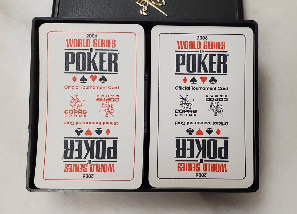
The 2006 designs were simplified to mostly white with red and black borders. Instead of several Copag symbols throughout, two large symbols facing North and South were included in the middle. The year 2006 was added to the top and bottom of the cards as well.
2007 - KEM Made Bicycle Branded (USPCC) Red and Black
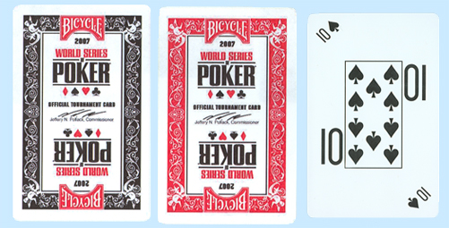
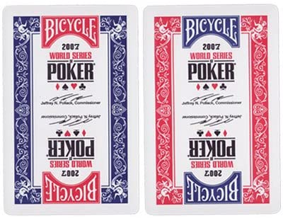
After two years of using Copags, KEM made a play to return to the WSOP and won the rights to be the official cards of the annual summer event for the next eight years. Despite being KEM quality cards, the Bicycle logo owned by the same parent company was printed on the top and bottom to help create brand awareness and increase sales of their typically less quality but more affordable cards for casual players watching the ESPN broadcasts which were at the height of their popularity around that time.
The busy designs featured black/red outer borders with classic bicycle card designs. In between the iconic WSOP logo was a misspelled facsimile signature of then Commissioner and current president of the XFL Jeffrey Pollack. The cards also featured corner peak indexes, which ended up being a total disaster. After just two days of play, the cards were quickly replaced by a blue/red variant with regular index and a correct spelling of the commissioner's name.
2008 – KEM Made Bicycle Branded (USPCC) Red and Blue
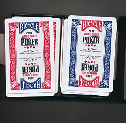
The WSOP decided to reuse the replacement design in 2007 for this year.
2009 – KEM Made Bicycle Branded (USPCC) Red and Black
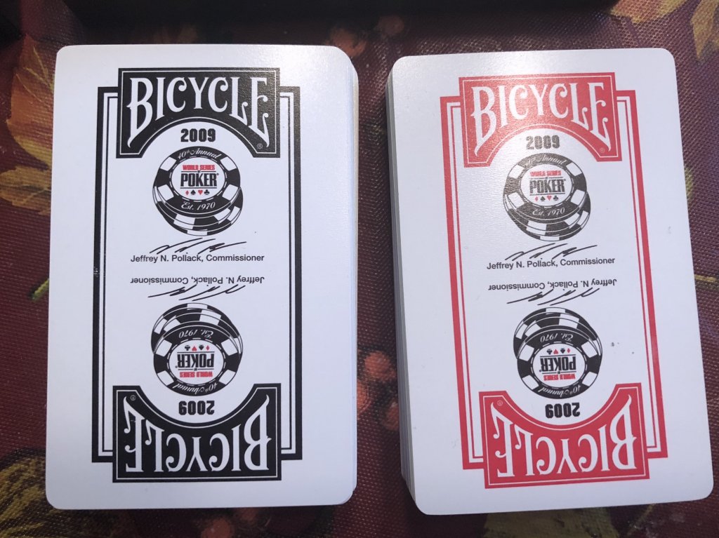
A radical design change from the year before, KEM decided to go back to the red and black design and simplify the borders away from the classic bicycle designs. The WSOP logo was now featured inside a four pipped poker chip announcing that it was the 40th anniversary around the border. Pollack’s mirrored signature returned for the last time.
2010 – KEM Made Bicycle Branded (USPCC) Red and Black
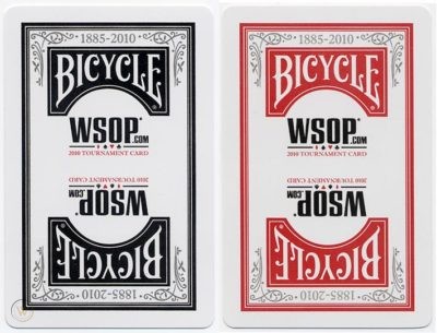
Keeping with the simplified overall design, the Bicycle logo was moved inside the borders and some branch like flourishes were added in the inside corners. The cards were marked 1885-2010, representing the years that the Bicycle brand cards had been printed to that point. The WSOP logo was altered slightly to advertise their website which was now offering play tournaments for prizes, WSOP.com. These cards were also marked as “tournament cards”, a trend that would continue through 2014.
2011 – KEM Made Bicycle Branded (USPCC) Red and Black
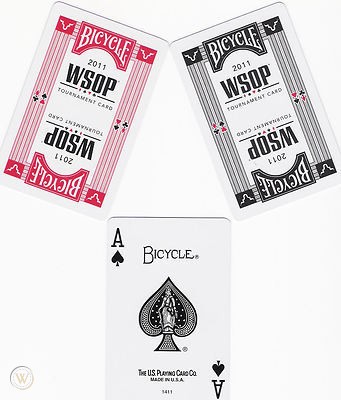
KEM returned to the world of complex borders, with red and black stripes featuring the four suit symbols framing the interior. The WSOP logo removed the .com but WSOP was written in acronym in black as opposed to the typical World Series of Poker logo with the first two words in red.
Something else was very new, a short lived concept for 2011 and 2012; sponsor branding on the cards. Jack Link’s Beef Jerky, the WSOP backer that played their “Messin’ with Sasquatch” advertisements during the commercial breaks of every ESPN WSOP broadcast at the time, had their Bull logo placed in the four corners of the cards.
2012 – Fournier Made Bicycle Branded (USPCC) Red and Black
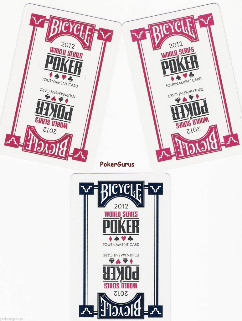
Starting in 2012 the WSOP switched to Fournier, a sister company of KEM under the umbrella of the United States Playing Card Company.
These card returned to the simplified striped border and classic logo of the past.
2013 - Fournier Made Bicycle Branded (USPCC) Red and Black
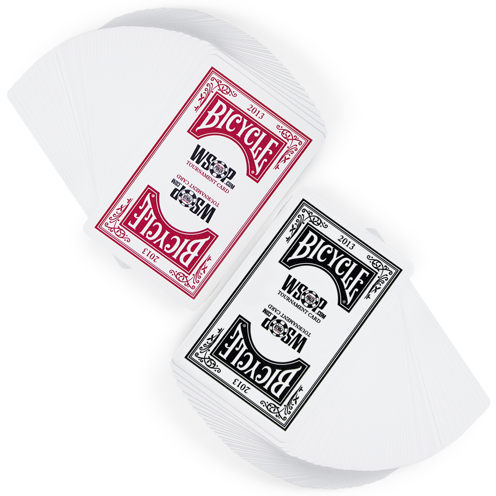
These cards were very similar to the 2010 design a few years earlier. However, the 1885 date did not appear in front of the 2013 and the O in the WSOP.com logo featured the WSOP chip logo.
2014 KEM or Fournier Made Bicycle Branded (USPCC) Blue and Black

The only cards not to have a red back design, these blue and black cards were even more simplified versions of the 2013 setup without the branch like flourishes. The “tournament card” markings were moved to above the Bicycle logo.
2015 Modiano Red and Black
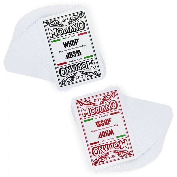
For the first time in a while, the WSOP went with a new vendor. Modiano, the Italian card makers produced setups for the series so unpopular by players and dealers a like that they would lose their designation as official playing cards of the WSOP the next year.
The black and red design featured the company name in bubble letters and stereotypical playing card flourishes around the 2015 at the top. The cards mention being made in Italy in the white space around green and red bars meant to invoke the Italian flag. In hindsight this decision may have been a mistake, as these were so unpopular among the seasoned veterans who will now always associate Italy with horrible playing cards.
2016 – Copag Red and Black
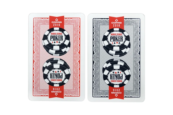
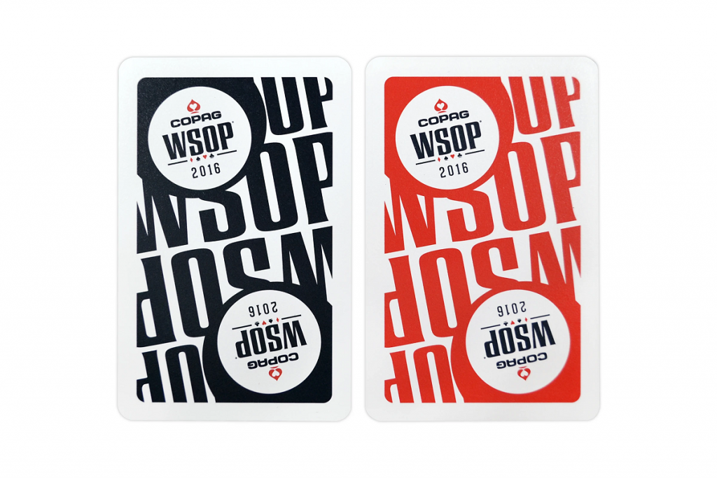
After 10 years, Copag was once again in the WSOP forefront where they have remain today. They celebrated their return with busy but slick designs, abandoning the usually white based cards with Red and Black net designs surrounded by scribble-esque borders. The WSOP chip logo was large and prominent, and the now simplified red spade Copag logo was featured on each edge.
The 2016 Main Event saw the usage of two different types of cards; The normal ones used all year and special Main Event cards introduced for the year. The Main Event cards were black and red with WSOP in large font and the series logo in two circles. The two different styles appear to have been used at the same time throughout the early stages of the tournament, most likely due to lack of supply.
2017 – Copag Red and Black
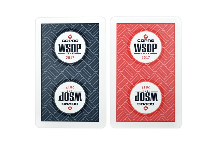
After success in 2016, Copag struggled to capitalize on potential popularity the next year. Players immediately started complaining about these card, commenting that the dark backgrounds were noticeably marked up after just a few orbits. Panic and rage began to fill the poker rooms as runners feared more attentive players would be able to use these markings to cheat.
The back designs of the red and blackish-blue cards featured a woven like design with white circle featuring the WSOP and Copaq logos.
2018 – Copag Red and Black
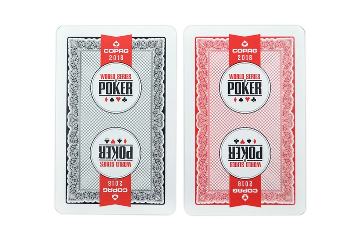
After a year of controversies, Copag returned to the similar and popular design of 2016. The only major change was the WSOP logo in a white circle as opposed to a chip.
2019 – Copag Red and Black
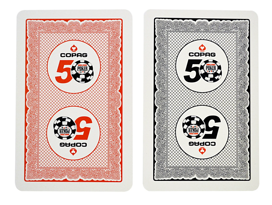
Copag used the same back designs as 2016 and 2018. In honor of the 50th anniversary, these cards featured the special 50 logo in white circles with the Copag logo.
2021 - Copag Red and White
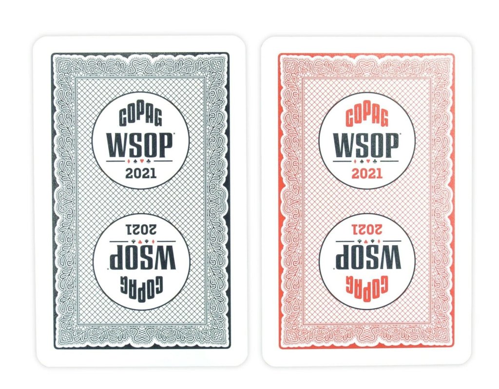
Copag continues their slight variation backs in 2021 with cards nearly identical to 2019.
2014 - 2018 Televised or Streamed Final Tables - Pokertronics RFID Red and Blue Cards
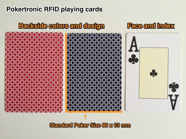
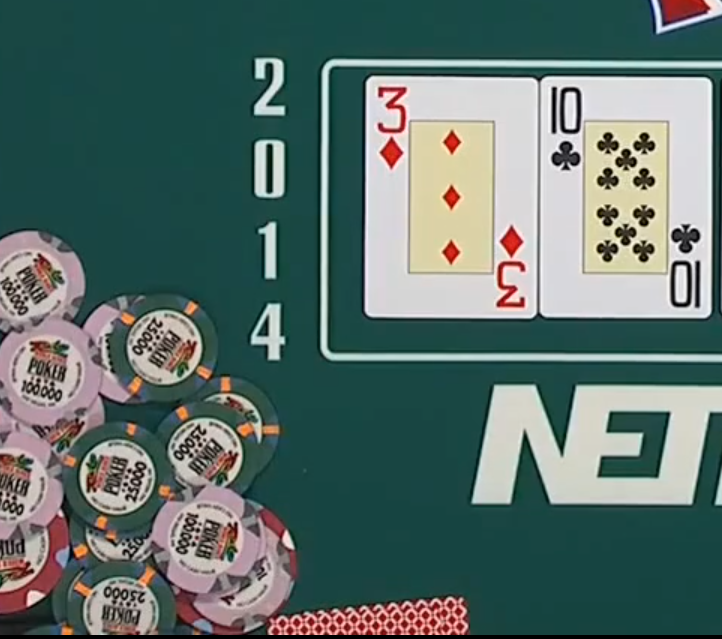
From 2014 - 2018 when the WSOP showed televised or live streams, they use a 30 minute delay and RFID embedded cards to capture hole cards. The screenshot above is from 2014 confirming they used these cards. It appears from other streams that they continue to use the same cards at Main Event final tables and other final table streams.
The designs feature solid blue and red cards with white diamonds.
For more information on WSOP usage see my other write ups below:
WSOP Chip Usage - 2007 Rio Primary Paulson Set
WSOP Chip Usage - 2007 Rio Secondary Paulson Set
WSOP Chip Usage - 2005 Rio Primary Bud Jones
WSOP Chip Usage - 2012 Rio Secondary Bud Jones
WSOP Chip Usage - Binion's Horseshoe
WSOP Chip Usage - Main Event
In 2005 the World Series of Poker, the most important event in all of poker, moved away from the Binion's Horseshoe casino for the first time all the way to an off-strip casino known as the Rio. Since the move, the WSOP has used different cards every year. The tournament coordinators have chosen multiple vendors to provide their cards over the years. Some have been well received by the players; others have been disasters. Here is a brief history of the playing cards used year to year at the Rio during the World Series of Poker.
2005 - Copag Red and Black
Before the move, Binion's had been using KEMs exclusively during their tournaments. The WSOP, fresh in their new venue, wanted a change and introduced these Copag cards. The cards were mostly white with red and black accents, the WSOP logo prominently featured on each end, and the many of the Copag symbol facing each way across the decks.
2006 - Copag Red and Black
The 2006 designs were simplified to mostly white with red and black borders. Instead of several Copag symbols throughout, two large symbols facing North and South were included in the middle. The year 2006 was added to the top and bottom of the cards as well.
2007 - KEM Made Bicycle Branded (USPCC) Red and Black
After two years of using Copags, KEM made a play to return to the WSOP and won the rights to be the official cards of the annual summer event for the next eight years. Despite being KEM quality cards, the Bicycle logo owned by the same parent company was printed on the top and bottom to help create brand awareness and increase sales of their typically less quality but more affordable cards for casual players watching the ESPN broadcasts which were at the height of their popularity around that time.
The busy designs featured black/red outer borders with classic bicycle card designs. In between the iconic WSOP logo was a misspelled facsimile signature of then Commissioner and current president of the XFL Jeffrey Pollack. The cards also featured corner peak indexes, which ended up being a total disaster. After just two days of play, the cards were quickly replaced by a blue/red variant with regular index and a correct spelling of the commissioner's name.
2008 – KEM Made Bicycle Branded (USPCC) Red and Blue
The WSOP decided to reuse the replacement design in 2007 for this year.
2009 – KEM Made Bicycle Branded (USPCC) Red and Black
A radical design change from the year before, KEM decided to go back to the red and black design and simplify the borders away from the classic bicycle designs. The WSOP logo was now featured inside a four pipped poker chip announcing that it was the 40th anniversary around the border. Pollack’s mirrored signature returned for the last time.
2010 – KEM Made Bicycle Branded (USPCC) Red and Black
Keeping with the simplified overall design, the Bicycle logo was moved inside the borders and some branch like flourishes were added in the inside corners. The cards were marked 1885-2010, representing the years that the Bicycle brand cards had been printed to that point. The WSOP logo was altered slightly to advertise their website which was now offering play tournaments for prizes, WSOP.com. These cards were also marked as “tournament cards”, a trend that would continue through 2014.
2011 – KEM Made Bicycle Branded (USPCC) Red and Black
KEM returned to the world of complex borders, with red and black stripes featuring the four suit symbols framing the interior. The WSOP logo removed the .com but WSOP was written in acronym in black as opposed to the typical World Series of Poker logo with the first two words in red.
Something else was very new, a short lived concept for 2011 and 2012; sponsor branding on the cards. Jack Link’s Beef Jerky, the WSOP backer that played their “Messin’ with Sasquatch” advertisements during the commercial breaks of every ESPN WSOP broadcast at the time, had their Bull logo placed in the four corners of the cards.
2012 – Fournier Made Bicycle Branded (USPCC) Red and Black
Starting in 2012 the WSOP switched to Fournier, a sister company of KEM under the umbrella of the United States Playing Card Company.
These card returned to the simplified striped border and classic logo of the past.
2013 - Fournier Made Bicycle Branded (USPCC) Red and Black
These cards were very similar to the 2010 design a few years earlier. However, the 1885 date did not appear in front of the 2013 and the O in the WSOP.com logo featured the WSOP chip logo.
2014 KEM or Fournier Made Bicycle Branded (USPCC) Blue and Black
The only cards not to have a red back design, these blue and black cards were even more simplified versions of the 2013 setup without the branch like flourishes. The “tournament card” markings were moved to above the Bicycle logo.
2015 Modiano Red and Black
For the first time in a while, the WSOP went with a new vendor. Modiano, the Italian card makers produced setups for the series so unpopular by players and dealers a like that they would lose their designation as official playing cards of the WSOP the next year.
The black and red design featured the company name in bubble letters and stereotypical playing card flourishes around the 2015 at the top. The cards mention being made in Italy in the white space around green and red bars meant to invoke the Italian flag. In hindsight this decision may have been a mistake, as these were so unpopular among the seasoned veterans who will now always associate Italy with horrible playing cards.
2016 – Copag Red and Black
After 10 years, Copag was once again in the WSOP forefront where they have remain today. They celebrated their return with busy but slick designs, abandoning the usually white based cards with Red and Black net designs surrounded by scribble-esque borders. The WSOP chip logo was large and prominent, and the now simplified red spade Copag logo was featured on each edge.
The 2016 Main Event saw the usage of two different types of cards; The normal ones used all year and special Main Event cards introduced for the year. The Main Event cards were black and red with WSOP in large font and the series logo in two circles. The two different styles appear to have been used at the same time throughout the early stages of the tournament, most likely due to lack of supply.
2017 – Copag Red and Black
After success in 2016, Copag struggled to capitalize on potential popularity the next year. Players immediately started complaining about these card, commenting that the dark backgrounds were noticeably marked up after just a few orbits. Panic and rage began to fill the poker rooms as runners feared more attentive players would be able to use these markings to cheat.
The back designs of the red and blackish-blue cards featured a woven like design with white circle featuring the WSOP and Copaq logos.
2018 – Copag Red and Black
After a year of controversies, Copag returned to the similar and popular design of 2016. The only major change was the WSOP logo in a white circle as opposed to a chip.
2019 – Copag Red and Black
Copag used the same back designs as 2016 and 2018. In honor of the 50th anniversary, these cards featured the special 50 logo in white circles with the Copag logo.
2021 - Copag Red and White
Copag continues their slight variation backs in 2021 with cards nearly identical to 2019.
2014 - 2018 Televised or Streamed Final Tables - Pokertronics RFID Red and Blue Cards
From 2014 - 2018 when the WSOP showed televised or live streams, they use a 30 minute delay and RFID embedded cards to capture hole cards. The screenshot above is from 2014 confirming they used these cards. It appears from other streams that they continue to use the same cards at Main Event final tables and other final table streams.
The designs feature solid blue and red cards with white diamonds.
For more information on WSOP usage see my other write ups below:
WSOP Chip Usage - 2007 Rio Primary Paulson Set
WSOP Chip Usage - 2007 Rio Secondary Paulson Set
WSOP Chip Usage - 2005 Rio Primary Bud Jones
WSOP Chip Usage - 2012 Rio Secondary Bud Jones
WSOP Chip Usage - Binion's Horseshoe
WSOP Chip Usage - Main Event
Last edited:
