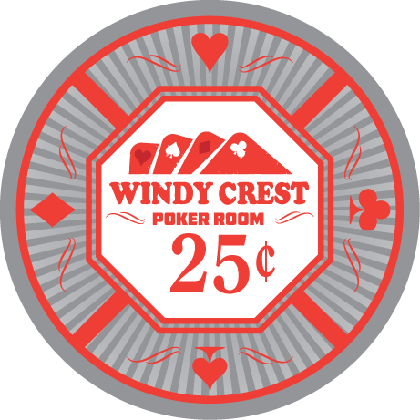
Working with @p5woody to design my custom ceramic and cash set. Starting on the cash set first. I'm looking for a clean and classic design and I think we are going in the right direction here. Steve has nailed it with elements from my logo with the suits around the outer ring of the chip as well as the extra wisps. I also like the octagon center, as I have two octagon tables. I'm looking here for feedback and suggestions on how to improve the look as I do not have an artistic bone in my body. Thanks in advance!

You are using an out of date browser. It may not display this or other websites correctly.
You should upgrade or use an alternative browser.
You should upgrade or use an alternative browser.
Windy Crest Poker Room Ceramic Cash Set (1 Viewer)
- Thread starter CraigT78
- Start date
Okay, I will be the first to respond  Changed the 100 to match the other chips, better or not?

Last edited:
CdnBeerLover
Full House
Not sure which one I like better, to be honest. Both are nice, and I kinda liked the difference for the $100...it made it stand out as the "big" denom. Maybe it's because I'm a sucker for black backgrounds, though. But the revision is consistent with the rest of the set, and fits in better.
Excellent job all around, though.(y) :thumbsup: It's a great concept, and good use of all of the available area. I also like the fact that it has a "solid" look to it. What are the plans for the rolling edge, and which manufacturer?
Darn it, I think I'm going to have to get in the line for @p5woody 's services.
I'm torn between the hundreds as well. The solid black is sweet, but I'm also one for consistency.Not sure which one I like better, to be honest. Both are nice, and I kinda liked the difference for the $100...it made it stand out as the "big" denom. Maybe it's because I'm a sucker for black backgrounds, though. But the revision is consistent with the rest of the set, and fits in better.
Excellent job all around, though.(y) :thumbsup: It's a great concept, and good use of all of the available area. I also like the fact that it has a "solid" look to it. What are the plans for the rolling edge, and which manufacturer?
Darn it, I think I'm going to have to get in the line for @p5woody 's services.
I haven't decided on the vendor. I'll be ordering prototypes before I decide for sure.
I want a grey/charcoal 25. I agree, it's not my favorite, what would you suggest?Really digging the design. Personally I'm not a fan of the 25¢ and $20 colors. As the $1 has blue I think it'd be nice to have a $20 in a different shade. (Yellow or orange).
Also the 20 needs a color change as well - happy to hear your input.
I want a grey/charcoal 25. I agree, it's not my favorite, what would you suggest?
Also the 20 needs a color change as well - happy to hear your input.
I like the grey, just maybe not the purple on it. Maybe something brighter to contrast against the grey. Pink/orange/yellow would all work nicely IMO. (Depending on what you did with the $20)
Really digging the design. Personally I'm not a fan of the 25¢ and $20 colors. As the $1 has blue I think it'd be nice to have a $20 in a different shade. (Yellow or orange).
alternate 25¢ , $1 and $20
original
new
Last edited:
What more alternate 25¢

Like it (y) :thumbsup:
Love the new $20 also.
johnnycnote
Flush
Very nice. I like the New. Ship it!
I'm liking the orange $.25 and the updated $20 - I like the original $1 with the darker blue. The only concern I would have is that there might not be enough contrast on the faint background lines for the $20? It looks almost like a solid yellow background.
Updated

Last edited:
The $.25 is the only one I still don't love. Can we try a different base color? How about a couple mock-ups with shades of pink? Pink base with either purple-ish, green, grey as the secondary color? Maybe one of these shades?


I will play around with the 25¢

updated the 25¢ - ping or orange?

atomiktoaster
Full House
Watch the yellow and brown $20... those shades can have serious issues translating to CMYK.
One more try, changed the 25¢ and we could use the orange as the $20.

chipjoker
Flush
Pink quarter and I like the yellow for the 20.. IMO
If we could go a couple shades darker on the grey - I think we have a winner. Like fossil, anchor or lead on this photo.
View attachment 37996
I was trying to keep it away from looking too close to black, since we have black on both side $5 and $100. But here you go, using anchor
Mr. Cheese
Full House
Blue .25c with yellow or orange accents. Keep the 20 from post #26 and the normal 1, 5, and 100
What about this?

The $20 looks much better. Now I guess the questions remains - do I need a different color on the red? Or leave it as black? Would the light grey from the first $20 do it justice - or does the black on red work better? The $5 and $100 are the only two that use black......thoughts?
Here is the $5 with gray

Similar threads
- Replies
- 18
- Views
- 596
- Replies
- 4
- Views
- 184
- Replies
- 21
- Views
- 572
