Trying to create my own set, any thoughts regarding colors and spots? (2 Viewers)

Emlemleml

Two Pair
Joined
Oct 14, 2017
Messages
302
Reaction score
167
Location
Odalen, Norway
Hello guys!

Left to right, 1-5-25-100.
RG.png

Left to right, 500-1000-5000.

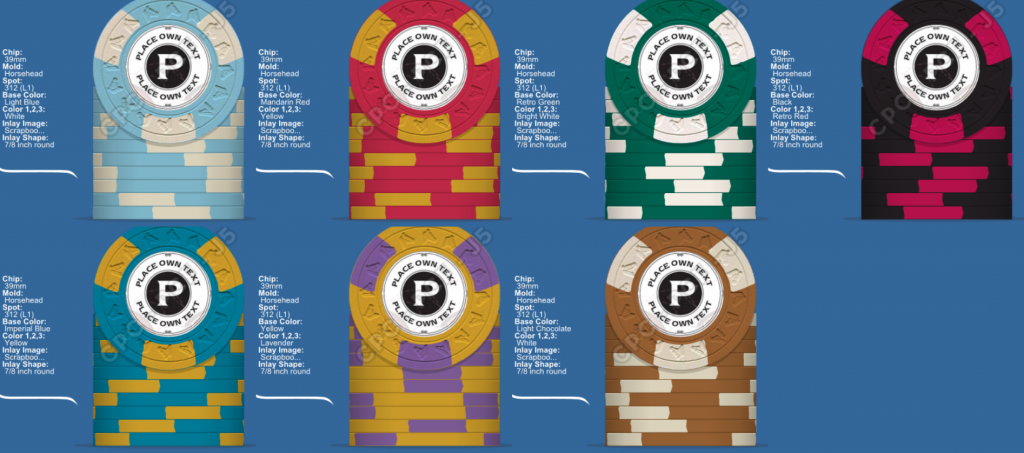
Im trying to set up some colors for a future CPC pokerchip set.
I've been looking at some chips between the 50's and 70's, I'm pretty sure this is not spot on. But acceptable?

My main chip color was the Imperial Blue/Yellow just because I like the chip combo (not particurlarly from that era).
So the rest is kinda built from that, and I also wanted somewhat standard colors... altough the colors and denominations from the that era seems to be pretty mixed up.


So I'm curious if you guys got any thoughts regarding the colors.

- Would it be boring with so much white? Or yellow?
- Are any of the colors combinations too close to each other regarding color blindness?
- Any other color suggestions?
- All comments are welcome.


Happy to hear from you!
 
Too much white? - yes
Too close in color? - yes

Take your time and make sure you're happy before you buy.

Buy color samples from cpc so you can see how the colors will look in person.

Lots of design threads here with tons of great advice and lots of awesome sets to see. Browse around the site and see what you can find.

I agree with @trever on to much white and too close together.

Treat the chip design tool as your lover. Spend some quality time with it. Mix it up with her. She loves it when you spend hours upon hours blending different colors and edge spots together :)
 
Thanks fellas (y) :thumbsup:

Hmm... Would it still be too much white if I change the light blue to a 314 spot, or maby to a no spot?
314.png
nospot.png

Anyways, I believe that all three 1,25 and 5000 will rarely be in play at the same time. So basically, I think there will only be 2 "white" chips in play at the time... still too much?:whistle: :whistling:

Is it the 5, 500 and the 1000 that you guys think are too close, right?


Yeah, I got the color samples, some of the chip colors doesn't look like the ones on my computer screen at all :D
 
I'm not a professional designer, but I have a suggestion.

It looks like you have the denom progression of a cash set 1-5-25-100 and a tourney set (100)-500-1000-5000.
Group each set separately, as they are not likely to see the same action at the same time at the same table.

Colours choices:

Your base chip colours are fine, if that's where you want to start. However, imho, you should not use an edgespot colour that is the same as a base colour of a chip within the same set. For example, take your 1 and your 25: they have the exact same edgespot colour (and pattern). I would recommend changing one of these colours to one that is not the same of any other edgespot or base chip colour of the others.

Looking at the next set, your 500 edgespot uses the same base colour as your 1000 chip, so I would switch one of those colours (and as long as it doesn't match any colours of the 100 or 5000).

Pattern choices:

Your first three (1,5,25) are fine. I would consider a different pattern for your 100, 500, 1000; and another different pattern for your 5000. Why? The 100 would be your highest value chip in a cash set, and should look distinctive when it is finally put in play.

With the same logic, your 5000 is your highest value chip in your tourney set. So there should be something to distinguish that from your (100)-500-1000.

Inlay design:

This is the most customizable portion of the chip, so use whatever you like. However, considerations for colour mix still apply. For example, if you label is mostly white space, then I wouldn't use an edgespot design that had very large white areas (but base chip colour white is ok).
 
Thanks for the feedback.

It looks like you have the denom progression of a cash set 1-5-25-100 and a tourney set (100)-500-1000-5000.
Group each set separately, as they are not likely to see the same action at the same time at the same table.

Yeah true. They are most likely not gonna see action at the same time at the same table.
You're right about the set is sort of built to acompany both cash games and tournaments. And the big part of this is economy, it seems like when I try to make 1 set for cash and 1 for tournament, i always get alot more total chips. (At first I was aiming for 800 chips, now Im up to 1400, altough the chip counts might not be perfect)

The 1s thorugh 25s are gonna be used in low stakes games, and the 5s/25s up to 500s are gonna be used for higher stakes cash games.
On the other hand I got different tournament setups starting with 5-10 blinds and 25-50 blinds, so therefore I believe I kind of need 5 thorugh 5000... depending on how deep we want to play and how many players there is.
 
......you should not use an edgespot colour that is the same as a base colour of a chip within the same set. For example, take your 1 and your 25: they have the exact same edgespot colour (and pattern). I would recommend changing one of these colours to one that is not the same of any other edgespot or base chip colour of the others.

Looking at the next set, your 500 edgespot uses the same base colour as your 1000 chip, so I would switch one of those colours (and as long as it doesn't match any colours of the 100 or 5000).

Pattern choices:

Your first three (1,5,25) are fine. I would consider a different pattern for your 100, 500, 1000; and another different pattern for your 5000. Why? The 100 would be your highest value chip in a cash set, and should look distinctive when it is finally put in play.

With the same logic, your 5000 is your highest value chip in your tourney set. So there should be something to distinguish that from your (100)-500-1000.

Inlay design:

This is the most customizable portion of the chip, so use whatever you like. However, considerations for colour mix still apply. For example, if you label is mostly white space, then I wouldn't use an edgespot design that had very large white areas (but base chip colour white is ok).

(y) :thumbsup:
 
Agreed with @detroitdad and @trever.

I'll add this; you're new here. Your tastes will likely evolve as you spend more time here. Put this project at least a year out and spend plenty of time with the chip design tool.

Yeah, true :D

I was thinking hopefully I get a set together during the summer, maby it's too soon.

But I thought I had nailed it.. so it was smart to put a thread out, obviously I'm far away from finished.

I just realized if I swapped some of the chip spots to a solid color, then I could go for higher spot lvls on some other chips for the same price :)
 
I just realized if I swapped some of the chip spots to a solid color, then I could go for higher spot lvls on some other chips for the same price :)

It seems from what I've seen here, solids are used for the lowest demoninated chips, like fracs, or for your case your 1's. Maybe consider solid 1, half-pie 5, quarter-pie 25, and then start solids with edgespots for your 100 and up? That way you have a base progression for your cash set, and an edgespot progression for your tourney set.
 
I would use entirely different chips for each game

The $100 must not be the same as the T$100 chip, think about using a $20 chip I've not seen a $25 note and it will differ from the tournament chip, if you do use a cash $25 chip it must be different than the T$25 chip

It only takes one or two errors over the lifetime of the set, or worse a dishonest player to justify completely different sets

Have Fun
 
Last edited:
My Father is a graphic designer and always explained colors like this article to me. (It's a also helpful when pairing your ties shirts,etc (y) :thumbsup:)

I like that you toned down the white on the $25 but preferred your original $1. I personally like to stick to standard denomination colors for consistency purposes (which you mostly have) so I would rather have a purple $500 and orange (I prefer over yellow) $1000 but tourney chips matter less to me than cash when it comes to that.

Not a fan of the yellow and black (reminds me of the Steelers uniforms which I hate) and the brown colors are too close for my taste.

As a few have already said, I would spend a lot of time searching for pics of each denomination on this site and the internet and find a color combos you like and may not have thought of.

https://lifehacker.com/learn-the-basics-of-color-theory-to-know-what-looks-goo-1608972072
 
Last edited:
...althoug its hard when you'r so eager to get it ready and order up, hehe
It's very tough! It's a major purchase that will be tough to sell if you regret it later. You'll be stuck with them if it's a sub par design. Take the time to figure out what you want, then save to get what you want and you'll have no regrets.(y) :thumbsup:
 
It's very tough! It's a major purchase that will be tough to sell if you regret it later. You'll be stuck with them if it's a sub par design. Take the time to figure out what you want, then save to get what you want and you'll have no regrets.(y) :thumbsup:

With any major purchase I always take a longer time to make the decision than I originally intended. When I look back on what I thought I originally wanted it's usually quite different.

That and the point made here that customized anything is hard to unload if you have buyers remorse.
 
@allforcharity is something like this what you mean?

Sure! Or maybe something like this

Eml1.png


I tried to use most of the colours that you've already chosen, but of there's lots of options. There's more neutral tones in your tourney set (last 4), you could liven them up with some brighter base or edgespot colours.

Wow, this chip design tool can get very addicting!
 
@allforcharity is something like this what you mean?

View attachment 145296

@dew4au you got a good point about not making hasty decisions.
...althoug its hard when you'r so eager to get it ready and order up, hehe

I like this a lot more than the first suggestion you made. The repeating spots looked pretty boring imo, and so this is much better!

Keep using the chip design tool, and look around on the forum for inspiration!
 
Thanks guys!
When I looked up older chips they seemed to have a more dull color, and also pretty similar spot patterns all over.
On the other hand, when I looked up newer designs (bellagio & aria) they seem to have spot pattern progression on all the chip ranges.

What I think I've learned from this is that maby nowdays more than before, the casinos are more aware, and willing to make it easier for people who has problems distinguishing colors and such.
... please corrext me if I'm wrong ;)


@Craig D ....guess I'll have to let go of the stubborness and realize that I have to get one set for cash and one for tourney. Was hoping I could get away with less chips total if I made a hybrid set.

Regarding the 20 notes, I assume you are talkimg about paper bills.. over here where I live we got coins 1,5,10,20 and paper bills 50,100,200,500,1000.
I'm trying to make a set who can be used for mixed(nl/pl/fl at the same time) games with buyins ranging from as low as 100 for kids games and up to about 2-3k for a litle more serious games.

Dunno if I would be better of with chip values going 1,5,20,100,500,1000,5000.
...well probably wouldn't need 1000 and 5000 for cash games..


@Old State thanks for the link, gotta say i've always had a crush on the blue/orange combo, other than that I'm helpless when it comes to color combos :p
 
@allforcharity Thanks for the mockup :)
Gotta say sorry, but I'm not quite sure yet if I like the 1/2 spot and 1/4 spots.:unsure:

Anyways, I did these based on your feedback about colors and progression.
f3337e1e-ac6b-452c-a4f9-29074acfff90.png
b1d3065d-e691-49e0-9fd1-bf3242a798b2.png
Any thoughts ppl?

I feel that the black chips can have many secondary colors..
 
I prefer the second set ie, less chunky spots on #3 and #4. The white spot on the green chip is a neutral colour... You may wish to change it up to make it pop more. Cheers
 
Cheers, maby try the #3 with light or dayglo green.
Think i liked the first #5 a little better than the second though:)
 
Generally speaking I would avoid the browns and earthy tones. To me they just don't look good. I like chips to wow and lean more toward bright primary colors or greens that pop.

I favor some type of edge spot progression rather than the same pattern for each. In the same vain I think all the chips should have some type of edge spot. Having the low denom with no edge spot seems a waste IMO. too bland.
 
Gotta say, thanks again guys, great with some feedback!
I feel that I've made a turn here, now I'm thinking the whole set should be for cash game. At this moment I don't really bother that much about the low price anymore. I'm more into a progression of the chips, so when you see bigger value chips on the table they will be different from the previous.

So I've come up with a new design. But i got some issues.

I like the 1, 5 & 25.
I'm kinda clueless on spot colors for the black 100 base.
I also like the color combination of the 500 Imp. blue and the yellow, but not quite sure how to get the spots to work. The 1000 is kinda random colors (probably not gonna order this at first if it's a lvl 11(going for the 5000 instead as a few big rebuy chips)) so feel free to mockup a 1000.
On the 500 and 1000 spot design I thought the "spinning" effect looked cool, although I'm not quite sure it is possible to manufacture them, this also counts for the first design of the 5000.
I liked the grey ish and yellow color combo on the 5000.

Mockup alternates are very much welcome! (y) :thumbsup:
cb352d5f-a970-4b2b-8862-1a604f72104c.png
 
Of all your chips, your color combos on the 100 and 500 are my favorite. The spots style you chose on the hundred might be my favorite of all of CPC's offerings so a bit of positive bias from me there. :D

Not sure if I like the hurricane/partial spots on the 500 and 1000 though. No biggie; just a personal preference.

As a whole the spot progression looks good.
 

Create an account or login to comment

You must be a member in order to leave a comment

Create account

Create an account and join our community. It's easy!

Log in

Already have an account? Log in here.

Back
Top Bottom