OP
OP
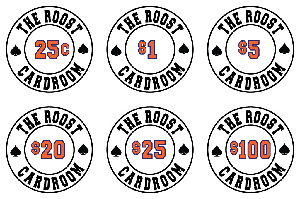
Do you mean purple lettering for 'The Roost Cardroom' , make denom black and make the inner and outer circles orange? Does sound cool that way.Had you considered blue text with orange circles on the denom side? Or vice versa.
Not directly related to the inlays which I need to make a decision on but has anyone seen the 'Nightshade' color of Whisper Vinyl in person?
I am going with black or nightshade for rail vinyl. Black is the easy choice but if the rail can pop a little...
The table in the link below has nightshade whisper. It's an interesting color, under low light it looks dark brown to black but a little light brings out the color, more of a dark purple/maroon or eggplant color.
https://www.pokerchipforum.com/threads/some-new-tables.6750/#post-406889
")