EventHorizonVII
Two Pair
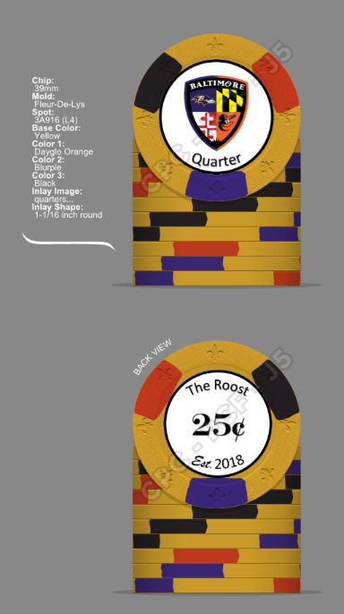
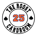
I will be ordering my suede from @T_Chan Monday it looks like and with that I will begin saving for custom chips, for now I'm relabeling spirit mold chips and will get labels from @Gear for that but I need you help. It's black, it's white yeah yeah yeah...
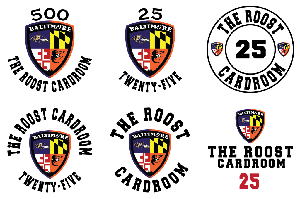
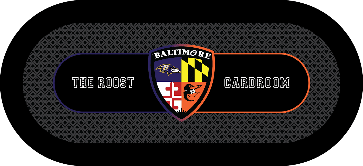
@p5woody did the artwork, he is awesome.
Ahem, I can't decide on label background color :
:
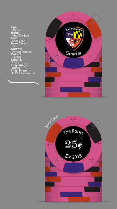
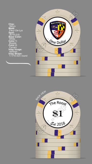
May create a full pic of the black later but here is the white...for now. chip colors and spots are open to critique!
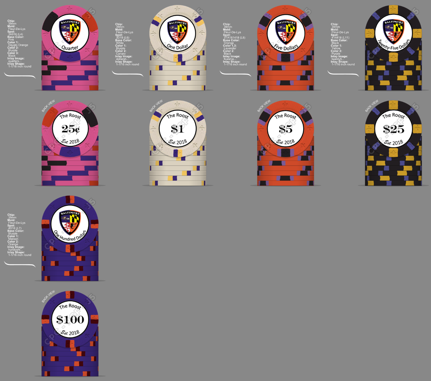
Table:
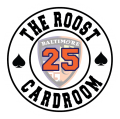
@p5woody did the artwork, he is awesome.
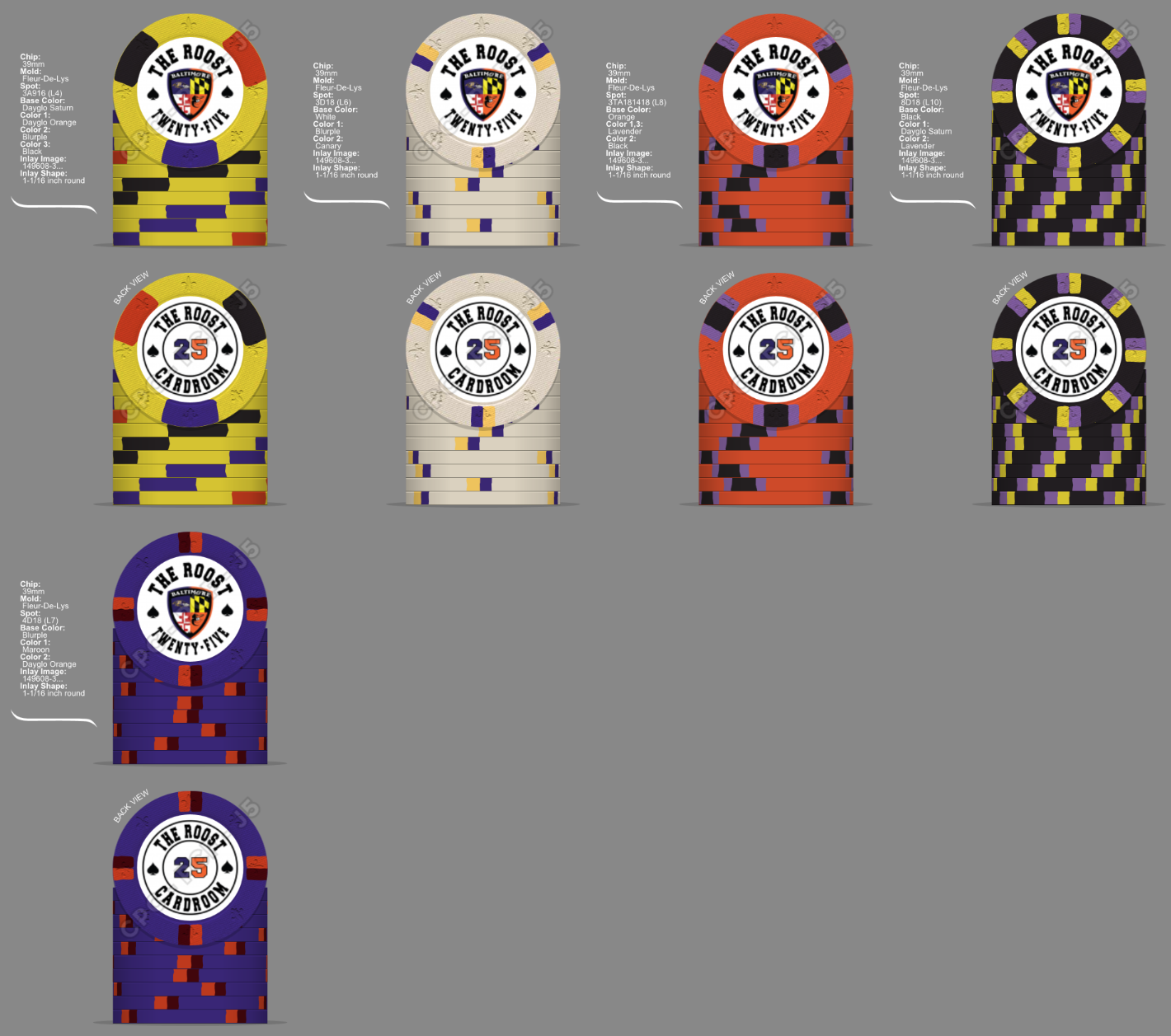
Ahem, I can't decide on label background color
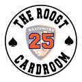
:
May create a full pic of the black later but here is the white...for now. chip colors and spots are open to critique!
Table:
Last edited: