Russian roulette (help me for design) (2 Viewers)

Bobb59

Full House
Joined
Apr 24, 2013
Messages
3,146
Reaction score
8,672
Location
France Nord
Hi.
Help me for my design
Russian roulette cardroom
Tournament chips
Look my poker design... its good?
What other possibility?
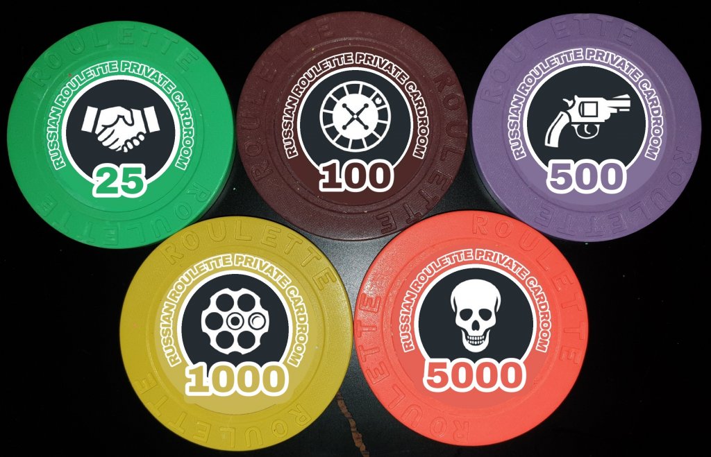
295582
 
Last edited:
Love the use of the mold with the theme!

For me the handshake jumps out as not quite fitting in. On that note, the different icons are little distracting to me. If I had to pick one that nails it, definitely the T1000 that has one bullet in the chamber.

That might be a neat starting point for a logo. If its me, I might take that and lean into the Russian poster art style to really pull this together.
 
Very nice concept, matching the mold to the theme.
I 'm not sure if people shake hands at all at this game, though :D
What about replacing the handshake with a bullet?
 
I would find one inlay you like and use it across all chips. To me it feels odd to have a different inlay for each denom.
It is a great name, idea, and love the connection to the mold. However, I suggest using a graphic designer to help you come up with a nice inlay.
 
Or you could just keep two inlays (as front and back); the revolver and its cylinder with one bullet loaded.

By the way, we used to play a lot of russian roulette with my sister :D
We had a nice fake Magnum 44 revolver using caps. Most of the pleasure came from slapping each other's face when too slow to pull the trigger and shouting "mau", inspired by the horrible roulette scene in "The Deer Hunter" film; which is a fine example of why children shouldn't be allowed to watch TV late in the evening:)
 
I kind of like the inlay image "progression", but if you decide to go with homogeneous inlay images, I like the T1000. Love the color matched edges. Great concept!
 
Last edited:
My 2¢ is that color-matched bleed labels never really match the chip color and should generally be avoided. Example: Cleveland Horseshoe fake shaped inlays are terrible matches and look like the sad faux things they are.

If the colors of label and chip don’t touch (like if you only matched the denom color to the chip color) then there’s less for your brain to compare to find a difference, and it can look really good. Example: Empress Joliet.

If the label color is made deliberately different but similar, that can also look good. Detroit JACKS did this and have some of the nicest RHC labels because of it. The labels have shapes, but they’re not pretending to be shaped inlays. The chip to label edge is honest.

Long way of saying I would extend the black out to the edge of the label.
 
It's much easier to colour match a label than an inlay as a label won't be heat pressed into the chip thereby changing colour slightly during the compression moulding process. Assuming you are using Gear's services or have access to a printing setup similar to his, you should be able to colour match the labels fairly well, especially if you go with matte/texture laminated labels. If there's any chips in your lineup that will make colour matching difficult I would think it would be the brighter ones.
 
Very cool idea! I definitely like the idea of picking just 2 of those images and using them across all chips. Revolver on one side of the chip and the image of the one bullet in the chamber on the other side of the chip. :tup:

And black background gets my vote.
 
At the end of the day, they're your chips so go with what makes you happy. I think your original design is good and if you like it, go with that.
 
I agree with the others, black background, bullet in the chamber is the best image.

The name is hard to read though when I hold it out at arms length. You may want to put it a different color to make it stand out more. Also try using a red denomination, it seems appropriate.
 

Create an account or login to comment

You must be a member in order to leave a comment

Create account

Create an account and join our community. It's easy!

Log in

Already have an account? Log in here.

Back
Top Bottom