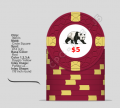
Post mockups for fun/science? (14 Viewers)

Not that it really matters but I'm pretty sure DG Peacock was the last colour added... I had to buy it separately after I bought my first colour sample (which included DG Tiger).

Yes I think you're right, I must have gotten these mixed up, I didn't organize them very well.
 
Here was the progression of mock-ups for my customs over several years:

First mockup from the ASM days (recreated in the new chip designer)
View attachment 234066

CPC is brings back custom chipping - and adds DG peacock!

View attachment 234068

Then DG tiger!
View attachment 234052

Then the scroll mold becomes an option (with 44mm chips! had to check those out)
View attachment 234054

Nah, back to HHR
View attachment 234055

View attachment 234056

Need to have imperial blue, love that color, and it goes so well with DG tiger....
View attachment 234057View attachment 234058View attachment 234059View attachment 234060

Can't get the orange chip right.....
View attachment 234061

Almost there - need a 20k or 25k chip too...
View attachment 234062

One last check on the scroll mold....
View attachment 234063

And..... done. I ended up getting both a 20k and 25k chip, couldn't decide between the two....
View attachment 234064

That's a great idea. interesting to see how things change over time. I'll likely do the same thing given my cpc's are drastically different from how they were at the start.
 

Just FYI...I got confirmation that they have a 25k inner ring with a design. Its new and hasn't been added to the tool yet.

25,000 inner ring.jpg
 
Not the first to do an old school-style scrown set, but this would be a fun little TRK tribute.
CC49364E-7A5A-4087-A4A6-7E5C754B8DDA.png
 
Last edited:
Special thanks to @saleen121212 for the initial mockups.
Thoughts on the “Magician’s” sizing?
Thoughts on a better font for Joe Magic’s?
Should I color match the “Magician” to the chips?
Thoughts on the initial colors?
The denom will not have the $ as this will be for a tournament set.
CAB11933-6898-41BB-8122-CAEE2953E0A5.png
F44E8A66-C72C-4B3F-A0AF-AFD085CB66E6.png

Feel free to critique to your heart’s content.
Any all feedback is appreciated.
Never mind the chip itself, just the inlay.
Cheers,
Joe
 
Denom gets a bit hidden in the magician.
Especially his armpit looks like another "1". Possible solution: have all of the magician drawn in the same (buff?) color or even another color, even more contrasting to white, if denoms are going to be white.
Nice concept otherwise!
 
Forgive my ignorance, not sure if this has been addressed somewhere else in this thread...

How are you all getting your custom inlays incorporated into your mockups? Have they already been designed previously and you are simply inserting them into the CPC design tool? Right now, all I can do is put in a piece of ClipArt that roughly represents what I'm looking for, but I can't write anything or put any denominations on the chips I'm designing. Any way I can do that without first having the inlay "properly" designed?

Also curious as to how you guys are able to share the mockups directly into your post. When I try to share my CPC custom design, all it does is provide a link to the page... appreciate any help.
 
Forgive my ignorance, not sure if this has been addressed somewhere else in this thread...

How are you all getting your custom inlays incorporated into your mockups? Have they already been designed previously and you are simply inserting them into the CPC design tool? Right now, all I can do is put in a piece of ClipArt that roughly represents what I'm looking for, but I can't write anything or put any denominations on the chips I'm designing. Any way I can do that without first having the inlay "properly" designed?
By uploading the artwork file to the CPC design tool. Can't put stuff there you don't have yet obviously.
If you have a 3rd party design your inlay sometime later and you already want to get a good impression of the chips as whole, what helps tremendously is using a plain inlay without any content that has the same background color as your actual inlay is likely going to have. Spot designs and colors look radically different with a white inlay vs. a black inlay for example.

Also curious as to how you guys are able to share the mockups directly into your post. When I try to share my CPC custom design, all it does is provide a link to the page... appreciate any help.
Save as PNG in the design tool.
Upload here.
 
By uploading the artwork file to the CPC design tool. Can't put stuff there you don't have yet obviously.
If you have a 3rd party design your inlay sometime later and you already want to get a good impression of the chips as whole, what helps tremendously is using a plain inlay without any content that has the same background color as your actual inlay is likely going to have. Spot designs and colors look radically different with a white inlay vs. a black inlay for example.

Right. So I guess my real question is, is there a way to design the inlay/artwork myself, or do I need to have someone else do it before I can insert it into the chip/mold?
 
Ok, took this as far as I could without being able to write words/denominations on them. I'm gonna look into free design software to see if I can navigate the design aspect.

This is NOT the same image as what's on the Sun-Fly Mountain Top hybrids, although it is similar. Has meaning to me, as my buddies and I call our most visited casino "The mountain top."

I'd most likely come up with two words to follow the inlay in the upper left and upper right quadrant, and the numerical denomination would go under the mountain itself. This is designed as a cash set, with denominations of $0.25, $1, $5, $20, $100 (in the order you see them).

One question I have is about the edge spots. How sacrilegious is it to have the same spot pattern on every chip, as long as the colors are different across the entire set?

Appreciate any input - this was my first crack at it.

.
CPC Cash1.png
 
There's nothing sacrilegious at all. Many sets, including casino tournament sets, have invariable edge spot patterns (no progression). Some people only differentiate the bottom and the top value chip.
You basically do what you like and want - that's the idea behind a custom set.
Your color combinations are fine. I might only go with a lighter green on the yellow chip (Retro Green or Green) - if not Blurple/Purple/Lavender/Retro Lavender.
 
One question I have is about the edge spots. How sacrilegious is it to have the same spot pattern on every chip, as long as the colors are different across the entire set?

Uniform spots or spot progression. Both are fine. It's a personal choice. These are your customs. If you like it, then its the right thing to do.
 
Your color combinations are fine. I might only go with a lighter green on the yellow chip (Retro Green or Green) - if not Blurple/Purple/Lavender/Retro Lavender.

I actually did have "Green" on that yellow chip to start with, and then changed it last minute. I've changed it back, and agree it looks better.

CPC Cash1 Yellow.png
 
I might only go with a lighter green on the yellow chip (Retro Green or Green) - if not Blurple/Purple/Lavender/Retro Lavender.

I agree with this as well.

I actually did have "Green" on that yellow chip to start with, and then changed it last minute. I've changed it back, and agree it looks better.

It's not that it looked bad, but Dark Green is so dark that it's almost black and it'll look like you have three chips with black in them.
 
I actually did have "Green" on that yellow chip to start with, and then changed it last minute. I've changed it back, and agree it looks better.

View attachment 236950

If you're looking at getting a custom CPC set, get a color sample! (I have one you can borrow if you'd like) Some of the CPC colors translate much different from the screen to real life, and DG saturn is definitely one of them, it's a really weird color.
 
If you're looking at getting a custom CPC set, get a color sample! (I have one you can borrow if you'd like) Some of the CPC colors translate much different from the screen to real life, and DG saturn is definitely one of them, it's a really weird color.

I’m not close to pulling the trigger. I still have to evaluate the mountain of samples I have (with more on the way). I’m almost positive I will eventually do it though. Who doesn’t want a set with their own custom colors/patterns? When that time comes, I’ll definitely be borrowing your color sample!
 
237987

5: Currently CPC doesn't have a "DayGlo Red" and Desert Flower is closer to blue hue.
25: Original base is Sherbet Green and DayGlo Green is lighter than Light Green.
100: 414418 is closest to 4V418.
500: Uncertain if Lavender, Purple and Blurple has enough contrast between each other.
1000: All Unweighted Colours.
5000: The black spots with light green might overwhelm the Canary Yellow base a little.
25000: I know if I want a more nearly faithful conversion to the OG, I need the Nex Horseshoe 100 style that's RANK C/12 spots.
100000: Based on WTHC/Original Atlantic Club 5000, but with Rank A/10 spots.

Price per chip per denomination (A-Mold, the best seller mold that's ALWAYS ON):
5: $1.89
25: $3.04
100: $4.08
500: $2.78
1000: $3.30
5000: $2.24
25000: $2.52
100000: $3.82
 
Last edited:
Here's two different takes on the same set that I've worked on over the past couple days. Yes, it's extremely crude, and not everything is sized/matches/lines up perfectly, but it's a decent enough representation of what I'm looking to do.

Struggling with a couple things:

  1. Set #1 vs. Set #2, as a general comparison. I like the added color in Set #2 but I appreciate the simplicity of Set #1.
  2. 1" vs. 7/8" inlay - I think I prefer the 7/8" in Set #2.
  3. Which $1 to go with in either set... Set #2 has a Bright White edge spot in the same spot on every chip, so I'm leaning toward keeping that consistent. If I went with Set #1 (only 1 color on edge spots), I could go either way. If I went with the white $1 chip in set #1, I'd change the edge spots on the $5 chip to white.
  4. $20 vs $25 chip in either set... prefer to do a yellow $20, but don't love the color combo on the $20 in set #2.
238247


238220


Any suggestions or glaring mistakes are welcome, would appreciate any input.
 
Last edited:
Here's two different takes on the same set that I've worked on over the past couple days. Yes, it's extremely crude, and not everything is sized/matches/lines up perfectly, but it's a decent enough representation of what I'm looking to do.

Struggling with a couple things:

  1. Set #1 vs. Set #2, as a general comparison. I like the added color in Set #2 but I appreciate the simplicity of Set #1.
  2. 1" vs. 7/8" inlay - I think I prefer the 7/8" in Set #2.
  3. Which $1 to go with in either set... Set #2 has a Bright White edge spot in the same spot on every chip, so I'm leaning toward keeping that consistent. If I went with Set #1 (only 1 color on edge spots), I could go either way. If I went with the white $1 chip in set #1, I'd change the edge spots on the $5 chip to white.
  4. $20 vs $25 chip in either set... prefer to do a yellow $20, but don't love the color combo on the $20 in set #2.
View attachment 238219


View attachment 238220


Any suggestions or glaring mistakes are welcome, would appreciate any input.
#2, I like the smaller inlay and the 2 color spots. Maybe play with mixing up the edgespots, so every chip doesn't have white? Each chip looks great, but I'm not sure how they all work together. Either $1 is great, but I think I prefer the off white one.

Overall, nicely done!
 
Last edited:

Create an account or login to comment

You must be a member in order to leave a comment

Create account

Create an account and join our community. It's easy!

Log in

Already have an account? Log in here.

Back
Top Bottom