Nex
Flush
- Joined
- Jan 25, 2017
- Messages
- 2,193
- Reaction score
- 3,417
- Rewards
- 193
- Location
- Club Hel, Downtown Megacity

1) Would definitely color-match the fox head to every chip's base color.
For some odd reason, I REALLY like the color and spot choices on your yellow:
View attachment 173509

Better don't let @Perthmike find this mockup...
Oh? He have some like this already?
For some odd reason, I REALLY like the color and spot choices on your yellow:
View attachment 173509
Better don't let @Perthmike find this mockup...
But who am I to jab at this! Just having ordered a set with more than half of the denoms being a close tribute, and another coming up that goes even further
Imitation, they say, is the highest form of flattery (y) :thumbsup:
I'll definitely give some more thought on the inlays. Thanks for the tips!1) Would definitely color-match the fox head to every chip's base color.
2) Inlay design could use some filler for the big white areas to the left and right.
3) You're currently exceeding the safe print area. You will have to shrink the graphics and denom label a bit.
Somewhat necro-worthy... re: #414 ff.
View attachment 173505
This is actually going to happen in a few months!
And it's only a L12 spot *cough*
Thanks for your post. I don't know why but I had really grown attached to having a yellow chip. But I just couldn't get the right color combos to work. I like the spots on the chip but the colors just aren't perfect.The top two spots on your dg arc yellow chip are really close. maybe a retro or imperial blue instead of the orange.

Yes I know. I tried both suggestions and I just didn't like them. Also tried other colors.Whoops. Sorry if I was not clear. The DG Arc Yellow was fine for the base color of the chip. I just meant change the orange spot to retro or imperial blue.
not that I will ever buy a full set of customs
We'll talk again in a year.
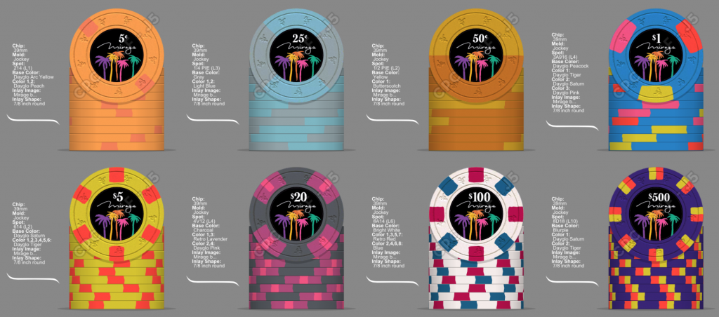
After sitting on this idea for 2.5yrs, they are ordered. Look a little different for sure.View attachment 25274 Hawaii themed set
All that happened.....Lol lets put it this way. IF this ever happened it would be sitting at #4 on my priority list behind Paymaster (already paid for), a HP hot stamp set, and a boatload of $2s for limit.
I don’t have anything that I have the passion for right now. As far as the Hitching Post goes I don’t have anything unique to do chip wise. You’ve seen how hard a time I have had just mocking the S@P V commemorative. Unless someone pulls a time machine out and I can get a custom TRK, BCC, or Paulson set made I’m not sure where I would go. I feel like I’ve done what I can with CPC earth tones and spots. I did what I set out to do with the Paymaster set and feel like that book is finished. So unless I get a lightning stroke of an idea I don’t see myself wading into designing a new set any time soon.All that happened.....