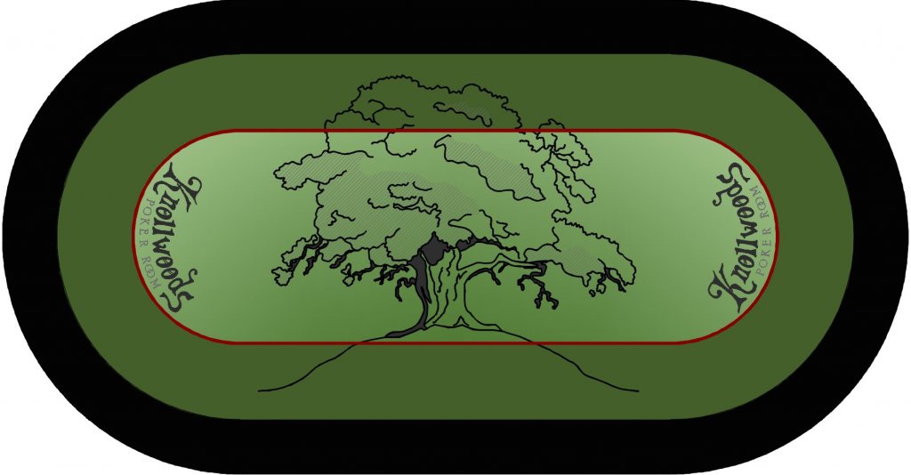
Knollwoods custom table felt design *need help* (1 Viewer)

72o

4 of a Kind
Joined
Nov 6, 2014
Messages
5,301
Reaction score
10,161
Location
MA
Hey guys/gals. I am currently building a 10-person oval table and had plans on using some Ultraglide Nylon felt that I scored awhile back for the playing surface. Well...I guess I procrastinated just long enough because I haven't stapled the felt down yet and just found out last week that I won a little money with one of my fantasy football teams. So off to Chanman for a custom felt...it's really the only logical thing to do right?

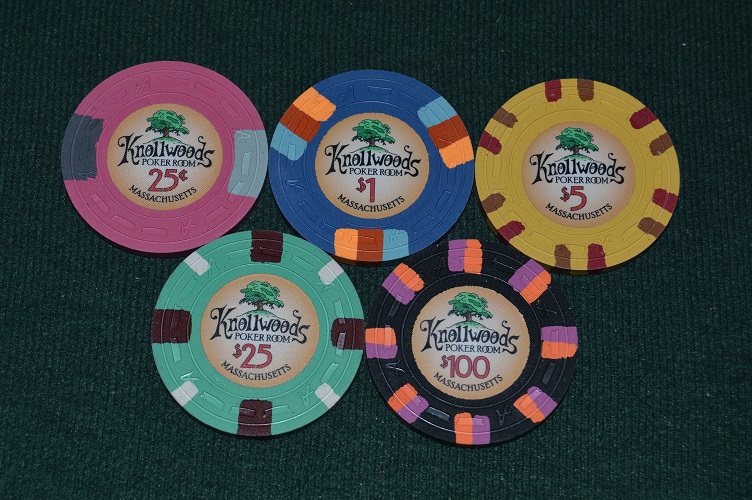
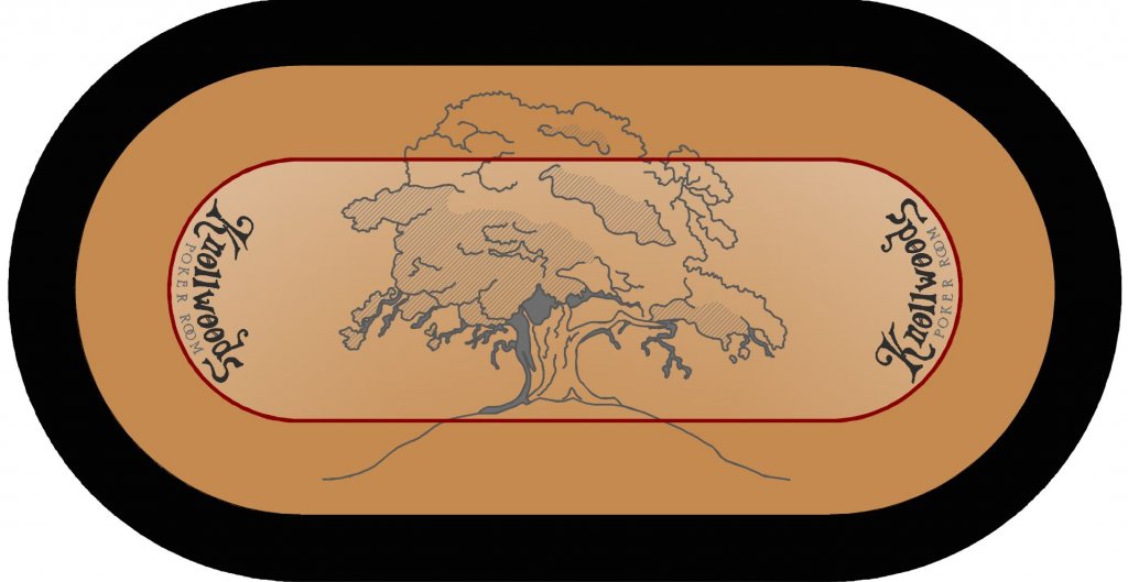
I have no experience with table felt designs but I know I love the look of @courage 's custom felts with the minimal colors. I'm thinking of going with a brown/tan color to match the fade in my inlay as the first option but I could see going green as well. I usually like the look of a solid middle area with a subtle pattern between the betting line and the rail but not sure if it would work here with this current design. This is obviously in the infancy stage at this point so all feedback is welcome. I've also added a pic. of the chips so you can see what felt colors could work with them.

Does the free-hand Knollwoods still work here or should I find a true font to use around the curve?

These are just mocked-up using my CAD program so I will definitely be looking for a resident designer to do the final product.

Thanks for looking.
Knollwoods felt_02.JPG


Knollwoods felt_03.JPG


Sample_small.jpg
 
Definitely like the first felt colour scheme. I feel that the greens of the second felt will "overpower" your chips from popping.
 
  • Like
Reactions: 72o
Looks sweet. Whatever you do your setup will be awesome.

Do you have any designs with the entire tree inside the betting line. I like the font that you use. (y) :thumbsup:
 
both design colors look great but i like the 1st one more.

Also, would maybe lose the 'hill' under the tree and bring the tree down to center. (but can still overlap the bet line)

just my 2 cents. And as always Alan, great attention to detail . Nice work.
 
  • Like
Reactions: 72o
Looks sweet. Whatever you do your setup will be awesome.

Do you have any designs with the entire tree inside the betting line. I like the font that you use. (y) :thumbsup:
Thanks man. Sure I can scale the tree down and just center it on the table. I was going for something a little “artistic” by overlapping the tree in both areas on either side of the bet line. Will post the result tomorrow.
 
Custom printed cloth on gaming suede from Tony the Chanman is the ONLY way to go (in my view). You will never regret it!

I like the tan as a basic colour scheme more, but there's no reason why you can't use both colours. Try this on for size:

1) Use your base inner and outer colour felt as in scheme 1
2) Slightly increase the area of your inner colour so that the faux racetrack area is smaller
3) Shrink the tree a little so most of the leafy part is within the inner circle, but keep the two-tone green
4) Consider a dealer cutout in rail closest to the top of the tree

This way (possibly, if I'm visualizing it right), the tree will define the community card area, and the muck can be to the left or the right. You'll still have plenty of room in front of the player for their stacks on their side of the bet line. You might need to shorten the line of the hill a little bit in order to get everything to look centered.

Anyway, just my 0.02 small blind. And please pardon my Canadian spelling.
 
  • Like
Reactions: 72o
both design colors look great but i like the 1st one more.

Also, would maybe lose the 'hill' under the tree and bring the tree down to center. (but can still overlap the bet line)

just my 2 cents. And as always Alan, great attention to detail . Nice work.
Thank you sir. Appreciate it.

I gotcha. I will take a look at your suggestion tomorrow and lower the tree a little. I do still want to keep the knoll but I can make it smaller for sure.
 
I would try the tan and make a smaller green tree to match the chips.

Also Tony does great work with the design and is very patient (trust me I know).
 
  • Like
Reactions: 72o
Thank you sir. Appreciate it.

I gotcha. I will take a look at your suggestion tomorrow and lower the tree a little. I do still want to keep the knoll but I can make it smaller for sure.

Ahh of course its a "knoll" LOL.

ok. maybe some more definition to it. i think as its just 2 lines that pass the betting line its loses it definition. maybe 1/2 a knoll?
 
  • Like
Reactions: 72o
Ahh of course its a "knoll" LOL.

ok. maybe some more definition to it. i think as its just 2 lines that pass the betting line its loses it definition. maybe 1/2 a knoll?
So an ant hill? Or a mound? Lol

Maybe put back the hints of grass that I have in the inlay?
 
I like the green a little more than the tan but both work well. Honestly it should just be your personal taste preference, there is no right or wrong answer. I think you should keep the same hand drawn font as the chips, always stay in brand!

However I think the tree drawing does need some dimensional cross-hatching or shadow to the hill side. On the ship you have a little bit of green that looks great. Here you can't do that but without something the hill is not reading well. It almost looks like roots or whiskers. Remember, most people at the table won't be looking at it right side up. You should rotate the design around all degrees to make sure you are happy with it.
 
  • Like
Reactions: 72o
I like the tan. I would also like to see a black/gray or dark gray/light gray mockup as well. Would also like to see the tree mocked as the same colors as the inlay. Another thought might be to see if Tony can make miniature two tone knoll/tree 'speedcloth' racetrack and shrink the center one to fit inside the betting line
 
  • Like
Reactions: 72o
To me, when it’s monochromatic like that, on the cloth, it looks kind of Japanese or something. Like maybe there should be a haiku next to it.
Just my strange 2 cents
 
  • Like
Reactions: 72o
Could do a more subtle betting line transition. Leave the red line, but have the color fade from dark to light as you have on the inlay. Tree is fine sized as you have it.

My vote on color is tan...that's perfect for your chips.
 
  • Like
Reactions: 72o
This will be weird with the knoll on the bottom (because it doesn't have a defined bottom edge), but what if the tree is on top of the design such that the top of the tree (and the bottom of the knoll) doesn't get darker as it crosses the betting line? I would make an irregular transition from the knoll to the area outside the betting line (as opposed to a straight line transition). The image is subtle but I think that minor change would make the tree stand out just a tiny bit more. This change might allow you to make the tree even a little more subtle.

To me, when it’s monochromatic like that, on the cloth, it looks kind of Japanese or something. Like maybe there should be a haiku next to it.

Pocket kings! I raise.
Door card is an ace, dealer.
Nice hand, donk. Well-played.
 
Last edited:
To me, when it’s monochromatic like that, on the cloth, it looks kind of Japanese or something. Like maybe there should be a haiku next to it.
Just my strange 2 cents
I hear ya. I just can't stand the cloths with too much color. I am easily distracted. :D
 
Alright I have a few iterations mentioned above to run through (thank you all for the suggestions) but this sort of came about after scaling the tree down. I added a "pattern" made from the lines of the "leaves". Worth pursuing? Not sure.

Knollwoods felt_04.JPG
 
The tree looks great, but the hill seems off. It lacks the depth the chips have. Adding some grass or just dropping the hill lines would be okay then you could make the tree a bit larger as well.

Looking forward to the finished design.

Edit:
Above comments were about the original post.

The new design is sharp. Like the leaf idea in the player area.
 
Last edited:
  • Like
Reactions: 72o
Alright I have a few iterations mentioned above to run through (thank you all for the suggestions) but this sort of came about after scaling the tree down. I added a "pattern" made from the lines of the "leaves". Worth pursuing? Not sure.

View attachment 144536
I like this one the most. Well done! (y) :thumbsup:Maybe add Massachusetts under the hill of the tree also.
 
  • Like
Reactions: 72o
I like the newest version as well. My only concern about the tan is if you make it the same color as the inlay, will the inlays start to wash out in that background? I'd like to see a @Ray-Col render to make sure. Love the new design and placement. Player area pattern is fine.
 
  • Like
Reactions: 72o
I agree on both accounts.

@72o nice to see you back after a short break.
Thank you, Bill.

I'm done concerning myself with buying/selling chips atm and the break was much needed...as short as it was. :D And a big THANK YOU for texting me pr0n along the way to keep me involved man...very cool of you to do that for me!
 
I like the newest version as well. My only concern about the tan is if you make it the same color as the inlay, will the inlays start to wash out in that background?....
Hmmm good point!

Next I will try a gray cloth as @RowdyRawhide mentioned. Still with the fade to resemble the inlay fade but not to interfere
 
Tan>Green>>>>>>Grey

I like lighter colors. I have a blue and a grey felt for Windy Crest and the Grey one is much better because it's a lighter shade. Your Tan one is the nuts. The Green is a close second. Get both.

Edit - I actually like the looks of my blue table better, but the Grey one plays better.
 
  • Like
Reactions: 72o

Create an account or login to comment

You must be a member in order to leave a comment

Create account

Create an account and join our community. It's easy!

Log in

Already have an account? Log in here.

Back
Top Bottom