Hoyle Harvest set (2 Viewers)

Taghkanic

4 of a Kind
Supporter
Joined
Jul 11, 2017
Messages
7,139
Reaction score
10,040
Location
Hudson Valley, NY
harvest-mockup.jpg


The chips for this custom set are now with @Josh Kifer and @Nanook for milling and inlay removal, and the designs have been uploaded to @Gear. My design process began at the thread below, but I wanted to create this clean page to post the results as they come in:

https://www.pokerchipforum.com/threads/messing-with-inlay-label-designs.62342/post-1664500

The theme of the set is fall “harvest” colors here in the Hudson Valley, heavy on tans, browns, mustard and other warm neutral colors. There’s also a variety of greens and pinks across the set.

The name on the chips, Hoyle Book Club, is what we call my home game. I live on a dead-end road named Hoyle—so no relation to the card company.

More design notes to follow. Thanks to all who gave a lot of helpful feedback in the earlier thread, and to the many sellers who helped me fill out this set. At some point I’ll go back through my conversations to recall who all those were.
 
Last edited:
The base chips (50¢ through $25) are Paulson THCs, with a 43mm hundo, and a small number of $500 48mm fat hats, and an even smaller number of yellow 48mm NCVs mainly just for fun (or in case our cash game at some point runs for several days and I need some mega-denoms).

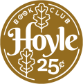
25¢ — Gold solid hotstamp, milled
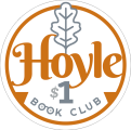
$1 — White Jack Cincy $1s, inlay removal
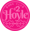
$2 — Pink Jack Snappers, inlay removal
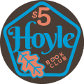
$5 — Brown Aurora Star $2s, inlay removal
$25 — Mustard (?) CDM 5s, inlay removal, plus some matching custom hotstamps, milled
$100 — Orange HSI 1K Secondaries, inlay removal
$500 — Blurple RPC Free Drinks, inlay removal
NCV — Yellow RPC 1K, inlay removal

Most of these are mint/near mint. Only the snappers are in slightly lower condition. Reality is that these were just a fun add-on, I may only rarely use them.
 
The colors, TBH, were determined at the outset mainly by availability. I wanted at least 400 $5s for my 2/5 game. But it proved very difficult during the pandemic to find minty $5s in that quality without absolutely breaking the bank.

Reds were pretty much totally unavailable, except well-worn ones. I also have an aversion to what I call “ketchup and mustard” colors (red base/yellow spot) and a lot of red THCs fall into that category.

This led me to go the unconventional route of using the brown A.S. $2s as my fives, when a bunch of those turned up. I had three racks of the tan solids, and always loved the CDM 5s. So that formed the core color grouping.
 
A few racks that I bought fell by the wayside, though they were among my very favorites. I found two racks of yellow A.S. T1K hotstamps, and I almost pulled the trigger on more when it started to feel like I’d never find enough CDMs. Also my favorite design was for a dark grey $100 chip using another longtime favorite, the darker Empress Star T100. But I decided this would be too much of a dirty stack problem with the dark brown ASes, so I had to let that one go.

The good news is that I have a bunch of racks I’ll never use, which I’ll be releasing back into the ecosystem soon...
 
The design originally included a lot of shadows and gradients, which certainly deepened the designs. However, I ultimately decided that at this size, these made the overall look too busy... So I am using flat text, lines and shapes throughout instead for what I hope will be a more classic look.

One design feature which I think may be novel are the surrounding circles/shapes:
  • The quarter has a single line broken in four segments
  • The $1 has a single line
  • The $2 has a double line
  • The $5 has a pentagon
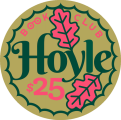
  • The $25 has a circle with 25 points
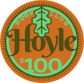
  • the $100 has 100 points
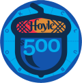
The $500 and NCV don’t follow this scheme, but those again are rarely going to be in play, and 500 points wasn’t feasible... The acorn on the $500 is an obvious visual pun on the oak leaves decorating the lower denoms. The woodchuck on the NCV is just another country reference.
 
Will be awesome to see this set come to fruition. Always liked the unique approach you took for the label
 
Here are the labels individually, since the JPG at the top of the thread is pretty degraded, click to see them closer up if curious. The final art is sharper than what is possible to upload here.

In almost every case, the colors of the text, lines and art pick up the colors of the edgespots, with the base color of the label matching the base of the chip (except for the $2, where it’s not realistic to print a matching color).

hoylehavest-frac.pnghoylehavest-1.pnghoyleharvest-2.pnghoyleharvest-5.pnghoyleharvest-25.pnghoyleharvest-100.pnghoyleharvest500.pnghoyleharvest-ncv.png
 
Last edited:
This breaks my heart just a little bit.

I hear ’ya. It’s actually only 70 CDM 5s. Most of my 25s are going to be these “K” stamped chips which match them.

I spared (sold!) other CDM 5s which I didn’t need to get to my 240 number, as well as a rack of Appletons because the spots were verrrry slightly lighter green.

1681324607076.png


Picture is from @kaimat ’s sale
 
Other small design considerations:

1) The spots are not “progressive” per se, but they do vary from chip to chip. The $2 and $5 spots are somewhat similar, but the base colors are so different that there’s no chance of confusion.

2) My first real set for a long time was THC starburst solids. I think this led me to prefer having the chip base color dominate the label. (I generally don’t care much for labels which are uniform black or white regardless of the base color.)

3) In practice, the $5s and $25s will be the chips most in play in my game. So those colors will dominate. I was mindful that the $1 and $100 have colors that complement them but don’t overlap/clash.

4) I do like in a cash game to have the higher value chips be bigger and more noticeable than the rest, to avoid any betting confusion and also make it harder for big denoms to get lost in a pot or stack. Hence the 43 and 48mm chips.
 
Type info for those who care about such things:

* For Hoyle:
BERKSHIRE SWASH
via Google Fonts, free

* For Book Club:
RIGHTEOUS REGULAR
Also Google fonts, free

* For Denom numerals,
$/¢ signs, etc.:
KLINIC SLAB family
I bought a personal license for these faces from http://losttype.com … They say to just pay whatever you want.
 
I hear ’ya. It’s actually only 70 CDM 5s. Most of my 25s are going to be these “K” stamped chips which match them.

I spared (sold!) other CDM 5s which I didn’t need to get to my 240 number, as well as a rack of Appletons because the spots were verrrry slightly lighter green.

View attachment 1117912

Picture is from @kaimat ’s sale
It’s actually the K’s that hurt, they used to be mine! I’m “K”.

08305326-0342-46C1-A556-910644EDA5AF.jpeg
 
Oh! Did you commission these?
Yup. There were originally 1000, half from Casinocom and half from Paulson in Atlantic City. Back in the day you could just walk in off the street in order from a selection of edge spotted chips and get them either hot stamped, or if you were a real highroller with inlays. This was the late 90s.

Somewhere in this mess in my house I have the receipt from Paulson.
 
N.b. Some of the label colors are dialed up quite a bit, anticipating that they will print duller. This is especially true of the hot pinks/magentas.
 
A late addition to the design was turning the OO in BOOK CLUB into glasses (which I wear). Kind of cheesy but I couldn’t resist.
 
Such a great project and the inlay design is so unique. Cannot wait to see the finished product
Looking Episode 11 GIF by One Chicago
 
I made the 25¢ piece an NCV, repeating the acorn icon from the $500 and adding Est. 2016 to it... Much as I wanted a frac, these would never get used as quarters. Other option was to make it a $20, but I rarely spread limit games, and figured having no value on it added flexibility.

Gonna modify the case to fit everything... Right now I’m about 20 spaces short. May be enough just to clear the remaining dividers from the middle.
 

Create an account or login to comment

You must be a member in order to leave a comment

Create account

Create an account and join our community. It's easy!

Log in

Already have an account? Log in here.

Back
Top Bottom