
House of Rock set (1 Viewer)

ChrisB

Pair
Joined
Feb 1, 2016
Messages
112
Reaction score
144
Location
Idaho
kissgroupchips.png
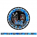
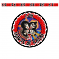
100centkiss.png 25centkiss.png 5centkiss2.png New source of custom ceramic poker chips and labels incoming. I have purchased all the items and tools to start this side business. I am making a custom ceramic set for my dad based around KISS his favorite band. I am sure there will be a learning curve and plan on making friends and family chips to perfect this craft. This will be used for small ante card games like phase ten and others. 5 cent 25 cent and 100 cent are the denominations. Here are the mockups.

update new designs
 
Last edited:
Definite copyright issues concerns for selling these, but otherwise,

Gene-Simmons-2.jpg

Since he is planning to make the Kiss chips for his father, it's not going to be an issue. He will need to work out production bugs, error rates, and other factors while making chips for family and friends (those people that are willing to accept a few bugs here and there). The highly complex Kiss chip is a great first batch trial run, but at this point it does not constitute copyright infringement any more than a junior high student decorating his notebook with Kiss sketches.
 
...for my dad based around KISS his favorite band....

Kiss was the first concert that I went to. That was in 1976. At the time, I couldn't possible imagine anyone ever saying my dad's favorite band is Kiss. Even though I'm part of that aging generation, it still strikes me as odd to hear that. It also reminds me of the first time I got on an elevator and the muzak playing was Led Zeppelin.

On a serious note, your artwork skills are very impressive. I would offer one caution, however. If your dad is a big fan of the band, and grew up in the generation I did, he might not appreciate the zombie treatment. I think the $5 chip is right on the money, and more of the direction I would take.
good info. I wish my skills were good enough to make the center image's however I found cool clipart of kiss to use in these.
 
An awful lot of fine detail in those mockups. Great for poster art, not so much for a canvas that's 1.5" diameter at best. Most details will get lost or be unreadable after printing.

Try printing out the artwork on paper in real-life size, cut the into circles, then hold it at arm's length away. That will give you an idea of what to expect when the chips are in play.

Yep, I belive it was @Rhodeman77 who gave me the same advice about my initial mock up of the Bourbons. Great advice it was :)
 
You guys left some great feedback and I went to work and tweaked the designs. I think they flow better and should print well.
kissgroupchips.png
 
You could also rearrange the order of the band in your denoms so that:

5 - Peter Criss
25 - Ace Frehley
100 - Gene Simmons
500 - Paul Stanley

This would allow for an expansion add-on of two denoms past Paul Stanley that could be used for colour ups. For example, Eric Singer could be the first denom to colour up Peter Criss, and then Tommy Thayer could be the next denom to colour up Ace Frelhey which would leave the band in their current state on the table. Or for continuity, you could use Eric Carr and Vinnie Vincent. ;)
 
First impressions, which you can ignore as they are just my thoughts!
  • The K I S S over-text "windows" really only work when you have all the denominations lined up like the mockup. I'd rather lose that feature to see more of the faces (i.e., instead of them peeking out of the small viewing windows formed by the letters). You would have much more area for faces, which is the primary theme of the chip.
  • Extend the color all the way to the chip edge, and then put the sawtooth edge pattern on the inside where the inlay picture and outer "ring" meet. You still get the sawtooth + you get more color/space. By having a uniform black outer edge for all chips, you are giving up valuable chip real estate that would be better used on the band members. Pi r squared and all that.
  • I'd put the denominations in the same location on the chips. Rather than alternating right and left locations. For me, upper right quadrant would be best.
  • I'd change COX to KISS if you really want to put something on the chip. The KISS font means most will misread that as LAX (which makes no sense as I think they are a NY band) or LOX. If you want it to say COX, it should be legible as such. The denominations have the same issue for me. The benefit of using the special font is outweighed by the fact that the numbers and text just look odd. COX should look like COX. Not that you are planning to resell, but personalizing it like that will affect aftermarket.
  • Drop the exclamation point for House of Rock. Or change it to House of COX. If you want to go personalized with last names, go all in!
  • Gene is the 5 red chip and has the bloody red tongue. Eric is the 25 green and has the green eye makeup. The 100 is blue and the guy has blue eye makeup. The 500 guy has no purple makeup though. Not sure if you did this intentionally, or if it just worked out for 3/4 of the band. Might be work taking a little artistic license to complete the theme.
 
First impressions, which you can ignore as they are just my thoughts!
  • The K I S S over-text "windows" really only work when you have all the denominations lined up like the mockup. I'd rather lose that feature to see more of the faces (i.e., instead of them peeking out of the small viewing windows formed by the letters). You would have much more area for faces, which is the primary theme of the chip.

Definitely this
 
First impressions, which you can ignore as they are just my thoughts!
  • The K I S S over-text "windows" really only work when you have all the denominations lined up like the mockup. I'd rather lose that feature to see more of the faces (i.e., instead of them peeking out of the small viewing windows formed by the letters). You would have much more area for faces, which is the primary theme of the chip.
  • Extend the color all the way to the chip edge, and then put the sawtooth edge pattern on the inside where the inlay picture and outer "ring" meet. You still get the sawtooth + you get more color/space. By having a uniform black outer edge for all chips, you are giving up valuable chip real estate that would be better used on the band members. Pi r squared and all that.
  • I'd put the denominations in the same location on the chips. Rather than alternating right and left locations. For me, upper right quadrant would be best.
  • I'd change COX to KISS if you really want to put something on the chip. The KISS font means most will misread that as LAX (which makes no sense as I think they are a NY band) or LOX. If you want it to say COX, it should be legible as such. The denominations have the same issue for me. The benefit of using the special font is outweighed by the fact that the numbers and text just look odd. COX should look like COX. Not that you are planning to resell, but personalizing it like that will affect aftermarket.
  • Drop the exclamation point for House of Rock. Or change it to House of COX. If you want to go personalized with last names, go all in!
  • Gene is the 5 red chip and has the bloody red tongue. Eric is the 25 green and has the green eye makeup. The 100 is blue and the guy has blue eye makeup. The 500 guy has no purple makeup though. Not sure if you did this intentionally, or if it just worked out for 3/4 of the band. Might be work taking a little artistic license to complete the theme.
like this?
proto5centkiss.png
 
I like it much better. I suggest moving the denom to the right behind Gene's head since there is nothing going on there. Feels like it is crowding his face on the left side.

Edit: Search out Mr Tree's Paymaster set for artwork limitations, and also do BG's recommended print-out test.
 
Last edited:
I like it much better. I suggest moving the denom on the right behind Gene's head since there is nothing going on there. Feels like it is crowding his face on the left side.
good idea
 
Put a few more touches to it. I think its close to final.
kiss5centfinal.png
 
I'd definitely ditch the mouth blood -- it's way too small of a detail to print clearly, and will only detract from the protruding tongue image on the chip (it will just look like a smudged tongue misprint).

I much prefer the new square Os. (y) :thumbsup:
 
I'd definitely ditch the mouth blood -- it's way too small of a detail to print clearly, and will only detract from the protruding tongue image on the chip (it will just look like a smudged tongue misprint).

I much prefer the new square Os. (y) :thumbsup:

I would normally agree with BG here, except that you will be manufacturing these yourself. I'd do a test run with the fine detail first, because you have that option. If, as expected, it comes out smudged or if the black lines bleed, you can go back and make the necessary adjustments. However, for a learning curve I'd think it best to see what you can't do, rather then getting down the line and having an unhappy customer. Your processes may be better than what is currently available, but we won't know unless you try.
 
HIgh-res artwork on a paper or vinyl substrate, sure. But it ain't gonna work on ceramics, period. If it were possible with the medium and existing process, there would already be ceramic chips with fine details like that. There aren't.

Shoot for the stars with a home-grown rocket if you want, but have a solid fall-back plan. Even NASA hasn't put people on Mars yet, and they're the experts.
My printer is 1200x1200 dpi and uses hd ink. I will definitely test its capability.
 
Ahhhh yes. It's takes me back to when my niece got married. October 31st, at the Church of Kiss.....Museum and Minigolf..:LOL: :laugh:
The guy was dressed up like Starchild and I couldn't stop laughing the whole way through the marriage...just flipping awesome.

And I love the idea. Hope all goes well with the execution!
 

Create an account or login to comment

You must be a member in order to leave a comment

Create account

Create an account and join our community. It's easy!

Log in

Already have an account? Log in here.

Back
Top Bottom