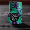
First time playing around with the chip design tool. All feedback welcomed. (1 Viewer)

I still like the original version, with the half-pie and spots -- IF there are enough colors to make it work with contrast.

I think the brown and grey chips are already there.
I really like the idea of the green and red chips -- ALMOST there, just need a little more contrast.

I will probably use that spot pattern some day. I really like it.
 
I dunno, I like the original post the best. It's unique, I've never seen anyone use that spot pattern for an entire chip set, and I actually think it looks really cool. I'd just say that some of the colors don't provide enough contrast, so that would need to be fixed. But I actually liked the concept!
thanks for the feedback
 
+1 to that. Having done a monochromatic pie set and failed to include enough contrast on a couple of chips, I beg you learn from my experience. To redo the chips is a costly mistake.

If you're looking to stay somewhat monochromatic while using a different take on pies, perhaps something like this. In barrels they almost look like 8v's. Not sure how much I like the look of the faces - it's a bit too chaotic for my preferences. I'm just riffing on your initial concept.

View attachment 496110
cheers for the feedback. i hear you regarding contrast. just limited by colours in the design tool
 
I still like the original version, with the half-pie and spots -- IF there are enough colors to make it work with contrast.

I think the brown and grey chips are already there.
I really like the idea of the green and red chips -- ALMOST there, just need a little more contrast.

I will probably use that spot pattern some day. I really like it.
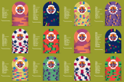
might have to be a ceramic custom set as one isnt limited by colours like you are on the cpc design tool. its all just a bit of fun at the moment and getting a feel for a few different designs. need to crack a few eggs to make an omelette!
 
Thank you to everyone who took the time to have a look and give some feedback. I have been back on the design tool and have "tried" to incorporate everyone's feedback and created a few sets with "mixed" designs and a revised quarter pie tri-tone set. Ill be giving the design tool a break after this. Its a rabbit hole that you can sink endless hours down!
Tritone quarter pie v3.png
.
mixed set v2.1.png
mixed set v2.png


mixed set v1.png
 
Last edited:
+1 to that. Having done a monochromatic pie set and failed to include enough contrast on a couple of chips, I beg you learn from my experience. To redo the chips is a costly mistake.

If you're looking to stay somewhat monochromatic while using a different take on pies, perhaps something like this. In barrels they almost look like 8v's. Not sure how much I like the look of the faces - it's a bit too chaotic for my preferences. I'm just riffing on your initial concept.

View attachment 496110
i did a revision where i used a 3rd darker colour which i think works well
Tritone quarter pie v3.png
 
These colors are much better, so much more contrast. I sure like the half-pie better, your original design. This one seems really busy. Too busy.
Sometimes less is more! if i noticed anything on this forum everyone is very particular when it comes to there preferences with chips.
 
So Ive gone back to the drawing board and came up with some new variations with some spot progressions
View attachment 497536
View attachment 497535.

Nicely done! You've jazzed it up with the spot progression while maintaining a more classic, old school feel in avoiding wildly contrasting base and spot colours. I give the nod to the bottom mock up because you did work those white pips in on the pink chip to give it a little pop and I think that purple chip works better. Shaped inlays are always a nice touch. And, you've avoided any concern over dirty stacks! Well done Sir! Looking forward to seeing what inlay design you come up with. :tup:
 
Its been a while since I have played around with the CPC design tool. Decided to jump back in after everything I have been absorbing since I first joined. Its Cali colour inspired and have included a few options for each denom except the hundo. The whole set was built around it. All feedback is welcome.

a3299201-9b14-4d18-a31f-abf8719c9570.png
 
Very nice!
My votes:
For the frac, 2nd version
For the $1, 2nd version
For the $5, 1st version
For the $20/25, 1st version, but with DG Arc Yellow instead of DG Peach (the latter is present on the fray)
For the $100, I 'm perfectly OK with the single version
For the $500, 1st version
 
Very nice!
My votes:
For the frac, 2nd version
For the $1, 2nd version
For the $5, 1st version
For the $20/25, 1st version, but with DG Arc Yellow instead of DG Peach (the latter is present on the fray)
For the $100, I 'm perfectly OK with the single version
For the $500, 1st version
89266c08-4d07-4a1c-8154-b905dc4d8831.png
 
The new (light green) 20/25 is also welcome; reminds of something too*
The new 500 is a lot more economical and still great; examine the posibility of using blurple for the main spots and the DG Green for the small "inside" spots.
I reiterate my (strong) preference for 4DSA316 over 4D14 for the DG yellow chip.


*
c20.jpg
:)
 
Its been a while since I have played around with the CPC design tool. Decided to jump back in after everything I have been absorbing since I first joined. Its Cali colour inspired and have included a few options for each denom except the hundo. The whole set was built around it. All feedback is welcome.

View attachment 623182

My choices, esp. in terms of spot progression, would be the following. I'm personally not a fan of either version of the $1 though - given how bright the rest of the line-up is, I think you'd be far better served brightening up your $1 somehow - I quickly threw together a few alternative ideas. I think the edge spots work though with the rest of the lineup. Ultimately, it's your set though and YOU need to like it.

1611927674634.png
 
My choices, esp. in terms of spot progression, would be the following. I'm personally not a fan of either version of the $1 though - given how bright the rest of the line-up is, I think you'd be far better served brightening up your $1 somehow - I quickly threw together a few alternative ideas. I think the edge spots work though with the rest of the lineup. Ultimately, it's your set though and YOU need to like it.

View attachment 624799
I like the contrast of the spots against the retro blue. It also helps the rest of the set pop againat imo. Imperial Blue would be a serious contender but its not that exciting IRL. Ive been looking at my CPC colour sample to get a better feel for the colours vs just the design. The other option is to use dayglo blue as the base and pick a different spot colour on the 5. decisions decisions. in thr meantime i will just keep collecting sample sers and see how they look IRL with the different spot ppatterns and colour combos to see what works and what doesnt.
 
My choices, esp. in terms of spot progression, would be the following. I'm personally not a fan of either version of the $1 though - given how bright the rest of the line-up is, I think you'd be far better served brightening up your $1 somehow - I quickly threw together a few alternative ideas. I think the edge spots work though with the rest of the lineup. Ultimately, it's your set though and YOU need to like it.

View attachment 624799

+1 for lightening up the $1. Retro blue is REALLLLLLLY dark. I actually love the first one mocked here by @cpac54. Really nice.

Also, lavender chip >>>>> green chip.
 
+1 for lightening up the $1. Retro blue is REALLLLLLLY dark. I actually love the first one mocked here by @cpac54. Really nice.

Also, lavender chip >>>>> green chip.
its not that dark in real life. i kind of like it. im waiting for a sample set to arrive where it was used to get a better feel how it looks stamped and with spots etc.

When is your set coming Mel? any proofs we can look at?
 
its not that dark in real life. i kind of like it. im waiting for a sample set to arrive where it was used to get a better feel how it looks stamped and with spots etc.

When is your set coming Mel? any proofs we can look at?

No proofs. I haven't submitted my final artwork yet. Just submitted and paid for the final order though. 2-3 months before B-mold goes in...will be a long torturous wait.
 

Create an account or login to comment

You must be a member in order to leave a comment

Create account

Create an account and join our community. It's easy!

Log in

Already have an account? Log in here.

Back
Top Bottom