[Feedback Wanted] Custom Money Tree Denoms (CPC) (1 Viewer)

FestiveKnight

Flush
Supporter
Joined
May 7, 2021
Messages
2,289
Reaction score
3,994
Location
United States
I have original TRK Money Tree Reno $5s, $25s, and $100s that I’m looking to build into a full set by getting CPC scrowns for $1, 25¢, and 5¢.

I think I’m 90% happy with where I’m at so I was hoping to open this up to getting some feedback from the brilliant aesthetic minds of PCF.

The main goal is obviously to make attractive chips that I will be happy to have forever. But I am also sensitive to wanting them to feel cohesive with the orginal TRK chips. Hence avoiding the brighter hot dayglo colors that usually catch the eye.

Here’s the mock-up in the design tool:

1691430992236.png


Left to right: 5¢, 25¢, $1

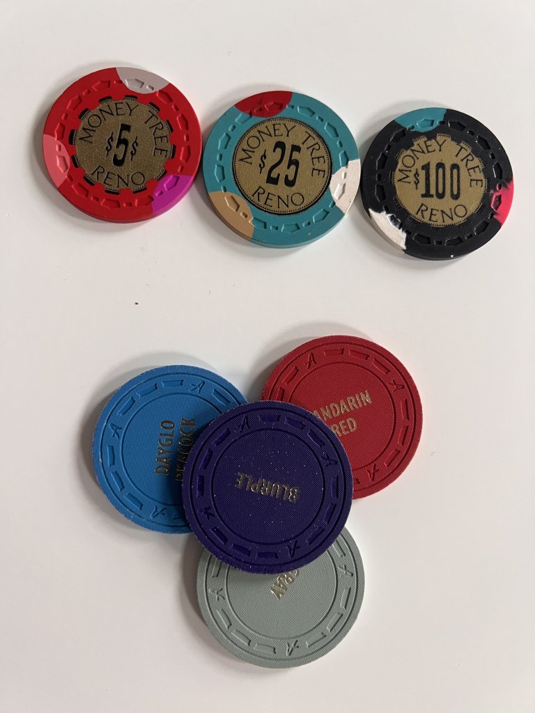
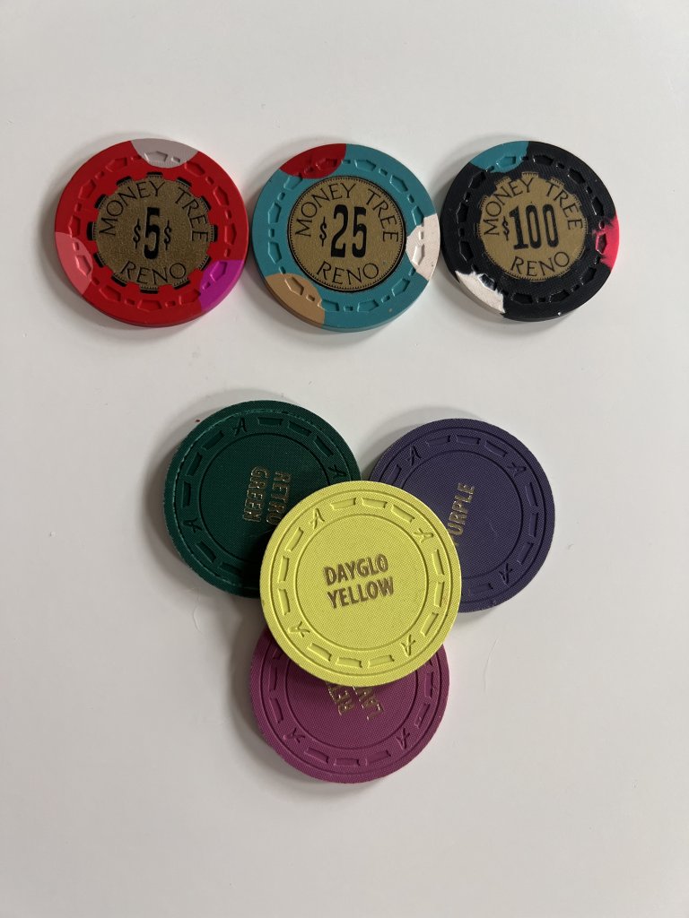
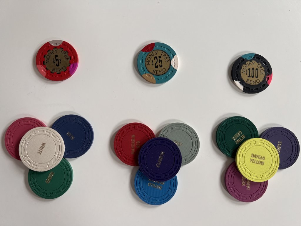
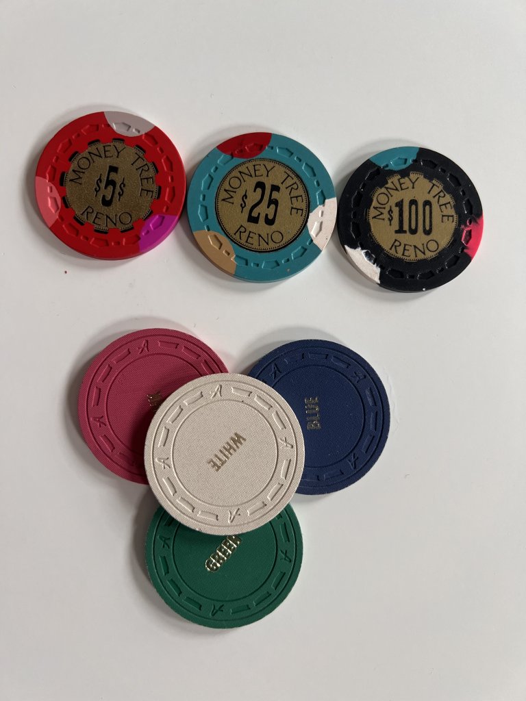
Here’s some pics of color sample with kind of dark overcast lighting (fwiw the photos make the colors pop more than they look irl imo).
CF7FF001-6512-4072-A2BC-86EEA59C7518.jpeg


2A30DF97-7180-40E4-B94E-30F152FF6535.jpeg


123DCB00-8FA0-43EE-BC94-38B1B6801B39.jpeg


76C7EC12-30D8-47E5-BD4B-A45DCEC04774.jpeg


I am very happy with the blurple quarter, quite happy with the white nickel, and only moderately happy with the yellow $1 which still feels like it could have a slight tweak or two.

Open to any and all feedback!
 
Another view. I think like this I can really see what I’m concerned about with the yellow. It’s just a bit too dark.

CF143905-B972-4398-9943-D030D895C1D5.jpeg
 
Last edited:
For my personal liking, the nickels and the 1$ are too similar regarding the color.
  • White - Dayglo Yellow
  • Blue - Purple
  • Pink - Retro Lavender
  • Green - Retro Green
Each kind of in the same spectrum. Also, there are three edge spots on each. So I'd be concerned they might not be easily differentiable under bad lighting. Maybe that's also why I don't quite get why you'd want the yellow to be brighter.

But since you've got color samples, you might be able to kind of check that with the conditions you'll probably use them under.

Other than that: Nice project, hope you'll be happy with your set in the end :)
 
Fwiw, I made custom CPC scrown quarters to go with my mint TRK set. Looked great.... but just not the same.

I ended up selling all of 'em.
I hear ya. I suspect that in most of the game there won’t be too much mixing. Smaller 25¢/25¢ game doesn’t have too many $5s. $1/$2 and up has mostly original TRK.

But helpful input, thank you. I guess I won’t know till I try. Maybe I should get a barrel of CPC scrown to handle along side.
 
Maybe I should get a barrel of CPC scrown to handle along side.
I highly advise it. My scrown color sample set didn't deter me, but I never thought to use them in bulk in a quasi-game setting to evaluate the size and weight differences. Those were deal-breakers for me in the long run.
 
FWIW this is the direction I went. This was before the crown mold was available on cpc, so they are milled and relabeled. I like the way they turned out. very low key and separate the real from "produced" chips pretty clearly.View attachment 1181532
I like that. I’m going to get my hands on some CPC scrowns to compare before committing but I think I’m interested in the creativity and range of options designing my own
 
Having done this the only thing I would recommend is to ask David if you can make the labels large and accept that the cut will not be centered. This is just like the real thing. It’s the only thing that annoys me about mine.
 
Having done this the only thing I would recommend is to ask David if you can make the labels large and accept that the cut will not be centered. This is just like the real thing. It’s the only thing that annoys me about mine.
I spent a bunch of time this afternoon just staring at that decision. I was thinking that direction. Your advice pushes me there I think. Thank you!
 
If I could do my Dayglo cpc set again i would ditch the Dayglo yellow and swap it for arc yellow. It looks good in a sample set but when they’re in quantity there’s something about Dayglo yellow that doesn’t work. There’s almost a green hue about them.

IMG_3830.jpeg
 
If I could do my Dayglo cpc set again i would ditch the Dayglo yellow and swap it for arc yellow. It looks good in a sample set but when they’re in quantity there’s something about Dayglo yellow that doesn’t work. There’s almost a green hue about them.

View attachment 1181607
Ugh. The Dayglo Yellow decision has been the toughest one for me. I feel stuck with it because I really want to tribute the Mapes $1 and it feels closest but it is not my favorite color. Shame CPC doesn’t do a good yellow.

@Darson you did dayglo yellow right?
 
Definitely get a CPC scrown barrel to feel for yourself. I haven’t handled Money trees but I imagine they feel something like Pick hobsons (leaded and heavy). I used to have a TRK set where I at one point had some unleaded TRK 100s mixed with leaded 1/5/25s. No bueno. Found some leaded to replace with. CPCs will feel even lighter, especially with a dg base.

CPC yellow decisions are difficult. I think arc yellow is the best one by a mile but DG yellow is the closest if you want the regular yellow of Paulson etc. You will however see the slight greenish hue that @BonScot mentions. Here are mine:

IMG_5588.jpeg
 
I think the blurple and $100 will definitely make dirty stacks but might not be on the table at the same time.
 
I think CPC scrowns are great but would be hesitant to use them together in a set with old school leaded TRKs. We’re all different and it might not be an issue for you but you should make sure for yourself.
 
Ugh. The Dayglo Yellow decision has been the toughest one for me. I feel stuck with it because I really want to tribute the Mapes $1 and it feels closest but it is not my favorite color. Shame CPC doesn’t do a good yellow.

@Darson you did dayglo yellow right?
I did dayglo yellow for my Money Trees, arc yellow for my personal cash set and canary for my pick hobsons frac. Don’t compare with Mapes, you’re never gonna get that. So just pick what you like the look of the best.

Oh and this whole weight/old school vs CPC thing is psychosomatic. You don’t see people complaining about the 2.2g per chip difference between the MT5s and MT25s but they do complain about the 0.6-1.2g difference between the TRK and CPC or the 0.6g difference between weighted and unweighted CPCs. All in the mind…

IMG_0147.jpeg
IMG_0148.jpeg

IMG_3984.jpeg
IMG_3983.jpeg
 
I think I'm definitely feeling drawn to the Arc Yellow over Dayglow Yellow but struggling again with this chip in general. Here's something that feels pretty good. Would appreciate any feedback.

1692410779552.png


This is better than the dayglow I had before (rightmost chip here) but I don't know if it's it.
 
I think I'm definitely feeling drawn to the Arc Yellow over Dayglow Yellow but struggling again with this chip in general. Here's something that feels pretty good. Would appreciate any feedback.

View attachment 1182119

This is better than the dayglow I had before (rightmost chip here) but I don't know if it's it.
The only thing I would change is the Dayglo orange spot. I’d probably go with a green spot there. Other than that I think it’s a winner.
 
mPKdFKY.png


Some updates for this thread.

Thanks to @XBobdog, I had a chance to try out a bunch of CPC scrowns with the TRKs I have and I no longer have any concern about mixing the two.

I hadn’t noticed until staring at this rendering just how similar the spots on the 5¢ and $1 are. Yes they’re not identical colors but each is a subtle difference and the three are very similar. I love the 5¢ so I will have to give some thought to the $1. Open to any suggestions for how to mix it up.

I’m also not loving the mandarin red spot on the 25¢. It’s a bit “blah.” I don’t want to go with anything to bright (like a DG tiger which would probably look great here) as that doesn’t feel in keeping with the aesthetics of the originals but I want something more lively. I think the other two spots are a lock but I’d take suggestions for replacing the red.
 
Have you already tried retro red instead of the mandarin red on the 25c?

Btw: Love the color change on the 1$
 
All your edge spots look similar! Try throwing a green and a pink spot in there.
 
Okay, this is the final set, heading to CPC soon!

1695691563574.png


Thanks for the feedback all! I feel these really hit the aesthetic of the original TRK MTs, I like the colors, and I think they will look good with the existing denoms, though TBH there won't be much overlap between these and the higher denoms for obvious reasons. I spent the most time the last few weeks workshopping the $1 and I think it will play really well with the TRK $5s.
 

Create an account or login to comment

You must be a member in order to leave a comment

Create account

Create an account and join our community. It's easy!

Log in

Already have an account? Log in here.

Back
Top Bottom