CPC lineup feedback wanted (1 Viewer)

Which lineup do you prefer?

  • A

  • B


Results are only viewable after voting.

nostan

Pair
Joined
Jul 16, 2020
Messages
131
Reaction score
69
Location
Sweden
Hi PCF,

Please give me your feedback. Do we find colors that wont work together? Please share your good and bad experiences with the presented color combinations. I you got any, otherwize I happy to receive your thoughts.

All I'm really sure of is the T5,000. The colors are chosen accordingly to avoid dirty stack issues, even for various forms of color blindness. But at the same time I also want to use different colors.


A
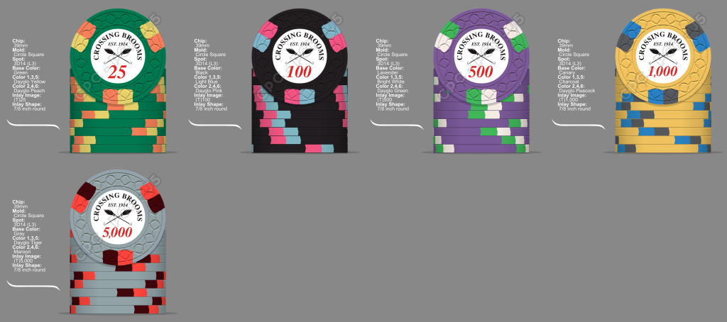
MTT.png


__________

B
MTT (2).png
 
A25, A100 or B1000, but not both for obvious reasons.

Also, do you have a colour sample? If not, I’d seriously consider getting one before commiting - some colours, including and especially the CPC yellows, look quite different in person. Personally, I would only use the CPC yellows as edge spots, as all the yellows are quite underwhelmed as a base colour imo. YMMV.
 
Thanks for feedback.

People seem to reason similarly to me. I'm not a big fan of A T1,000. The chip that will get most action...I like B T1,000 but I can't use this since I like A T100 even more.


A25, A100 or B1000, but not both for obvious reasons.

Also, do you have a colour sample?

Thank you for feedback. On it's way. Until that I'm very eager to see a picture showing some colors next to each other. I wonder how blurple/dark blue/retro blue goes with peacock. For an update of T1,000.
 
I already told you this but I’ll echo @cpac54 and suggest looking at alternatives to canary/dg yellow. Arc yellow is friggin awesome example, but you’ll see that for yourself when the color sample set arrives.

That said, I do think canary and dg peacock is a very good match. I would suggest retro blue instead of blurple though

My starting point was to not mix weighted and unweighted, as base colors. But I'll maybe have to revalue that :)

Anyway if I say goodbye to my best fellow T5,000 things might get better overall:


b2fe1704-dd13-419a-b83c-8689df4bba72.png
 
I'm not a big fan of using the same spot on an entire set but that's just me. I do like all of A but the 1k from B is tits! Oh and great mold!!!!
 
Any hero out there who have done butterscotch spots on gray base? Or ligh chocolate. Bad luck in searching...

Screenshot_20231222_012558_Gallery.jpg
 

Create an account or login to comment

You must be a member in order to leave a comment

Create account

Create an account and join our community. It's easy!

Log in

Already have an account? Log in here.

Back
Top Bottom