Evolution of my hybrid design (1 Viewer)

JFG

Pair
Joined
Feb 20, 2022
Messages
216
Reaction score
470
Location
Riverside, CA
I'm designing a micro stakes cash set for myself and have decided to go with Sun-fly's Polyinno 43mm chips. I don't want to design the chips to look like clays, Bud-Jones, or Matsui. Instead, I want to design a truly hybrid chip that incorporates ceramic with an inlay. My goal is to make them bright, fun, and unique. My wife and I love Laguna beach—it's home away from home—so that's the theme I've decided on.

I'm in the process of design, and I thought it would be fun to show my progress as I experiment and make headway. This is what I have so far. It's all rough right now, I'm not thinking about specs just yet. Ignore the colors and inlay—I'm mainly kicking around ideas for patterns and shapes.
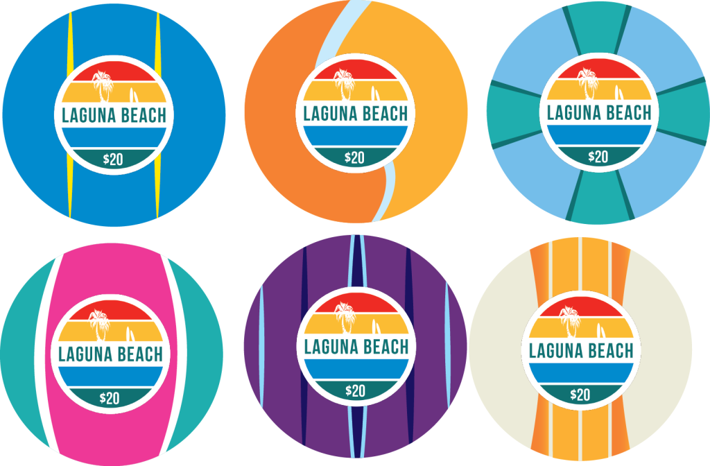
polyinnomockup.png


Any thoughts or ideas from the community? Which ones need to be trashed or changed?
 
Very cool. And very creative. I like the way you're leveraging the design possibilities of ceramic chips and not trying to mimic clay edgespots.

Do you have the edges figured out?

One suggest is to enlarge the denom text size. Make it large enough to cross over into the blue area. Kind of like how the tree outline on the top half covers both color areas.
 
Nice! The purple one is a keeper for sure. 2nd place goes to the chip in the top row right & 3rd place bottom row left. I like top row right too but maybe the color is too similar to the other blue one. Only chip that doesn't do it for me is the orange one. Maybe red & orange? Good luck & keep having fun with it
 
  • Like
Reactions: JFG
I approve of what's happening with your design and overall concept. Trying to emulate clay spot edges on ceramic is great and all, but it's like putting lipstick on a pig, to a degree.


I'm curious to see where you go with this. I haven't done a ceramic design myself, so take this with a grain of salt, but I might recommend making the weight (thickness) of some of the lines in your stripes a bit thicker. The first chip (upper left, as an easy esample) has great contrast, but I worry the relatively thin lines used there might be a bit too thin... if that makes any sense....

I'm going to recommend here like I recommend in any design thread, print these at 1:1 on paper as what they will be in real life. You have the advantage here that these will be full-face ceramic chips and not 1" inlays on a clay chip (in that case, likely with texture to dilute details), but the view on a monitor can easily make a design look OK when it's only mostly sufficient.


Kudos using the flexibility of a ceramic design to the fullest. :tup: These early drafts look very promising, and I'm looking forward to seeing where you go with your design!
 
Great job, I love the idea as and design. I don't like using the same colors in different chips (greens, oranges...). I'll try to avoid it.
 
  • Like
Reactions: JFG
Very cool design!

One suggest is to enlarge the denom text size. Make it large enough to cross over into the blue area. Kind of like how the tree outline on the top half covers both color areas.
+1
 
  • Like
Reactions: JFG
Very cool idea. Reminds me of surfboards. The shapes and overall designs I really like.

I like them all, but maybe try to incorporate some different colors as well if possible, to get a slight bit more variety. The two different blue ish chips and especially the two different orangey chips might be too similar if both are used in the same set. That being said my favorites are the two orangey!
 
  • Like
Reactions: JFG
Love the purple , and the second one - very creative, very nice.
Not really a fan of the pink/turquoise looks kina like a volleyball but nevertheless all of them area really nice and creative!
 
  • Like
Reactions: JFG
I wouldn't mind a red chip as it still beach like. Yellow chip to make it a Cali set? Plenty of beach colors to work with. Some of the chips are close color as some mentioned before.
 
  • Like
Reactions: JFG
Thanks for the feedback. I plan on using more colors, I’m just using a small color pallet to get ideas down. I have several ideas for the inlay, so I will post those too.
 
It's been a while since I last worked on this, but here's what I have so far.

View attachment 998733
For what they are, I like 'em a lot. Very unique pattern designs -- I like the hurricane chip best, but they all 'break the mold" in a good way.

I'd brighten up the purple chip a bit with more contrast, as it's much less flashy than the others.

Have you asked Sun-Fly about potential issues with aligned edges? And make sure you request aligned labels -- a must-have in this case.

edit:
For the quarter chip denomination, using 25c works better with the others all having a $ sign. A .25 chip (with decimal) works better if the other chips also have no currency markings.
 
Last edited:
Thank you.
For what they are, I like 'em a lot. Very unique pattern designs -- I like the hurricane chip best, but they all 'break the mold" in a good way.

I'd brighten up the purple chip a bit with more contrast, as it's much less flashy than the others.

Have you asked Sun-Fly about potential issues with aligned edges? And make sure you request aligned labels -- a must-have in this case.

edit:
For the quarter chip denomination, using 25c works better with the others all having a $ sign. A .25 chip (with decimal) works better if the other chips also have no currency markings.
Thank you. I’m not content with the purple chip yet. I’ll brighten it up and post later. Good point regarding Sun-Fly. I’ll request both alignments when I ask for a quote.Thanks for your feedback.
 
It's been a while since I last worked on this, but here's what I have so far.

View attachment 998733
I love this concept, I love the execution, can't wait to see it Irl.

The frac looks like a beach ball to me, I think that's probably what you were going for but just want to make sure.

Also, since they're ceramic I think you could do some "inlay" color matching to really make everything cohesive! But I'm a sucker for that :)
 
  • Like
Reactions: JFG
For what they are, I like 'em a lot. Very unique pattern designs -- I like the hurricane chip best, but they all 'break the mold" in a good way.

I'd brighten up the purple chip a bit with more contrast, as it's much less flashy than the others.

Have you asked Sun-Fly about potential issues with aligned edges? And make sure you request aligned labels -- a must-have in this case.

edit:
For the quarter chip denomination, using 25c works better with the others all having a $ sign. A .25 chip (with decimal) works better if the other chips also have no currency markings.
What he said.
 
Much better coloring on the purple chip. :tup:

Try swapping the outside red and white lines. I'd also try swapping the center line colors and see what jumps out at you.
 
  • Like
Reactions: JFG
Updated design. I feel like I still need to tweak the purple.
View attachment 999289
Best set so far, prefer the all blue $1, symmetrical over asymmetrical swirls on the $5 & red on the $20. I do prefer both the curved designs but like how it goes curved-straight-curved-straight.

Presumably the lines will continue down onto the edges creating the edge patterns?
 
  • Like
Reactions: JFG

Create an account or login to comment

You must be a member in order to leave a comment

Create account

Create an account and join our community. It's easy!

Log in

Already have an account? Log in here.

Back
Top Bottom