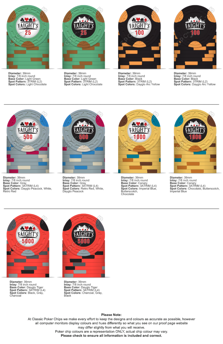
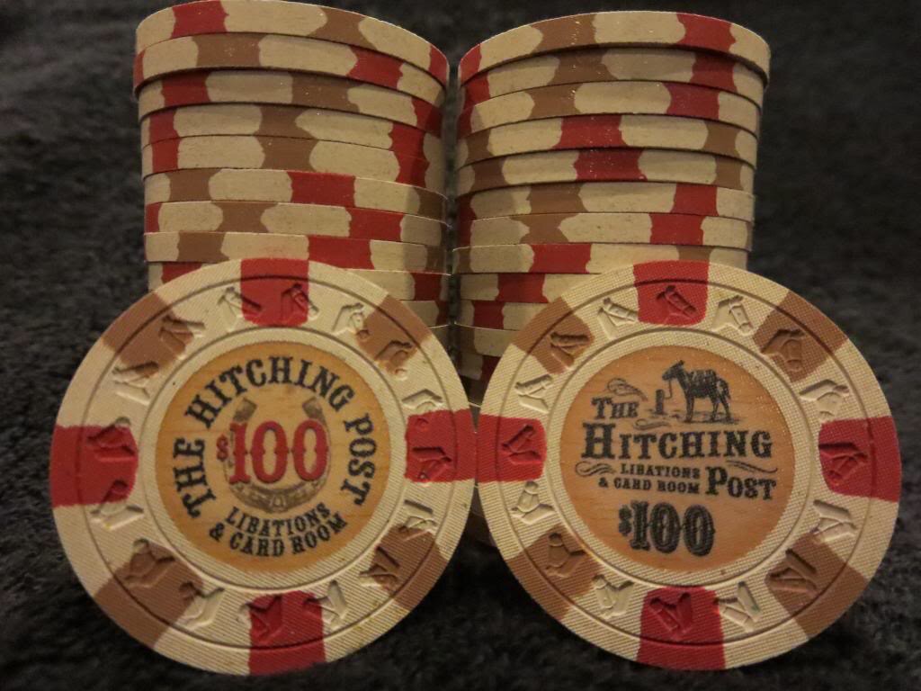
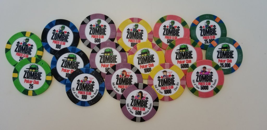
FWIW, my preference is to have the same inlay on both sides.
You are using an out of date browser. It may not display this or other websites correctly.
You should upgrade or use an alternative browser.
You should upgrade or use an alternative browser.
Do you prefer same inlay design on each side of each chip or different for each side of chip? Why? (1 Viewer)
- Thread starter Chipandchair
- Start date
Poker Zombie
Royal Flush
2 different inlays. That way I can flip a chip to decide "Call" or "Fold".
viet rounder
Two Pair
My preference is to have same inlay on both sides. I think individually it’s cool to have it different but as a whole (when the barrels are lined up) it just throws my eye off.
SeanGecko
4 of a Kind
When did you get that DOPE black night $500?As mentioned already it all depends on the design. I have 3 sets that use different designs on each side. I think they were all done well and enhance the overall appeal of each set.
I’ll let @AK Chip post the Soapy’s Parlor chips since it was his brain child.
View attachment 243183View attachment 243185View attachment 243186
Rhodeman77
Straight Flush
When did you get that DOPE black night $500?
First add-on I think? Pretty sure I did the 25c and $500 at the same time.
SeanGecko
4 of a Kind
Love it!
Quicksilver-75
4 of a Kind
Personally I like chips that have different inlays "that work". And that really is the hard part. Keeping a visual balance is key, imo to making it work. The samurais geniously get around this issue because of its grey tones.
To me, when I see a different inlay on a chip and it works it tells me that some thought went into the "chip". Not just the art on the inlay.
To me, when I see a different inlay on a chip and it works it tells me that some thought went into the "chip". Not just the art on the inlay.
1A25R
Flush
different inlay on each side gives more place for art
DJ_Fett
3 of a Kind
I ended up in the camp of “couldn’t decide, so went with both”! Originally started with a pretty neutral/darker gray background in mind like Bellagio/Aria, but liked these designs way better. I’ll post pics in 3-4 months when I get them!!

Mr Tree
Straight Flush
Sometimes you just can’t decode which inlay to use...

Steamtrain
3 of a Kind
If a splashed pot looks good with 2 different sides then I say OK
Poker Zombie
Royal Flush
Why limit it to just two different sides?

That really depends on the level of OCD you have....
Exactly. Symmetry is everything for some of us.
Now if my wife ever learns to place her empty coffee cup on the drain mat in the right spot, with the handle at the right angle, I'll die a happy man.
I think that depends entirely how the designer of the two sides handles things. If the two sides don’t relate well and cause confusion about denominations, that’s no good.
If both sides are similar to each other—because of their symbolism, color scheme, patterns etc.—but distinct from the other denoms, then I think it is fun to build in some variations for interest and to get more data onto the chip.
Say (living upstate New York) I have a different nature symbol on each denomination—25¢ deer, $1 trees, $5 birds, $25 predators, $100 mushrooms.
I might put a doe one side of the frac, and a buck on the other... An oak leaf on one side of the $1 and a maple leaf on the other... Ducks and wild turkeys on opposite sides of the $5... Wolves on one side of the $25, foxes on the other... And a morel/chanterelle flip for the $100.
Likewise, I might use type on a curve on the round top edge of one side for the name of my “room,” and use the same space on the other side give the location—while keeping the rest of the label/inlay design the same.
Steamtrain
3 of a Kind
These would look great in a splashed pot!Why limit it to just two different sides?
View attachment 256271
Great looking set
Similar threads
- Replies
- 0
- Views
- 106
- Replies
- 7
- Views
- 345
- Replies
- 19
- Views
- 837
