You are using an out of date browser. It may not display this or other websites correctly.
You should upgrade or use an alternative browser.
You should upgrade or use an alternative browser.
Design first stages (2 Viewers)
- Thread starter xemulshionphilx
- Start date
I like the white text better than the black. But for legibility's sake try a black outline around it.
xemulshionphilx
High Hand
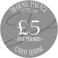
been making some more revisions after some feedback from members here, are these too busy?
Attachments
-
 Copy of Copy of Copy of Copy of Copy of Copy of Copy of Copy of Copy of Copy of Copy of Degens...png65.4 KB · Views: 16
 -
 Copy of Copy of Copy of Copy of Copy of Copy of Copy of Copy of Copy of Copy of Degens Pala ce.png61.2 KB · Views: 22
 -
 Copy of Copy of Copy of Copy of Copy of Copy of Copy of Copy of Copy of Degens Pala ce.png68.2 KB · Views: 21
 -
 Copy of Copy of Copy of Copy of Copy of Copy of Degens Pala ce.png66.2 KB · Views: 17
 -
 Copy of Copy of Copy of Copy of Copy of Copy of Copy of Degens Pala ce.png66.9 KB · Views: 12
 -
 Copy of Copy of Copy of Copy of Copy of Copy of Copy of Copy of Degens Pala ce.png63.6 KB · Views: 14
been making some more revisions after some feedback from members here, are these too busy?
Text will be too small/thin (black eats the white).
xemulshionphilx
High Hand
reckon just bolding out the text will fix issue
reckon just bolding out the text will fix issue
Print the Inlays with your Printer at home.
xemulshionphilx
High Hand
thats a good idea
xemulshionphilx
High Hand
Here are my revisions
xemulshionphilx
High Hand
Hi mate was very much stuck in the same sinking boat as yourself, the UK really has such a market gap for getting affordable chips. that will stand up and stand out.
I have spent months and months scouring the internet and for ready made chips ive only been able find majestics that ship from main land europe. they are expensive and imports are going to do you in...
I thought all was lost until i had a few chats with some folks on here and I have decided to go ahead with a TINA group buy that @justincarothers runs and will ship to the UK for you, these chips are ceramic and offer high custom options. what i am doing is mitch and matching from the pre designed chips and inserting my own inlay, i dont have a final price but all in for 750 chips im expecting to come in around 600 usd inc vat. for uk chippers this is the best and only realistic option ive found. id reach out to them they are super super helpful.
not a bad price for custom chips but still about double I'm willing to spend but I am only after around 600 chips. Using dice chips now so we can play just want to find a way to elevate the game. Seen a lot about the Tina group buys but thought they where less expensive but sure I'll figure something out.Hi mate was very much stuck in the same sinking boat as yourself, the UK really has such a market gap for getting affordable chips. that will stand up and stand out.
I have spent months and months scouring the internet and for ready made chips ive only been able find majestics that ship from main land europe. they are expensive and imports are going to do you in...
I thought all was lost until i had a few chats with some folks on here and I have decided to go ahead with a TINA group buy that @justincarothers runs and will ship to the UK for you, these chips are ceramic and offer high custom options. what i am doing is mitch and matching from the pre designed chips and inserting my own inlay, i dont have a final price but all in for 750 chips im expecting to come in around 600 usd inc vat. for uk chippers this is the best and only realistic option ive found. id reach out to them they are super super helpful.
Depending on your order Quantity:not a bad price for custom chips but still about double I'm willing to spend but I am only after around 600 chips. Using dice chips now so we can play just want to find a way to elevate the game. Seen a lot about the Tina group buys but thought they where less expensive but sure I'll figure something out.
Hybrids are $0,35 per Chip (+Labelcosts)at Tina. NoMold $0,30 per Chip.
+ Shipping, +VAT
Last edited:
The label is really coming along. I think what is suffers from is that every element is battling for your attention equally. What I mean by that is much of the text is the same size, and the art is almost an equal to the text as far as prominence.
I recommend picking one thing and making that your “A” design element…maybe it’s the name of the place, the art, or the denom. An "A" design element is clearly more prominent than anything else in the image.
For the “B” element, it should be something obvious that it is a less attention-getting element. Follow that with your “C” items.
For example, The Bellagio used the denom as their A element and the name as their B, location as C:

Caesar's used the art as A and the name (or denom) as B:

And the Jack chips used the casino name as A, with denom B and everything else C:

But in all these examples, there's one item that's clearly the "A" element, and commands your attention before the others. Most often, it's making something larger, but it could be the use of space, or colors, shapes, etc.
It could also be that you're trying to put too many things in that space. You have the skyline, the "casino" name, the card room text, the date founded, the location, the denom and the denom spelled out. You may benefit from just making it simpler...reduce the amount of elements to 3 or 4, or make some of them much less prominent.
I recommend picking one thing and making that your “A” design element…maybe it’s the name of the place, the art, or the denom. An "A" design element is clearly more prominent than anything else in the image.
For the “B” element, it should be something obvious that it is a less attention-getting element. Follow that with your “C” items.
For example, The Bellagio used the denom as their A element and the name as their B, location as C:
Caesar's used the art as A and the name (or denom) as B:
And the Jack chips used the casino name as A, with denom B and everything else C:
But in all these examples, there's one item that's clearly the "A" element, and commands your attention before the others. Most often, it's making something larger, but it could be the use of space, or colors, shapes, etc.
It could also be that you're trying to put too many things in that space. You have the skyline, the "casino" name, the card room text, the date founded, the location, the denom and the denom spelled out. You may benefit from just making it simpler...reduce the amount of elements to 3 or 4, or make some of them much less prominent.
Last edited:
xemulshionphilx
High Hand
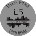
The issue i was having when printing out to real size was the lack was eating all the white so everything had to be bold and big, with your feedback i have removed the EST bit which i think should clear things up a little


QuailValley
Pair
Looking at it I would take out the written denomination, and just use "£1" or "5P", etc. That way you free up some room and can make the denomination bigger and more of a focal point. Will also make it easier to read quickly.
On the flip side you could take out the £1" or "5P", etc, and just have the written out denomination. I feel like having both is a little redundant, and makes it a little too busy. It kind of fights your skyline.
On the flip side you could take out the £1" or "5P", etc, and just have the written out denomination. I feel like having both is a little redundant, and makes it a little too busy. It kind of fights your skyline.
Center the denomination, make the symbol smaller and off center (look at examples in the chip DB).
Agree to remove some clutter as it's too busy IMO.
Agree to remove some clutter as it's too busy IMO.
xemulshionphilx
High Hand
somthing a little more like this?
I’m curious of the need for the underline under “one pound”…imo it’s unnecessary.View attachment 1304466
somthing a little more like this?
You may want to change the typeface for the numerals, that 1 just looks like the capital letter I.
xemulshionphilx
High Hand
Honestly idk i just like it haha you are right about the numeral tho. And now you mention it underline isnt present in the rest so would make sense to get ridI’m curious of the need for the underline under “one pound”…imo it’s unnecessary.
You may want to change the typeface for the numerals, that 1 just looks like the capital letter I.
xemulshionphilx
High Hand
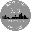
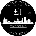
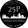
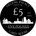
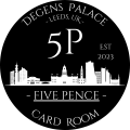
think im happy with these
JP1984
Flush
Hi mate, check your alignment with these, to my eye "five pounds" and "card room" are not aligned. I also think less is more and you should lose the text but they are your design, if you're happy, that's what matters most!
xemulshionphilx
High Hand
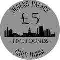
double checked the alignment should be fixed here


JP1984
Flush
What do they look like with Leeds, UK written horizontally underneath the cityscape?
xemulshionphilx
High Hand
i can give it a go

JP1984
Flush
I like it but I'm no designer...
Go with what you like, or get @mattross1313 to help you out. He did all of mine...you can see them in my signature
Go with what you like, or get @mattross1313 to help you out. He did all of mine...you can see them in my signature
Maybe test this out:
Remove the denomination text, since it's redundant.
Move the horizon line to the exact center of the chip so the skyline fills the majority of the blank space on the upper half.
Move the value text to the bottom space created by the above.
Remove the denomination text, since it's redundant.
Move the horizon line to the exact center of the chip so the skyline fills the majority of the blank space on the upper half.
Move the value text to the bottom space created by the above.
xemulshionphilx
High Hand

Similar threads
- Replies
- 32
- Views
- 1K
- Replies
- 28
- Views
- 984
- Replies
- 25
- Views
- 991
- Replies
- 46
- Views
- 2K
- Replies
- 15
- Views
- 528