You are using an out of date browser. It may not display this or other websites correctly.
You should upgrade or use an alternative browser.
You should upgrade or use an alternative browser.
DEALER BUTTONS for the New China Club CARDS MOLD Group Buy - Gaging Interest (7 Viewers)
- Thread starter TX_Golf_N_Poker
- Start date
I'm out of ideas. If anyone else wants to suggest a couple more versions, I'll pass it all on to Tim to draft up.Maybe get 4 versions or so and choose two?
New drafts. Don't love the green scalloped version so did a version without. Also the white/red button looked sweet, so did a version on it's own.
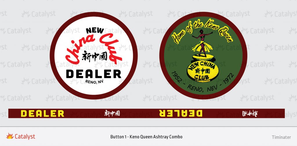
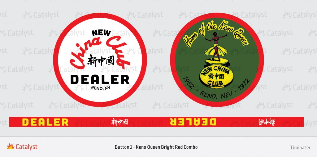
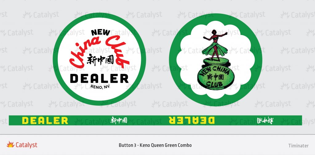
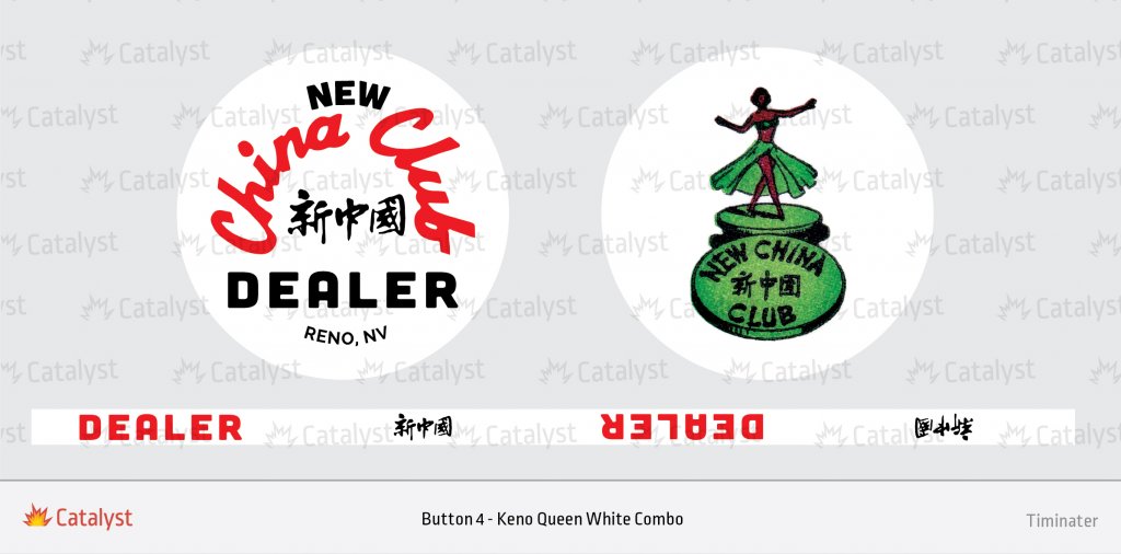
I like the bottom 4.
I love the Keno Queen inside the white scalloping, but that shade of green around the outside is too bright. I asked Tim to re-do it with a green closer to the shade used in button #1 & 2.
mnebesny
Flush
My thoughts exactlyI like the bottom 4.
I like button 1 and button 2
FDLmold
Royal Flush
I agree with you fellas.
FDLmold
Royal Flush
Although I do have to say the bright red buttons make me feel like a card-carrying member of the Chinese Communist Party. Bright red is not a color I associate with 1960s New China Club.
Like the bottom 4 as well.
mnebesny
Flush
I like the maroon colour in Button 1, I just think it clashes with the green background color and yellow highlighting, like it's just too much. If there was a version of Button 5 or even Button 3 in the maroon, and maybe without the yellow text on the edge, I think that would be awesome.
Last edited:
Although I do have to say the bright red buttons make me feel like a card-carrying member of the Chinese Communist Party. Bright red is not a color I associate with 1960s New China Club.
Red is a significant colour in Chinese culture irregardless of communism. Look at the Wynn and the Encore. Their interiors are red for a reason. Red symbolizes vitality, luck, energy, fire, happiness, youthfulness. Brides in China wear red.
I like 1 and 3. I like 4, but with one side of the button being exactly like the original, it doesn't do as much for me. I would like to see more options with the brown and dark green. Maybe with the scalloped "inlay" area.
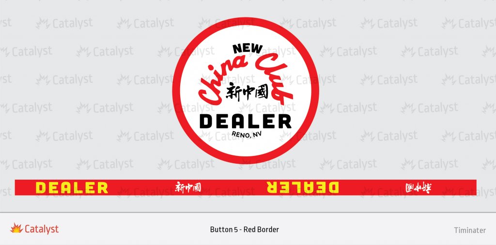
Also, since red is such an important color in Chinese culture, how about taking the original button, but change the base color from white to red, change the black text color to white, and change the red text color to yellow? Or the other way around might be better? Then use the rolling edge artwork from button #5.
Also, since red is such an important color in Chinese culture, how about taking the original button, but change the base color from white to red, change the black text color to white, and change the red text color to yellow? Or the other way around might be better? Then use the rolling edge artwork from button #5.
Last edited:
Also, be careful using a thin border on the face of the button. The printing isn't always perfectly centered, so some of the buttons will probably have a thin border on one side and a thicker border on the other side.
ADS Aviator
Flush
I love 1 & like 3
mnebesny
Flush
Just to clarify, are we ordering some of the original buttons as well as new designs, or just new designs? I'd be in for 1 or 2 of the originals
redeagle
3 of a Kind
I like the first three. I did think the contrast of yellow and green on the first two looks a bit muddy but I know pc monitors may not render it all perfectly and it might come out awesome on the puck. regardless, a Keno Queen DB is a must.
In regards to the dates from an earlier post, I found the article on the Nevada Gaming Commission historical site. It talked about they opened in 1952 and let their license expire on Dec 31, 1971 and closed that day. So I guess it could be 71 or 72 depending on was it the last date or up to 1972.
In regards to the dates from an earlier post, I found the article on the Nevada Gaming Commission historical site. It talked about they opened in 1952 and let their license expire on Dec 31, 1971 and closed that day. So I guess it could be 71 or 72 depending on was it the last date or up to 1972.
I like all of them except the all green one. The Keno girl looks like a Christmas tree from afar or if you've had too many whiskeys. I'm not saying that's a bad thing.
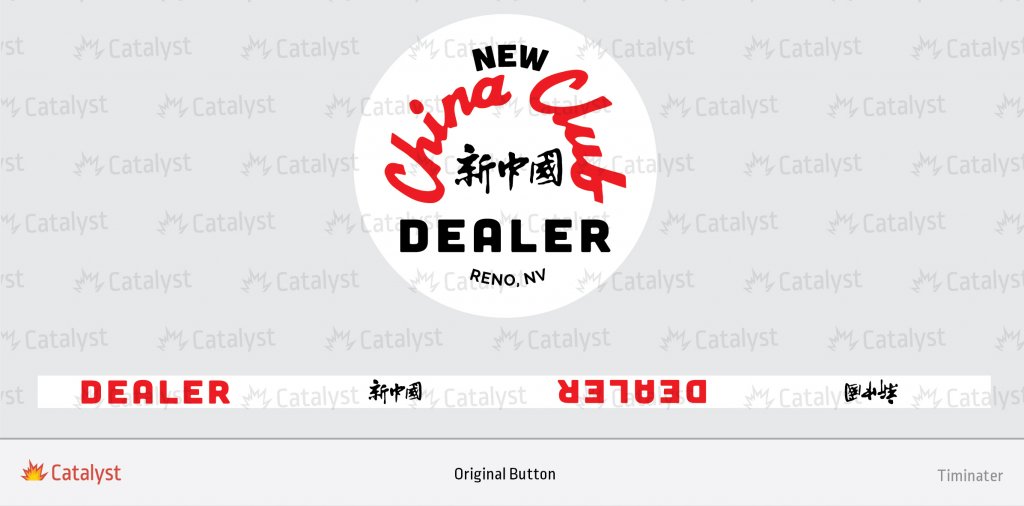
Yes. The original will be offered, assuming it gets 10 or more orders. That's the MOQ for rolling edge printing.Just to clarify, are we ordering some of the original buttons as well as new designs, or just new designs? I'd be in for 1 or 2 of the originals
That is exactly what I wanted to do. Unfortunately, BR Pro Poker can't do aligned edges on Dealer Buttons, and I don't think the quarter pie would look good without matching edges.What about a quarter pie design for the background like the chips have?
Thanks. Yeah, I'd say we should change it to 1971 if they closed on 12/31/71.I like the first three. I did think the contrast of yellow and green on the first two looks a bit muddy but I know pc monitors may not render it all perfectly and it might come out awesome on the puck. regardless, a Keno Queen DB is a must.
In regards to the dates from an earlier post, I found the article on the Nevada Gaming Commission historical site. It talked about they opened in 1952 and let their license expire on Dec 31, 1971 and closed that day. So I guess it could be 71 or 72 depending on was it the last date or up to 1972.
OK, how's this for tweaks? Speak up please. I'm just the messenger, not the final decision maker.
Button #1
Button #1
- Change 1972 to 1971.
- Change 1972 to 1971.
- Do we want Tim to make the red a couple of shades darker, or leave it?
- Make the green a couple of shades darker - closer to the green in buttons 1 & 2. (I already submitted this tweak to Tim)
- I don't care for this one, so if anyone else wants to tweak it, speak up.
- Someone suggested making the entire base color of the button red, changing black text to white, and changing red text to yellow. Should we do that to this button, or leave this one alone and do a new draft with those ideas?
- This is the original. No changes.
gopherblue
Straight Flush
Don’t know how I missed these. In for 5 of the original, depending on price.
Last edited:
Ben8257
Royal Flush
In for a couple of each of everything made!! Everything looks great!! You guys have been busy!! Wow I have the original but the others are really coming along!!
detroitdad
Royal Flush
I just saw this. I would be interested in a few buttons.
OK, how's this for tweaks? Speak up please. I'm just the messenger, not the final decision maker.
Button #1
Button #2
- Change 1972 to 1971.
Button #3
- Change 1972 to 1971.
- Do we want Tim to make the red a couple of shades darker, or leave it?
Button #4
- Make the green a couple of shades darker - closer to the green in buttons 1 & 2. (I already submitted this tweak to Tim)
Button #5
- I don't care for this one, so if anyone else wants to tweak it, speak up.
Button #6
- Someone suggested making the entire base color of the button red, changing black text to white, and changing red text to yellow. Should we do that to this button, or leave this one alone and do a new draft with those ideas?
Think on this and give me your feedback. I'll submit tweaks to Tim tomorrow afternoon.
- This is the original. No changes.
I dont think you go too dark on button 2. I think you want it different than button 1
Unless there's a big demand, my thinking is that there will just be one button with the green and yellow "ash tray" design actually going to print. So I'm trying to dial in the single best color for the outside and edges. I thought #1 was too dark. Some others thought #2 was too bright. So I'm suggesting a third somewhere in-between might hit the sweet spot. These are all just drafts right now that we are tweaking to try and come up with one or two new buttons to go along with the original.I dont think you go too dark on button 2. I think you want it different than button 1
I got tied up with personal stuff today, so one more day to make comments. I'll submit tweaks to Tim tomorrow.
Similar threads
- Replies
- 35
- Views
- 2K
Collecting (ordering closed)
SPW private message group buy
- Replies
- 34
- Views
- 2K
- Replies
- 204
- Views
- 14K
