Custom Chips Final Revisions (1 Viewer)

StingRay

Sitting Out
Joined
Jul 31, 2020
Messages
17
Reaction score
25
Location
NC
Hi everyone!

Thanks to @timinater I now have some artwork for the custom cash set I have been working on. Any additional feedback or suggestions before I send these off to be made?

CustomChips13.png
 
I have a couple suggestions, the colors for the spots of the 1 and 5 are a little too close. Obviously they both use white, but arc yellow and peach can look kind of same-y next to each other as well in my opinion. Also I am firmly in camp "DG Yellow is best for edge spots", but I'm assuming you have a color sample in front of you and can see how it looks haha!
 
Hi everyone!

Thanks to @timinater I now have some artwork for the custom cash set I have been working on. Any additional feedback or suggestions before I send these off to be made?

View attachment 564652

I like the spot progression a lot. For colors, you should go with whatever you like. Personally, I’d probably tweak the spots on either the $1 or $5 because the spots are similar there and the spot colors aren’t similar on any other chips. But you should go with colors you like.

I would echo the sentiment that you should get samples if you haven’t already. A lot of colors look very different in person than how they look on the tool.
 
Thanks for the feedback so far. I totally get the edge spot colors on the $1 and $5 being so similar but I really like the design and don’t think there is any chance of mistaking one for the other and second I’m not really sure what I would do differently. I really want to keep the traditional base colors but I find a white $1 a little boring. Any suggestions for alternatives I could try?
 
Thanks for the feedback so far. I totally get the edge spot colors on the $1 and $5 being so similar but I really like the design and don’t think there is any chance of mistaking one for the other and second I’m not really sure what I would do differently. I really want to keep the traditional base colors but I find a white $1 a little boring. Any suggestions for alternatives I could try?
I'd make the $1 dayglo peacock, as light blue is a very dull color, but peacock is vibrant, and honestly one of the best CPC colors. I'd also change the $500 to retro lavender, as normal lavender is very dull. Maybe also consider making the spots on the $1 dayglo tiger and bright white, because dayglo tiger is easier to distinguish from arc yellow.
 
Thanks for the feedback so far. I totally get the edge spot colors on the $1 and $5 being so similar but I really like the design and don’t think there is any chance of mistaking one for the other and second I’m not really sure what I would do differently. I really want to keep the traditional base colors but I find a white $1 a little boring. Any suggestions for alternatives I could try?

It’s all personal preference. They wouldn’t get mixed up or cause dirty stacks. It’s just some people don’t like repeating the same spot colors just on two of the chips. If you like it as is, go for it. It’s your set.

I like how blues look on the CPC red chips. Something like this looks good to me with the samples in hand:
6D7F798D-E05D-4E5B-93F2-8F0CC1092D25.jpeg

But if you like the look of the oranges/yellows on red more, I totally get that.

And I wouldn’t go with a white $1. Stay blue.
 
I just mocked up this:
6b542e04-3b39-48cf-a974-eca455ba0372.png

It has a few of its own flaws, like a lot of blue and orange, but I made some edits I thought would look good. Feel free to use any of these if you'd like to.
 
Agree with others re: the colours for the $1 and $5 being too similar - I'd definitely change one of those chips up. Personally, from the first mock-up, I'd keep the $5 the way it is and change the colours for the $1.

Just an idea:
Screenshot 2020-10-30 at 19.08.20.png
 
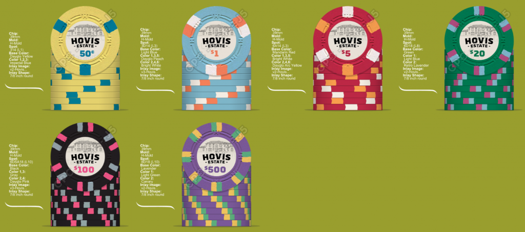
I went back to the drawing board and came up with this:

CustomChips20.png


I just talked to David at CPC and he let me know that the H mold will run in March which means I need to submit my order now. Any final thought or anything I'm missing or forgetting before I submit this?

I was thinking about something like this for the breakdown:
(160) .50's
(240) $1's
(300) $5's
(180) $20's
(120) $100's
(100) $500's
(20) missed blind

Thanks again to everyone for all their help, it's been a fun journey. Also a special thanks to @timinater for doing the inlays and being so quick and awesome to work with!
 
I like the colour-matching with the denominations. Still not a fan of how similar the edge spots are on the $1 and $5 though - I'd really consider changing up one of those chips. Even if it's just one of the colours if you're intent on keeping white in both.

One additional thought re: the $20. For me, the edge spots from the $20 through to the $500 are all pretty similar - what about trying something like a 414418 edge spot pattern for the $20 - I feel that would help achieve a smoother transition from the $5 to the $100.

Something like this perhaps?
1605454901389.png


Personally, I'd take the time to really nail your lineup down and not let myself be pressured by what in reality is a fairly fluid deadline in terms of CPCs production schedule. A CPC set is a lot of money, and if it takes 2, 4, or 20 more mock-ups to get it to where you look at it and go, "perfect!" then that's what I would do. For my recent set I mocked up no less than 40 different versions of the chips and a few dozen variations on the inlay before landing on my final design.
 
That's quite a large number of chips. Are you covering 2 full tables of cash at 0.50/1 stakes?

No, I can't imagine ever doing that. However, I do plan on these chips lasting the rest of my life and something tells me some chips will go missing over the next few decades or need replacing. I'd rather just order now and be set for any scenario.

I like the colour-matching with the denominations. Still not a fan of how similar the edge spots are on the $1 and $5 though - I'd really consider changing up one of those chips. Even if it's just one of the colours if you're intent on keeping white in both.

One additional thought re: the $20. For me, the edge spots from the $20 through to the $500 are all pretty similar - what about trying something like a 414418 edge spot pattern for the $20 - I feel that would help achieve a smoother transition from the $5 to the $100.

Something like this perhaps?
View attachment 574594

Personally, I'd take the time to really nail your lineup down and not let myself be pressured by what in reality is a fairly fluid deadline in terms of CPCs production schedule. A CPC set is a lot of money, and if it takes 2, 4, or 20 more mock-ups to get it to where you look at it and go, "perfect!" then that's what I would do. For my recent set I mocked up no less than 40 different versions of the chips and a few dozen variations on the inlay before landing on my final design.

Thanks @cpac54 for all the suggestions. There are a couple reasons I am wanting to keep the $1 the way I have it. First, my biggest hobby is cars and I really like the gulf theme for my $1 chip. Second, I plan on ordering a table with blue felt so I think keeping the blue as light as possible would work best.

I kinda see the deadline as a blessing in disguise. I've been working on this almost daily for the last 6 months and I think I'm ready to be done and I know my wife is ready for me to be done with it lol.
 
No, I can't imagine ever doing that. However, I do plan on these chips lasting the rest of my life and something tells me some chips will go missing over the next few decades or need replacing. I'd rather just order now and be set for any scenario.

As you prefer. It is an awful lot of extra money to spend if you can otherwise get by with 30-40% less chips. Or can allow you to afford higher level chips. Worth contemplating.
 

Create an account or login to comment

You must be a member in order to leave a comment

Create account

Create an account and join our community. It's easy!

Log in

Already have an account? Log in here.

Back
Top Bottom