Custom ceramics idea - I am no designer (1 Viewer)

JuniperCat

Pair
Joined
Aug 7, 2019
Messages
105
Reaction score
166
Location
Essex, UK
Hi,

Considering some new custom ceramics.
I have a chip design in the bag, but when it comes to inlays, boy, it turns out I am no designer. I have a very rough & basic concept but I could really do with some pointers as to making the inlay work as all of my attempts scream "20 minutes in MS paint".

Black Fox (Poker) Club is the name of the fantasy casino and something like "Casino & Gin House" or Gin House & Card Room" is what I'd like for the sub-text, but I just can't make the text or denoms look acceptable.

Fox logo also just a placeholder, but silhouette seems to be the direction I want to go.

Any ideas, suggestions etc gratefully received.
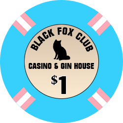
bfpcsnapper.png
 
Just a couple of quick ideas below. Some of them I don't like :LOL: :laugh:, but thought I'd share. When I'm coming up with a design, I like to quickly make a bunch of different versions. Then take a break and come back, and sometimes I find one or two elements from different versions that I like and go from there.

1637769501422.png

1637770107678.png

1637770805783.png

1637771092526.png

1637771416743.png
 
Wow, thanks for the ideas & inspiration. I really like them. I've decided to ditch the "gin house" theme and I'm now liking "Casino & Cabaret", it fits the Black Fox aesthetic more. I really liked "the Black Fox" more than "Black Fox Club" too, especially the lower case "the".

I'm gonna have a think and go back to the drawing board. I think maybe a white base for the chip now too.

Thanks again for the feedback and for taking the time to make some mock-ups, it's really appreciated.
 
Made some changes, getting closer to what I want.

Which lettering layout is better:

#1
bfpc_snapper_largeinlay_sm.png


or
#2
bfpc_snapper_largeinlay_v2.png
 
Toned things down a little. This is more subtle. Thoughts?

bfpc_snapper_largeinlay_newfont.png


@Pinesol13 What font did you use for the denoms in your 3rd mockup? In the fox's tail?
 
Last edited:
I like the white, centered $1.

I'm not sure about the fox silhouette. Make sure you get a sample printed. It may not be as recognizable as a fox once it's printed, might just look like a black blur
 
I like the white, centered $1.

I'm not sure about the fox silhouette. Make sure you get a sample printed. It may not be as recognizable as a fox once it's printed, might just look like a black blur
You might look at it upside down and sideways as well just to avoid the pooping parrot syndrome. I don’t see anything but somebody will if it’s there.
 
Personally I think you need to leave some space to make things more legible. A good trick is to print your designs at real scale and see how they look. What looks good on screen may not translate so well when life size.
 
I wasn't overjoyed with that fox anyway, so currently I'm looking at this:

blackfoxsinglefinalblackfoxsing.png


I'll make some prints and look at them in every direction, thanks for the pointers. Currently really quite happy with this one. Please let me know if something doesn't work with this.
 
Poring over the custom ceramics threads over the last few days, and I've been disuaded from mimicing edge spots on my ceramics. I've also switched to £GBP and made a few final tweaks, and I think we're there with a white base for the chip. I'll no longer need aligned edges, which will save a little money.

This is where I'm at now:

BFPC_SINGLE_FLAGFACE_GBP_FINALsmblackfoxsing.png


I much prefer this fox, and I like how the arch of his back matches the curve of the text. There's also a little more negative space, so it's less busy and a little cleaner overall. Pretty sure I'm gonna go with this, unless anyone can point out some sins that I've missed.

Any and all feedback grafefully received!
 
Like the name / theme. Few quick considerations:

  • 'the Black Fox' text is not central, it needs to spin clockwise a bit. The 'the' is too low V's the 'Fox' if that makes sense
  • The above may then help the the text overlapping the tail
  • I'd maybe bring the 'Casino & Cabaret' in a little bit, it's pretty close to the edge
Edit - I'd also suggest you mock up all the other chips in the line up. If you are using a gradient based on the edge spots you'll want to check that they all still have readable text on top.
 
Last edited:
Thanks so much for the feedback. I've been looking at this and its many iterations so much that I really appreciate fresh eyes.

So, the Black Fox text, indeed, isn't central, but it's a feature rather than a bug, but I do agree it needs a tweak. The idea was that "Black Fox" would be centered, and the "the" would not be. This has slipped a little due to me changing the font size of "the", which was originally smaller, but I was worried it would be too small. I have centered the "Black Fox" now and made "the" a couple pixels smaller.

The overlap of the tail was also a feature rather than a bug; I had some versions in which the text didn't overlap, and... it lacked something, so I decided to keep the overlap as it tied the fox and the text together a little. I do understand what you're saying though. Is it too distracting?

Agree with the Cas & Cab needing to come in a bit.

Here's a tweaked version:

BFPC_SINGLE_FLAGFACE_tweaked_posblackfoxsing.png


Thanks again so much for the feedback.

Thoughts?
 
I have tinkered with a fox logo, as well (my neighborhood is named Fox Run). I was using this image (I filled it in with all black to go with your "black fox" idea).

1638207038172.png
 
  • Like
Reactions: BNM
Just some food for thought as there are many fun ways to show a fox. Having different version of foxes on different chips can look awesome. You can look for the Black Cat Club set for example. https://www.pokerchipforum.com/threads/black-cat-sample-set.49123/
I adore that set so much.

This fox is more animated, and a little more fox.

I think I'm getting closer and closer to being satisfied. I moved the denom a little to make seem more like the fox is jumping over it.

BFPC_theblackfox_moved_the_nufoxblackfoxsing.png


So many versions now, I feel like I'm drowning in decisions :(

I do feel like this is almost exactly what I want, but I need to make a final decision on the denom placement and whether I want the denom to pop a little more, and if so, how?
 
I adore that set so much.

This fox is more animated, and a little more fox.

I think I'm getting closer and closer to being satisfied. I moved the denom a little to make seem more like the fox is jumping over it.

View attachment 818900

So many versions now, I feel like I'm drowning in decisions :(

I do feel like this is almost exactly what I want, but I need to make a final decision on the denom placement and whether I want the denom to pop a little more, and if so, how?

What is the highest value, you need to look at it like that before you can do more with the denom look. Love the design btw!
 
This is the highest value :D

This will be a £1 chip, which is the highest we ever have in play. It's just to mix in with my Black Betty pink quarters and Dogecoin yellow nickels. It's a mix & match set :oops:

poker-1.jpg


The lil guy that @Himewad posted has grown on me and works really well too

BFPC_theblackfox_moved_the_nu_lil_fawxblackfoxsing.png
 
At this point I'm close to saying "can anybody recommend me a designer that I can throw everything at and let them make sense of it?"
 
This is the highest value :D

This will be a £1 chip, which is the highest we ever have in play. It's just to mix in with my Black Betty pink quarters and Dogecoin yellow nickels. It's a mix & match set :oops:

View attachment 818920

The lil guy that @Himewad posted has grown on me and works really well too

View attachment 818919


Then the face is good but I would like that blue to extend over the edge as a white edge might lead to dirty stacks with other chips in light pink and yellow :)
 
Then the face is good but I would like that blue to extend over the edge as a white edge might lead to dirty stacks with other chips in light pink and yellow :)
I had considered that, but thought the colours were different enough. But maybe in low light, not so much.

So, something like this?

BFPC_theblackfox_moved_the_BLUEomgblackfoxsing.png
 
I had considered that, but thought the colours were different enough. But maybe in low light, not so much.

So, something like this?

View attachment 818940
yes just like this. When you get them printed ask if they would recommend a wider blue line to make sure a little misprint is not going to leave you with no blue on one side.
 
yes just like this. When you get them printed ask if they would recommend a wider blue line to make sure a little misprint is not going to leave you with no blue on one side.
Ok, thanks. I'm gonna take a long break and take a look with fresh eyes tomorrow.

Thanks again for the feedback, much love.
 

Create an account or login to comment

You must be a member in order to leave a comment

Create account

Create an account and join our community. It's easy!

Log in

Already have an account? Log in here.

Back
Top Bottom