I know where both of you guys are coming from... I'm actually in between your preferences/views...
I believe the reason why many "one side only" denoms is really common in hot stamp chips is because the casino/cardroom only needs one custom die, for the non-denom side... The denom side is done with stock die and imo, it really gives the chips a non-custom feel... I'm not a fan of this practice although I have a set of HS Ramada that follows this pattern and I like the set very much...
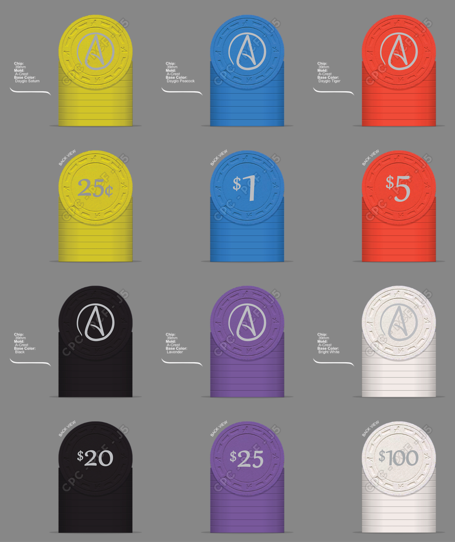
On the other spectrum, If one has denoms on both sides, it's very, very hard to insert any image/logo on the design... In most case what happens is the inclusion of only the casino/cardroom name and the denoms... I don't mind that at all and some of my favorite HS sets follow this pattern... The issue with that is that it limits the customization of the set...
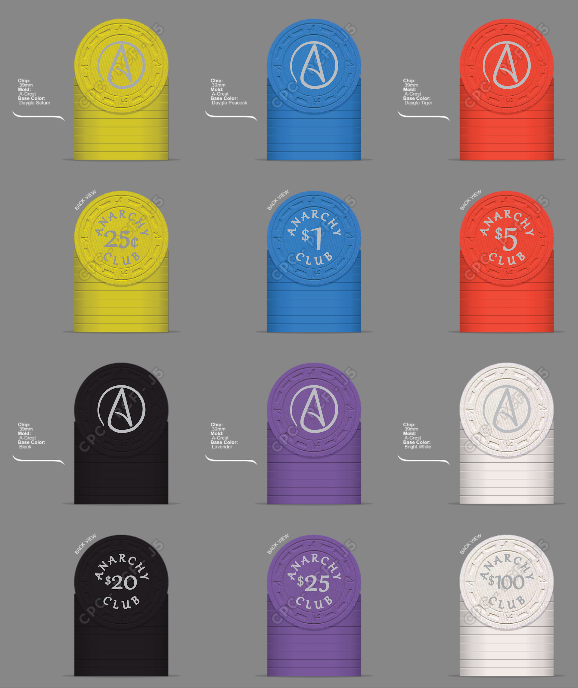
Soooooo... Because of the above, my preferred design for customs is to have a combination of both worlds... One side with a logo/image (with or without the casino/cardroom name) and the other with the denom WITH the casino/cardroom name to utilize customization to the fullest...
One example of that is Club Courage HS, another one is the custom set I just got made

(Pr0n once I finish oiling them and have time for pics).
I know it seems I'm in the minority but I would prefer the name together with the denom in one side and the logo/image on the other for this project...
Apologies for the long-winded comment...
")