Coming Soon!!! (2 Viewers)

Which purple? See post #373 for current photos.


  • Total voters
    44
  • Poll closed .
I appreciate that Gear makes quality prodcut, but it's a bit weird to contemplate paying more for the labels than the chips... and if you do two laminated labels at $.15 each, that's more than the $.29 expected chip price...

These are my thoughts as well. Adding custom labels makes these chips about 60 cents each, which is about the same price as getting fully custom ceramic chips from PGI.
 
Sure but I would bet a lot that Josh's proprietary labeled chips won't be $.60 each. So as Keller suggested above, see if Josh and the designer (I'm assuming J5) will agree for you to get a nickel label made. Then just the rack of nickels will be $.60 each and the rest will still be cheap.
 
Exactly. How many racks of nickels are you thinking? As a worse case scenario, you might pay an extra $30-60 to get a rack or 2 in case they're not offered. The rest of the set will be dirt cheap. Total cost will still be low.
 
You guys are absolutely right for someone who likes the stock label and wants a one-off chip.

I was thinking more about a full custom-label set.
 
Here is some of the art so far. This is not complete art and more updates will be made.
majestic.jpg
 
Yeah...so these don't suck at all. Love the top left (would prefer silver vs gold, but still looks good as is), top right, bottom left, bottom right. Not terribly keen on the two middles, but they sure aren't awful, either!
 
I posted some of the 1st China Clays ever made and they had sharp edges....

Don't remember where the post is...
 
I'll repost my reply:

1 2 3
4 5 6

Discussion is easier if we can all use the same identifiers.

I really like the overall look of 1. Gold on black with a white denom that pops. The crowned griffon is pretty cool too.

"Card Room" and "Casino" text tend to get a neutral to negative reaction around here, it seems. I'd say drop them. Same thing with the "Las Vegas" unless it's just a place holder for a custom location text.

"The Majestic" reminds me of that Jim Carey movie. "Majestic" might be ok, but I'd look at something like "Regal". "The Empire" brings up Star Wars for me, but I do like the Art Deco feel (Empire State Building inspired?). Less nerdy people might not have that issue.
 
Looking good!! Middle bottom has my vote for sho.
 
Several good-looking starts, here. I'd be a fan of a two-sided design with a front/back. Either way, I'm liking both the black and the light labels.

I like both The Majestic and The Empire.
Am OK with Card Room.
Dislike the Las Vegas.

I like where this is going, for sure.
 
Definitely okay with Card Room. Not really keen on Las Vegas appearing on these chips as a stock set.

The Empire w/art deco theme looks great, but if you're going to put a city on this one at least use NYC.
 
I posted some of the 1st China Clays ever made and they had sharp edges....

Don't remember where the post is...

Somebody else also had an early set of sharp-edged china clays -- pretty sure they were Da Vinci Casino on the spirit mold (and probably machined after injection-molding). I think the CT post was by ttttubby -- but I never saw any pics.
 
Here is some of the art so far. This is not complete art and more updates will be made.
View attachment 9567

The J5 artwork looks great, Josh. Looking forward to where you two go with this. Of those initially listed, I like #1 best (gold on black). John never makes the artwork decisions easy. :)

Agree with most others that "Majestic Card Room" >>> "The Majestic", and swapping NYC for Las Vegas on the Empire chips (or dropping city name altogether).
 
Was hoping for something more like the "Protege" and focus on denomination. I like the griffon and we'd probably just call them that if there was no name on them. First glance I like #3, think I prefer the black labels. But I completely trust J5!!!
 
Very nice J5 quality artwork! Correct me if I'm wrong, but I'm afraid anything silver, gold or similiar fancy will simply look extremely cheap on cheap china labels. Such designs usually only make sense for high-quality labels, which these (at least judging from my Dunes labels) possibly won't be. In this regard, inlay samples may be just as important as chip samples.

That said, I much prefer the red denom of design #5 (although I'd prefer a lighter red). Without such an element, the design tends to get a bit monochromatic ...
 
Last edited:
Top left with red denom and "card room" text removed a la bottom middle. Perfect!

IMO for this purpose gold text >>> silver - the silver will be a lot more difficult to read in most situations.
 
Correct me if I'm wrong, but I'm afraid anything silver, gold or similiar fancy will simply look extremely cheap on cheap china labels. Such designs usually only make sense for high-quality labels, which these (at least judging from my Dunes labels) possibly won't be. In this regard, inlay samples may be just as important as chip samples.

To address the quality issue (without knowing the manufacturing details for these) I can say that based on existing CCs, print quality is actually quite high. As for the metallic look, I would say that because of the silvery quality of the label material, metallic gradient effects are actually enhanced compared with printing on traditional white labels.

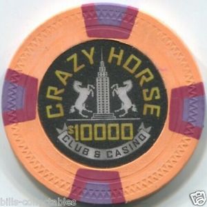
For anyone who has the 'Crazy Horse' chips, I put a silver gradient on the banner and IMO it achieves a realistic effect on the printed chip. I also used a gold gradient similar to the top left mockup here, and I think that too looks quite nice. Even white areas have a silver shimmer that I think enhances the 'luxury' feel we are trying to achieve with these.

I know some are not too keen on the silver look to CC labels in general, however a black background actually eliminates its appearance on much of the label, except where we are actually trying to achieve that look.

Thanks for the feedback everyone!
 
I just ask 3 things:
1. No gold whatsoever...I just despise all things gold.
2. No location/city...unless you use MA :D
3. Red denom.

Hence the vote for middle bottom.
 
I know some are not too keen on the silver look to CC labels in general, however a black background actually eliminates its appearance on much of the label, except where we are actually trying to achieve that look.

i am definitely one of those who doesn't care for the silvery effect and also doesn't care much for black-background inlays/labels/whatevers, but after looking at the above mock-ups and again at the crazy horse chips (mock-ups and photo below), i totally agree that this is a great workaround to those "issues".

chsetall01.jpg


UfUBkxH.jpg
 
The best thing for Apache and J5 and all of us is to have something completely new for a stock inlay, right? That makes me think going with "The Empire" and changing Las Vegas to "Manhattan" might be a cool way to go. An art deco NYC feel would only have the PNYs to compete with (at 10x the cost).
 

Create an account or login to comment

You must be a member in order to leave a comment

Create account

Create an account and join our community. It's easy!

Log in

Already have an account? Log in here.

Back
Top Bottom