Club Miðgarðr - CPC customs (1 Viewer)

Medisin

High Hand
Joined
Jan 30, 2018
Messages
73
Reaction score
44
Location
Oslo
So,
I cannot seem to stop playing with the poker chip design tool. I want to create a cpc cash set but when going for customs, there are just too many choices. For all you out there, how does the color combinations work here? I'm pretty set on the 5 and 20 chip. Unsure about the 2, 50 and 200. Yes, the denoms are a bit off from what you probably are used to see, but for me it makes sense (2/4, 5/10 games most common, never 1/2). I also like the idea of an oversized top-denom chip.

A (very) little background: For those of you not familiar with Norse mythology, Midgard (Miðgarðr) is where the people live.The scroll mold is a nice fit here as it could somewhat illustrate the sea serpent (Miðgarðsormr) that encircles Midgard. I will need to do a lot of work on the inlays, but for now that is not what is important.

The denoms with runes will be as follows (for now only the 200 on alt 1 has a rune on in):

2 - ᚾ - need
5 - ᚬ - as/oss (Æsir)
20 - ᛋ - sun
50 - ᛦ - yew (tree)
200 - ᚠ - wealth


I have whipped up 2 slightly different mock-ups, just to get the thought progress going.

Alt 1. standard 39 mm scroll mold, grey 2, green 50, dg tiger 200
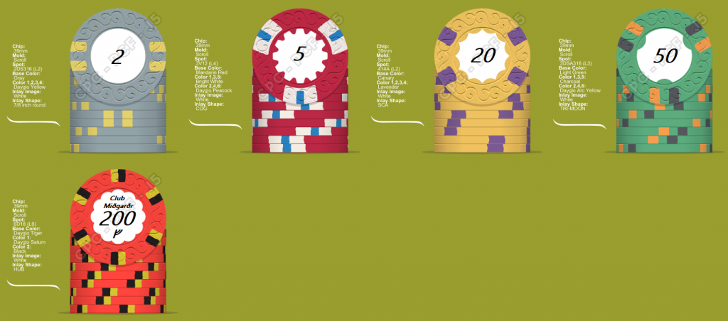
cash_7_7.png


Alt 2. 39 mm scroll mold, 44 mm for the 200 chip. green 2, chacoal 50, dg pink 200
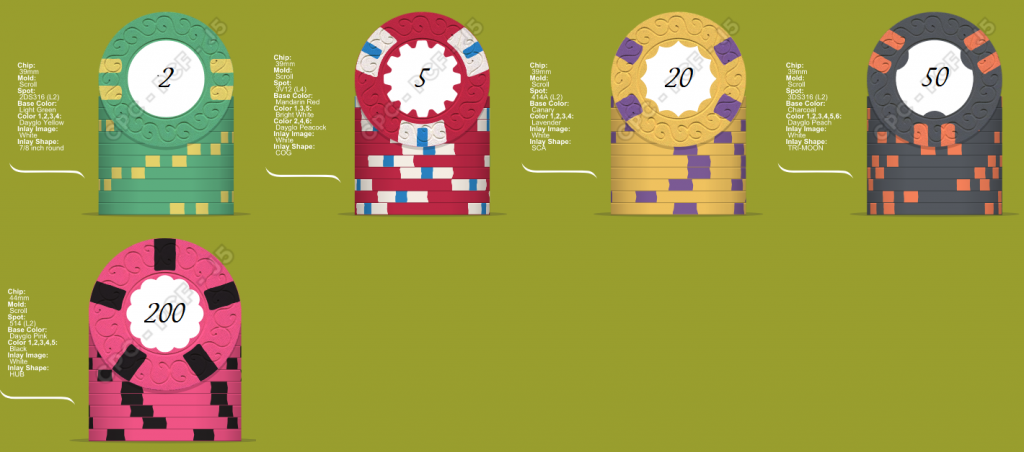
cash_7_8.png


So, comments on base colors, spot combinations, spot progression, other suggestsions etc would be sweet =)
 
Very thrilled by the theme!

Seeing how relatively simple the edge spots are, I'd recommend to drop the real shaped inlays and instead get your inlay (esp. border) really fancy.

With the mythology/pre-medieval theme, I could imagine a stone texture background could fit nicely on the inlays, in a way that your runes then would actually look like "engraved" on the stone. This would already draw so much attention that the expensive shaped inlays would then probably only deteriorate the overall look. With the money saved by dropping the shaped inlays, you could maybe spice up the spots a tiny little bit, e.g. by adding a second spot color on the 20.

Option #1 is my favorite among the two. Overall color distribution just looks better.

Oversized chips may sound nice but keep in mind you'll need specialized racks to store them, and those don't stack well with regular 39mm racks.

Edit: You do have a color sample set, yes?
 
Last edited:
Very thrilled by the theme!

Seeing how relatively simple the edge spots are, I'd recommend to drop the real shaped inlays and instead get your inlay (esp. border) really fancy.

With the mythology/pre-medieval theme, I could imagine a stone texture background could fit nicely on the inlays, in a way that your runes then would actually look like "engraved" on the stone. This would already draw so much attention that the expensive shaped inlays would then probably only deteriorate the overall look. With the money saved by dropping the shaped inlays, you could maybe spice up the spots a tiny little bit, e.g. by adding a second spot color on the 20.

Option #1 is my favorite among the two. Overall color distribution just looks better.

Oversized chips may sound nice but keep in mind you'll need specialized racks to store them, and those don't stack well with regular 39mm racks.

Edit: You do have a color sample set, yes?

I really likes your idea of putting more work into round labels, thanks! I'll try and get hold of a skilled designer and see what we can work out. Anyone reading this thinking they are up to the task? (or know of anyone with experience?)


yes, have color samples. Still difficult to get it just right though, but the more I mix and match the closer it feels like I'm getting to a satisfactory result.
 
I can see the issues with the 20 now. I'll do some work on the spots on it (and probably the 50 as well).
I'll try 3DSA316 for the 20 and swap to 314318 on the 50. New mock-ups coming soon.
 
Version 2 for me. I 'm a sucker for pink-purple chips:). Plus, I prefer these two 2 and 50 chips to those of version 1.
Nice concept!
 
As far as the edge spot progression goes, what do you think?
(Haven't exactly color matched with sample chips yet so spots could be a bit off.)
traded down the green to a 2' chip, blue goes in as a 50'.

cash_7_7_4.png
 
  • Like
Reactions: Nex
Version 2 is excellent for me, but your new blue and big orange are fine too. However, leave that 20 alone:), it was perfect in version 2, especially color-wise.
Edge spot progression is fine, but not mandatory - you could even use a single design pattern if in love with it.
Getting the samples in your hand is of paramount importance, as well as seeing how the various edge spot patterns look like in real-world photographs. The Pr0N section of this forum is invaluable.

True, liked the 20 in the first version as well.. Mayby a little different approach on the 50 could save it.
 
Take 3.
Toned it down a bit from the last one. 20 form v1 is back, 50 with new spot pattern. It helps a lot on the thought process just posting on this forum =)
How about that 2'er now, in need of a different spot pattern?

cash_7_7_5.png
 
BTW: In need of a graphic designer for inlay designs. Suggestions?
 
My humble attempt.

midgard.png


Mint green and DG Yellow is a great match, no matter if on the 2Kr or 50Kr, but I'm not too fond of the new blue 50Kr chip. Doesn't quite fit in - way darker than the rest of the set.

Edit regarding inlays -- at first, my idea was just rough gray stone on all denoms and then maybe different colored "paint" on it around the engraved rune. Looking at some random pics from Google, taking colored precious stones instead that color-match the chip base color closely could be some nice alternative:
s-l1600.jpg
 
A few more tries

Version 4:
cash_7_7_9_10.png


Version 5:
cash_7_7_9_2.png


Just the green and tiger chips that's different in v4 and 5. If not for anything else it is a great help to myself posting theese. But of course. comments on spot an spot color combos are welcome.
 
If you don't want to stick with your earlier green chip versions, definitely take the 3TA316 one.
Alternate yellow chip looks good to me too.
Do stick to the black/yellow tiger chip. You could replace the dayglo saturn with a non-glowing yellow but don't take two grayscale spots.
 
I liked the spot color mix with butterscotch on your earlier 2's The grey and yellow of your latest iteration just doesn't pop enough to me. That's my own personal preference though; given what matters most is how YOU like them. :D

The others are really awesome... especially the latest green 50.
 

Create an account or login to comment

You must be a member in order to leave a comment

Create account

Create an account and join our community. It's easy!

Log in

Already have an account? Log in here.

Back
Top Bottom