Chip Design Feedback (1 Viewer)

RoamingBuffal0

Waiting List
Joined
Sep 2, 2023
Messages
8
Reaction score
5
Location
Phoenix, AZ
Could you kind folks take a look at this custom design I had drawn up for BRPoker ceramic chips set? Any feedback you would give me that would be helpful to think about before submitting order? Thank you!
 

Attachments

  • IMG_4317.jpeg
    IMG_4317.jpeg
    90.2 KB · Views: 187
Cool inlays. Are these used for advertisment? And even if so, is it really necessary to list your name 3 times around the edges of the chips? May look good on this design sheet but I believe it will be small, busy, and tough to read, plus stacks would frustrate me when they were flipped different ways. Also, don't know if the font for the denoms is too small on the flip side, might be easier to just add the number again or remove it altogether. The word ROAMING gets lost in the background grey/black gradient for me.

Most of that comes down to preference. Will you be using this for tournaments and cash? May want to add a $ on the 1/5/25 or remove "dollars" from the tourney side. Whatever works.
 
Cool name.

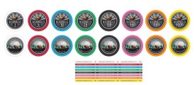
I think both sides are a good starting point, but imho clash somehow and do not particularly go well together. They do not share the same aesthetic/style and do not tell the same story in my opinion. It is subjective, and both could end with something good, but I would pick one style, and then work on differences between sides.

As @NotRealNameNoSir said, I would ditch the text on the edge. Looks like a promo, adds nothing to the distinction between chips, and just adds visual clutter.

The stripes as background for the text is a problem.

I think I prefer the second side, I feel it has something classic, and a little more in tune with what Roaming Buffalo" evokes for me. I quite like the overall look, I think the solid colours and the rings work well.
The first has a somewhat busy/speedy/aggressive vibe, but to each their own.

Nitpicking, but I would perhaps make the buffalo a bit bigger. I feel the moon/sun/cactus are taking the focus, and the space above is a bit much. The left cactus needs to be smaller and let the text breath.
Not sure about the text denom. I think it works quite well, but on the other side, I think you have the perfect space in the dark ground to put a nice number.

Good luck ;)
 
I'd ditch the sunburst behind the buffalo as well.

I'd consider adding some color that matches the perimeter of the chips on the inlay to help them stand out when spread out in the pot. For example maybe have the moon be a pale version of the base color.

Also, unless you're absolutely keen on it, I'd ditch the $10 chip entirely. They don't really serve a purpose if you're going to have 5s and 25s.

Lastly, pay the money to have them send you proofs. You'll be very happy you did. I usually find something to tweak after I've seen them actually printed.
 
I enjoy the concept and the colors! BR Pro has been great to work with for me.

Chip denoms: Would recommend not reusing chips across cash and tourney games. You don't want a T25 becoming $25 out of your bankroll. One possible solution is to do 25c/$1/$5/$20 for cash and T25/T100/... for tourney. Also seconding the advice about skipping the $10.

Base colors: I like most of your colors. Do you have samples? The black that BR Pro prints is not as deep as other vendors. Maybe there's no way around it but if you were going to break from the traditional colors, this would be the one IMO.

Faces: Overall I think the front face is more functional and the back face is more beautiful. I would try to figure out how to combine the best of both and make that the one side to ship. For the front design, it would be great if you made ROAMING more prominent or de-emphasized it. It's in the middle right now.

"Inlay" ring: The ring around the center artwork will look better with complementary colors.

Edges: The upside down triangle pattern could be a fun way to help people count stacks. If you remove the text (which is a bit busy imo), there will be room for more of them.
 
Last edited:

Create an account or login to comment

You must be a member in order to leave a comment

Create account

Create an account and join our community. It's easy!

Log in

Already have an account? Log in here.

Back
Top Bottom