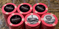
Stardust Single Chip Limit Set (6 Viewers)

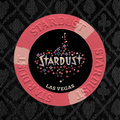
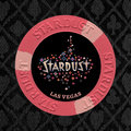
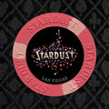
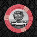
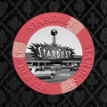
I really like the one on top(yellow), the matching one just isn't doing for me like i thought it would.

I don't like the match one either, I only posted it so you'd see.

The one on the top is actually the original color I chose when I added the Las Vegas line, but at first thought it was too dark. But now I think it's a good shade. Not too bright as to draw attention away from the graphic, but not so dark that it's hard to read on the black background.
 
Top one in your last mockup has my vote definitely.
 
Ok, almost "done". Here are the three color options I narrowed it down to for the text.

Stardust final draft - compare.jpg
 
Attached are larger images of the above options.
 

Attachments

  • Stardust final draft - brown lettering.jpg
    Stardust final draft - brown lettering.jpg
    369.6 KB · Views: 136
  • Stardust final draft - pink lettering.jpg
    Stardust final draft - pink lettering.jpg
    370.1 KB · Views: 133
  • Stardust final draft - gray lettering.jpg
    Stardust final draft - gray lettering.jpg
    367.8 KB · Views: 134
Last edited:
And here's the chip with two limited edition commemorative chips.

Stardust final draft - compare LE.jpg
 

Attachments

  • Stardust LE-1.jpg
    Stardust LE-1.jpg
    357.3 KB · Views: 114
  • Stardust LE-2.jpg
    Stardust LE-2.jpg
    384.8 KB · Views: 98
Fookin sweet, I didn't think I could be this jealous of a relabel project......

Thanks! Glad you like it :)

I'm hoping it works out and that it looks pretty close to the mockups once I get samples made and applied. The chips themselves are really sweet, I was pleasantly surprised when they arrived. Condition is perfect, colors look fantastic in person and I was a bigger fan of the house mold than I was expecting to be. I also like the simple 314 spots in the lighter shade. So it certainly helps to have an awesome chip as a base for the project.

Here's a little cell phone pr0n of some of the chips that are waiting to be relabeled.

image-jpeg.28112
 
Last edited:
Another vote for 1.5

Looking at the thumbnail images in post #65 (without enlarging them), you can't even see the gray text in #3. I'd go with 1.5 or 1.0
 
Got some test prints done today. My printer sucks, so I sent them over to the photo lab at Walmart to get a better idea of what they'd look like printed as labels.

I gotta say, if the labels end up look anything like these, it's got the potential to be a pretty sweet set!


IMG_0300.jpg
 
  • Like
Reactions: 72o
They look great! I'm liking the top two on the left and the bottom row left one for the main chips. I feel like the top right las vegas is too dark with everything else being so flashy and bright. The two throwback ones look great too.
 
They look great! I'm liking the top two on the left and the bottom row left one for the main chips. I feel like the top right las vegas is too dark with everything else being so flashy and bright. The two throwback ones look great too.

Thanks! Just cut the photos up into little circles (turns out it's not that easy to cut a 1" circle out of a photo). Here's some real life mock-up, including an ultra min-splashed pot. :LOL: :laugh:

IMGP8661.jpg

IMGP8662.jpg
IMGP8663.jpg
 

Attachments

  • IMGP8662-no vegas.jpg
    IMGP8662-no vegas.jpg
    145.5 KB · Views: 289
Last edited:
sick, going to such a sweet set of chips.
Wow! They look great!
In for a sample set... :ROFL: :ROFLMAO:

They look awesome! I'd do 50 of each LE label tho. Or, have them on one side.

Thanks all!

Yeah, I'm not dead set of 20 of each, just made that up so I'd have something to put next to the "LTD". I also thought about doing just one side, but haven't really figured that out yet. That's the good part about labels, you don't have to decide right away and can even redo them later if you change your mind.

Also, any opinions about how they'd look without the Vegas line (photoshopped out, since I forgot to print out samples without the Vegas line). I would recenter the graphic a bit if I didn't used the Vegas line.
imgp8662-jpg.28430

imgp8662-no-vegas-jpg.28431
 
Last edited:
i like the Las Vegas line.

Me too. Even though I understand the position that it looks cleaner without it, I think it looks more balanced and complete with it there. And I think with the right color (leaning towards "1.5", the one on the bottom left in the above pics), the text doesn't detract from the main graphic.

But who knows, I could change my mind tomorrow. :oops:
 
Vegas line. don't care for the color matched one. the other two are toss ups. are you gonna do them random or "aligned" If aligned then I think I like the "Las Vegas" centered in between the two spot on the bottom (bottom row far left)
 

Create an account or login to comment

You must be a member in order to leave a comment

Create account

Create an account and join our community. It's easy!

Log in

Already have an account? Log in here.

Back
Top Bottom