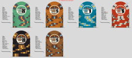
First of all, I'd like to echo the sentiments of others and say that you've NAILED one of the hardest things to nail, which is the inlay and theme of the chips. Great job creating a beautiful and clear inlay design that tells a story with its spacing, element sizing, and art!
Second, I'm going to go against the grain and say that you should totally do a 50¢ chip with denomination... because you've already said that your players love it. If you are able to create and deploy something that #1 You love and #2 Your main audience loves, then you should execute on it, regardless of whether or not it fits the ideal of other hosts, even more experienced ones.
I played at a game this past Monday that used dice chips (yuck!) and employed a 25¢ chip, a 50¢ chip, $1, $5, and $10 chip! Did I groan internally? Absolutely. Did I get used to it within the first 10 minutes of the game? Absolutely. Would I employ it at my game? Probably not. If you already have positive feedback on a 25¢ and 50¢ chip structure, then create the chips. You can always decide to only play with one or the other if you change the stakes or your audience changes.
Third, I've been watching your progression in tweaking the base colors for your chips, and I see the suggestions of others, and I'll offer two points here. First point: I think most of us shy away from brown as a primary base color, and definitely as a workhorse chip ($1's and $5's). To that end, I think you have also achieved something rare in the sense that you've created a compelling brown chip that looks really nice! In your first iteration, the butterscotch and brown chips really stood out to me, and I wouldn't abandon trying to get them to somehow work together.... I would attempt to move them away from each other so that they are not felted so often together, and I would probably try to change the edge spots so that the chips look easily identifiable between each other.
The second thing I would really compel you to think about is the emotion of each chip color combination. What you want to try to achieve is a diverse palette of emotions across your set. I know others are saying things like "don't use these colors together, don't use these denominations, etc..." but I like to approach it from "what opportunities are there?" "What stories can be told here?" What do you gain by choosing a certain combination of colors?
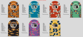
Your very first iteration starts with lighter, natural cooler colors (mint to then middle blue) and then shifts to earthy golden, then to strong-bold earthy mountain, etc... so we've achieved light grass, water, earth, mountain.... but what we're missing is warmth and bold un-natural colors (orange, pink, lavender, etc). I would describe your first iteration as "cold and bold."
So my question to you is, if you had to put a lineup together that represented a progression of feeling and connection to the world around you, what colors are needed to represent the Green House? Strive to balance the pull of the viewer between 4-5 emotions or ideas. If you include greens and blues you'll need to balance it with either pink, red, or orange. If you include grays and blacks you may want to balance it between whites and light beiges. If you include browns you'll need to balance it somehow with pinks or purples. You don't have to do this, but if you do consider it, it will open up opportunities to really "complete" your emotional idea in a way that feels complete.
Hope this helps, and once again excellent job with the hardest part of the process! I am a fan!