Working on my first CPC set. (4 Viewers)

Joined
Dec 3, 2024
Messages
111
Reaction score
226
Location
Denton, Texas
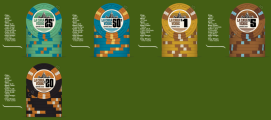
Have a recent custom set of Tina's (that I love), but as I feared, I want a clay set. Paulsons seem impossible to find in the color combos and numbers that I'd need without having to sell a kidney. CPC colors aren't quite exactly what I want either, but I know I'll love them - the samples I have that vintage look I'm going for. With the CPC factory moving, I'll have plenty of time time to finalize things. I know that it's kinda silly to have a 25c and a 50c chip, but everyone in my game really likes the small denom chips. Again, plenty of time to change my mind, colors, design etc. We play 25c/50c NL Might be too earthy in the color scheme. 1" labels or 7/8" labels?

5$brown.png


CPC CasaVerde78 label.png
 

Attachments

  • CPC CasaVerde 1inch label.png
    CPC CasaVerde 1inch label.png
    243 KB · Views: 528
Last edited:
Please change the background color to something more neutral. Grey works well

Pick your fav chip and change the inserts on the other chips. I don't like brown, but man you nailed it, I do like the palette you've got going on here.

You should use a non-denominated chip for your frac; you don't need both .50 and .25. I think I like the green chip a bit better.
 
First off, I really dig the vintage vibe and look forward to seeing your finished project.
Second, the inlay is great. Sure, it borrows heavily from a proven design (hey, I've done it), but the it comes with the benefit of looking great with staying power.

As for spot pattern: Vintage largely kept to a single spot pattern, mostly because there were few options available. New casino rules prevent that, but for vintage... no reason you can't stick with a single spot pattern.

Critique:
The 25¢ and 50¢ are really inefficient. For 25¢/50¢ NL, stick with the quarter ditch the half-dollar
Your $1 and $5 are the biggest issues. Personally, I really like the $5. Maybe use the DG peacock as the base for your $1.
Next are the similar yellow-brown earth tone spots across the line. I think you have some other color options available that you could pull in.

Play around with it and enjoy!
 
I agree the $1 and $5 are a little too close. Maybe just switch the colors int the $1 chip so the base is white and the 3V12 edge spots are light chocolate with yellow. That maintains the integrity of the color pallette but makes them more distinct.
 
Thanks for the critique. I started playing with different edge spots over the weekend - I'll post some up later. One day, hopefully soon, I'll actually talk myself into progressive edge spots or different edge spots. Like always, I get stuck trying to make a color palette match throughout the chips. This set is for our cash game that I've run for the past 15 years or so. It's a goofball, train-wreck of a game. I agree that 2 fracs are not needed, but with this game, I need the extra chips. We even do a 2 for 1 - $20 buy in gets $40 in chips. That way, it puts more chips on the table and gives the illusion of everybody having more $$. In theory, it keeps it from becoming a shove fest. I've long wanted to raise the stakes, but I'd lose some of the fun players that frequent the game. I agree with you guys, the most logical thing would be to get rid of the 50c chips and just have the 25c frac for the blinds. That way I can start everyone with 1 barrel of 25c and 1 barrel of $1 chips with 3 $5 chips. It's fewer chips than I use now - 1 barrel of 25c, 1 barrel of 50c, 10 $1, and 3 $5 chips, but still decent?

The colors of the 25c and 50c are too close in color - especially in low light. Thanks again for the suggestions - I'll get this ironed out by the time CPC is up and running in the new location.

Back to the drawing board
 
Different spots. Actually kinda like the gray chip. I just don't know if I can bring myself to use different edgespots with the $5 chip as that was my favorite chip.

3D14.png
 
There's a lot of repeating shades of brown on each chip. Try going with more unique colors to let each chip shine and be distinctive from the others. It'll also help avoid getting dirty stacks between chips with similar colors.
 
It is not completely necessary to have spot progression with cash, but I personally feel that it adds a nice touch. @TKEUofM has a great set with all chips being 3D14. I would also agree with getting rid of the 50¢ chip. I think you will still see significant dirty stack issues with all of the brown being used.
 
I see you like brown.
I simply must have a chip in brown or butterscotch. :ROFL: :ROFLMAO: 
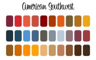
Then I get stuck with the southwestern color palette. I get lost thinking the colors must all tie together. I don't think I'll get past it - that's why I'm trying to get you guys to talk some sense into me.

Is it just the edge spots that are causing the dirty stacks? I'm gonna try and make sure I have no edge spots with identical colors.
I also probably need a green chip since my table and chips both will be marked with Casa Verde...

So... Brown or butterscotch and some sort of green are musts.
 
Last edited:
I am going to respectfully disagree with some of the feedback. I think you CAN use a consistent edge spot on cash chips and have it work. I also think you can use a lot of brown in keeping with the desert color scheme. BUT, the concern about dirty stacks is valid. The CPC gray actually appears bluish when you get the actual chips, so I would keep the green frac and delete the gray so it doesn't compete with the blue chip. Then since you are leaning heavily into the brown in the edge spots, and you would like to bring back the yellow, I would scrap the brown chip and use the yellow. Personally, I would make the $1 chip the blue and the $5 yellow just to keep with more conventional denomination colors. I would also go with the 314 edge spots to allow the primary chip colors to occupy more of the edge space. Just one novice's opinion.
 
Last edited:
Played around in the chip designer for 10 minutes, so take this with a grain of salt... but where my head was going for colors/spots - building toward your green chip.

Not saying use this, but just another "clean slate" view to look at to see gauge if you want to reaffirm your current direction or want to explore another.

1747087700416.png
 
Last edited:
My personal opinion you need to start with the original 5 you had in the first post. The inserts need to vary from each other in the set, not change them all to a different insert pattern.

Also and again CHANGE THE BACKGROUND COLOR
 
It is not completely necessary to have spot progression with cash, but I personally feel that it adds a nice touch. @TKEUofM has a great set with all chips being 3D14. I would also agree with getting rid of the 50¢ chip. I think you will still see significant dirty stack issues with all of the brown being used.
Here’s my cali cash set with all the same spots. Thanks for the compliment @BottomPair7!


IMG_4166.png


1747092598690.jpeg
 
I usually don't like the V edge spots but I think they work on this set. I also understand the desire to incorporate brighter colors but I really like the way this set sticks to the muted southwest tones. Here is what I think this looks like with my suggestions above. (the 50c inlay should be $1)...

View attachment 1508069
I might suggest swapping the lt chocolate on the blue $1 for orange (which is a muted color).
I would suggest some color and contrast on the $5.
 
My personal opinion you need to start with the original 5 you had in the first post. The inserts need to vary from each other in the set, not change them all to a different insert pattern.

Also and again CHANGE THE BACKGROUND COLOR

I'll change it. :ROFL: :ROFLMAO: I was using that dark green as it is pretty close to my table color.
Here’s my cali cash set with all the same spots. Thanks for the compliment @BottomPair7!


View attachment 1508037

View attachment 1508038

Really really really like the Tiger orange and dayglo peacock next to each other. The champagne of beers! That case is beautiful
 
thanks! man, I'm having a great time with these. Dug my samples back out, and you're right - that light gray is ALMOST a very light grayish blue. I almost like it but the other colors are better. These CPC colors are really nice in person - they already have a good southwesterny muted color
 
Last edited:
Well, I'm gonna post this and take a few days off. It's so addicting. Against all wisdom, I keep coming back to 2 fracs - I know it makes no sense on multiple levels. If I dropped one of the chips, it would be the light gray. I'd then just move the denominations down. I am in love with the butterscotch color - still up in the air for the edge spots. The light chocolate (my curent favorite) and green will also have to stay. Keep firing suggestions, they are greatly appreciated.

CV 11 513.png


CV 11.png
 
Well, I'm gonna post this and take a few days off. It's so addicting. Against all wisdom, I keep coming back to 2 fracs - I know it makes no sense on multiple levels. If I dropped one of the chips, it would be the light gray. I'd then just move the denominations down. I am in love with the butterscotch color - still up in the air for the edge spots. The light chocolate (my curent favorite) and green will also have to stay. Keep firing suggestions, they are greatly appreciated.

View attachment 1508407

View attachment 1508408
I understand that you like it, but you won't be able to play with them. It will be a super dirty stack. You will sit and suffer all evening, especially if the lighting is bad.
 

Create an account or login to comment

You must be a member in order to leave a comment

Create account

Create an account and join our community. It's easy!

Log in

Already have an account? Log in here.

Back
Top Bottom
Cart