GeeOhVee
Two Pair
I looked at my other BA cards, and realized the bridge were gold/black. I change my answer to the red/blue setup being first.
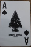
BNew bridge jumbo set starting soon. New @Cratty back design. Same faces as last time with an adjustment to the Ace of Spades
Which option do you prefer?
View attachment 1484801
View attachment 1484803
Any time table for when this next group buy may happen?New bridge jumbo set starting soon. New @Cratty back design. Same faces as last time with an adjustment to the Ace of Spades
Which option do you prefer?
View attachment 1484801
View attachment 1484803
Hope to start in about two weeks. Finalizing a few thingsAny time table for when this next group buy may happen?
are those WSOP sets are from 2012?I get it…
View attachment 1484901
They look like 2018's.are those WSOP sets are from 2012?
best cards I have ever handled....Yes, 2012
View attachment 1492815
I have some "used" but IMO mint and bought recently two sets still in cello, I mean that if you do not mind standard index and back design these are the GOATYes, 2012
View attachment 1492815
To quote somebody around these parts.....Hope to start in about two weeks. Finalizing a few things
Please sell me a setup or at least the blue deck of 1361 Piatniks

Using speed cloth?Any chance you can find a better printer for your cards? They handle nicely but the ink loss is as bad or even worse than Copag. (especially red):
Yes a between standard and jumbo index please!Possible to get new artwork for the court cards and slightly smaller indices?
Possible to get new artwork for the court cards and slightly smaller indices?
Yes a between standard and jumbo index please!
Echo the responses so far. I'd like to see a little bit of a different font along with a "blackjack" index.
Hire an artist/designer?I have been looking for some new updated face art but so far no luck.
Have been working on that but no luck as of yetHire an artist/designer?
Pet peeve feedback.


Yeah, and issue really is always just going to be the amount of work. 16 intricate and unique court card designs (every suit has differences) would be a major project. My gut says $1000 minimum to get professional quality ones unless you go with online stock.Have been working on that but no luck as of yet
I don’t need more cards but I love the back design on these so I would probably be in on this type of design