MoscowRadio
Flush
Thanks, @SeanGecko!
")
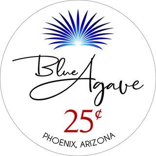
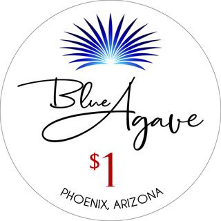
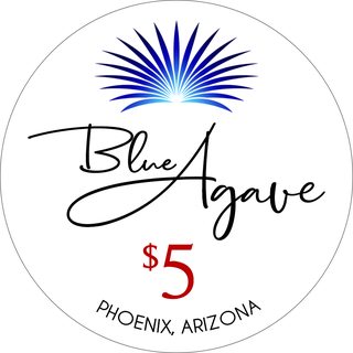
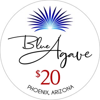
I think I might've found a way to work in a red denomination! By using a smaller, thinner denomination, it doesn't take away from everything else so much. I also added the location at the bottom to balance the red denom and to keep in fashion with traditional, Vegas inlays. Let me know what you guys think!
I like that font waaay better. Much more modern without the serifs.
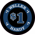
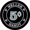
That .25 chip is sweet!
This is a great looking design!
Yeah, that inlay is fantastic. Looking forward to seeing how these turn out.
Are we talkin' RED Agave or BLUE agave here? Oh, that's right, it's BLUE Agave. Needs a BLUE denom!
Actually, I like the look of both denoms. The red may have edged out a win in my book in your last lineup. (y) :thumbsup:
Nope. Still blue.
")
My thought was that it was getting a little redundant with all the blue in there. The logo is blue, the text says, “blue”, so doing a blue denomination just wasn’t doing it for me.
Love what you have going on here. Any chance you'd share your process a bit? I'd be interested to see how something like this comes together in the software. Is it all vector?
Try this:
Black background.
White border around logo.
Light blue text for name and location text.
White denom.
Done.
Ship it.
Try this:
Black background.
White border around logo.
Light blue text for name and location text.
White denom.
Done.
Ship it.
Try this:
Black background.
White border around logo.
Light blue text for name and location text.
White denom.
Done.
Ship it.
+1 on being very interested in what a black label would look like. That logo might reallyglow off a dark background.
Looks great!!I think I might've found a way to work in a red denomination! By using a smaller, thinner denomination, it doesn't take away from everything else so much. I also added the location at the bottom to balance the red denom and to keep in fashion with traditional, Vegas inlays. Let me know what you guys think!
.png")
.png")
Any updates?