MoscowRadio
Flush
Hey guys!
With everything that's been going on, I'm trying to keep my mind occupied. I've always loved the idea of designing labels and inlays, but don't have a lot of experience.
As many of you may know, I purchased the artwork rights to the Four Suits design because I always loved the simplicity of it. However, as time went on I fell less in love with it. For anyone who doesn't know, I did make available to everyone to use, so if you'd like to use it at all, please let me know! There is absolutely no charge to use it. I only ask that you let me know that you'd like to use it.
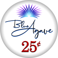
Lately, I've been toying with other ideas that hit a little closer to home. I was born in Arizona and have lived here most of my life, so I started thinking about themes that would fit into that. I kicked around a lot of ideas like The Palo Verde Lounge (which I still like, but can't seem to get the art right), and several others. I knew that I wanted something modern and simple. Something that you might see in a classy (?) card room, but didn't completely miss the mark like many of the newer inlays we see making an appearance these days (SLS ). Then I thought about the agave plant, specifically the blue agave which is used in the manufacturing of tequila. Now, tequila does not hold a place in my heart, and while it is governed my Mexican regulations, it does grow naturally in Arizona. I started to like the name "The Blue Agave", but couldn't settle on what I should use to follow it, IE: poker room, lounge, card room, etc., so I decided to drop that aspect of the name. The more I thought about it, I decided to drop the "the" from the name as well, just calling it "Blue Agave".
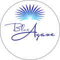
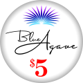
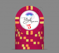
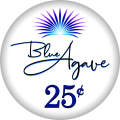
I see all of these absolutely amazing custom sets that you guys make centered around where you live, a specific landmark, etc., and I think I may have found mine. What I'm going to post is a very, very rough first draft, and I wanted to get your guys' opinion on it! I made two versions: one where you can see an agave watermark in the background, and one without. I'd love so much just to hear what you have to say and any opinions that you may have. The design, wherever it lands, will almost certainly be cleaned up by one of the professional designers here when the time is right. So, let me know what you guys think!
Thanks everyone!


With everything that's been going on, I'm trying to keep my mind occupied. I've always loved the idea of designing labels and inlays, but don't have a lot of experience.
As many of you may know, I purchased the artwork rights to the Four Suits design because I always loved the simplicity of it. However, as time went on I fell less in love with it. For anyone who doesn't know, I did make available to everyone to use, so if you'd like to use it at all, please let me know! There is absolutely no charge to use it. I only ask that you let me know that you'd like to use it.
Lately, I've been toying with other ideas that hit a little closer to home. I was born in Arizona and have lived here most of my life, so I started thinking about themes that would fit into that. I kicked around a lot of ideas like The Palo Verde Lounge (which I still like, but can't seem to get the art right), and several others. I knew that I wanted something modern and simple. Something that you might see in a classy (?) card room, but didn't completely miss the mark like many of the newer inlays we see making an appearance these days (SLS
I see all of these absolutely amazing custom sets that you guys make centered around where you live, a specific landmark, etc., and I think I may have found mine. What I'm going to post is a very, very rough first draft, and I wanted to get your guys' opinion on it! I made two versions: one where you can see an agave watermark in the background, and one without. I'd love so much just to hear what you have to say and any opinions that you may have. The design, wherever it lands, will almost certainly be cleaned up by one of the professional designers here when the time is right. So, let me know what you guys think!
Thanks everyone!
