Personally I feel like every chip needs a blue spot with that theme...

-
PCF is an eBay Partner. If you make a purchase through one of our links, we may earn a commission at no extra cost to you. Thank you for your support!
You are using an out of date browser. It may not display this or other websites correctly.
You should upgrade or use an alternative browser.
You should upgrade or use an alternative browser.
The Blue Agave (Work-in-Progress) (1 Viewer)
- Thread starter MoscowRadio
- Start date
Amish Rabbi
Straight
I liked it with the watermark. A bit less simple but added subtle layer to the design
BSteck
Full House
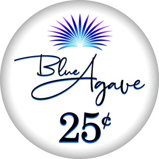
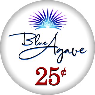
Okay! Black versus blue versus red denominations! I was afraid a blue denomination might be overdoing it, but I'm definitely on team 'blue'.
EDIT: Threw in a deep red denomination as well, which is tough because I really like that one as well.
View attachment 229070View attachment 229071View attachment 229072
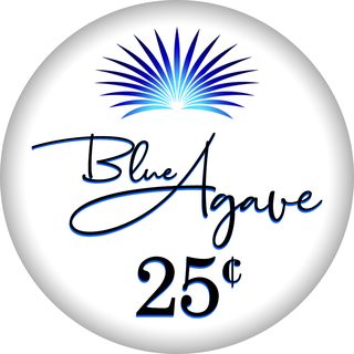
I vote black denomination... but I'd give it just a barely there shade of navy.
RowdyRawhide
Full House
I'm still on team blue
MoscowRadio
Flush
Here's a really dark blue denomination, so it lands somewhere between blue and black.

SeanGecko
4 of a Kind
Yeah that has my vote.
Anthony Ferguson
Flush
For what it is worth, I prefer the simplicity of your initial design:

BSteck
Full House
Personally I feel like every chip needs a blue spot with that theme...View attachment 229075
Yah.. you definitely gonna need to do that hundo.
MoscowRadio
Flush
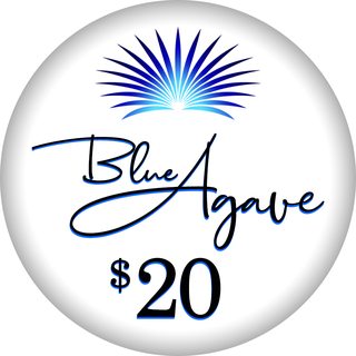
Did the slightest bit of tweaking and I honestly think these are what I'm going to have to choose between. One the one hand, I love red denominations, but it does draw attention away from the logo. On the other hand, the black denomination looks really heavy to me.
Anthony Ferguson
Flush
I like the red denominations also.
SeanGecko
4 of a Kind
BLUE DenomRED denom!
^^^This guy is color blind. Don’t listen to him.BLUE Denom

Team Red:
SeanGecko
4 of a Kind
This guy makes bad life choices don't listen to him.^^^This guy is color blind. Don’t listen to him.
To be clear I don't know that for a fact I'm just repping team blue.
Last edited:
Either way this is a great looking inlay!!Did the slightest bit of tweaking and I honestly think these are what I'm going to have to choose between. One the one hand, I love red denominations, but it does draw attention away from the logo. On the other hand, the black denomination looks really heavy to me.
SeanGecko
4 of a Kind
BLUE
Attachments

Steamtrain
3 of a Kind
The bigger Agave image looks good there
MoscowRadio
Flush
The bigger Agave image looks good there
You don’t think the plant is too large?
Steamtrain
3 of a Kind
I love these inlays- Paris and Tropicana - and your set reminds me a bit of both.You don’t think the plant is too large?
For me the Blue Agave image is the best part of the inlay.
(Sorry for the poor quality images)


I take no sides in the denom color.
MoscowRadio
Flush
I love these inlays- Paris and Tropicana - and your set reminds me a bit of both.
For me the Blue Agave image is the best part of the inlay.
(Sorry for the poor quality images)
View attachment 229193View attachment 229194
I take no sides in the denom color.
Wow! Considering the fact that those are two of my favorite inlays, that’s a huge compliment! Thank you!
MoscowRadio
Flush
There was someone who created a beautiful, simplistic inlay with a hummingbird on it. I wish I could find a photo of it.
RowdyRawhide
Full House
.....
Steamtrain
3 of a Kind
Have you tried putting the words "Blue Agave" on top rounding over the top of the image (moved to the center) and denom on the bottom?
More like the Tropicana layout
More like the Tropicana layout
RowdyRawhide
Full House
@Mr HankyThere was someone who created a beautiful, simplistic inlay with a hummingbird on it. I wish I could find a photo of it.
Bel Air
MoscowRadio
Flush
MoscowRadio
Flush
After a whole lot of deliberation, I think that the black denomination looks the best with the way the label is now, but I'm not sure I'm totally sold on the font of the denom. I love red denominations, but it just took too much away from everything else. I also think that this could look really cool as a hot stamp for a tournament set!

SeanGecko
4 of a Kind
After a whole lot of deliberation, I think that the black denomination looks the best with the way the label is now, but I'm not sure I'm totally sold on the font of the denom. I love red denominations, but it just took too much away from everything else. I also think that this could look really cool as a hot stamp for a tournament set!
Agreed on maybe changing the font for the denomination. I LOVE everything else about the set up. Excellent work.
Similar threads
- Replies
- 0
- Views
- 238
- Replies
- 8
- Views
- 338
- Replies
- 8
- Views
- 231