Rate this line-up - Antique Rose (1 Viewer)

How do you rate the overall design of the set? (0 - awful, 10 - perfect)

  • 0

  • 1

  • 2

  • 3

  • 4

  • 5

  • 6

  • 7

  • 8

  • 9

  • 10


Results are only viewable after voting.

PocketAces

Full House
Supporter
Joined
Apr 28, 2020
Messages
3,258
Reaction score
13,226
Location
United Kingdom
We had the "Rate this inlay" series in 2020, and since I like polls, I thought I'd start a series to pick PCF favorite line up. I am going to use pictures of samples I own because as usueful as the Chip Guide can be, picture quality is often...subpar. Sadly I don't have that many samples, so you are encouraged to contribute with your own (cash/tournament, casino/fantasy - THC/RHC/TRK, your personal CPC custom...doesn't matter as long as you own the sample)

What you are voting on:
- color progression/combinations
- edge spot progression
- inlay design
How do you rate the overall design of the set?

What you aren't voting on:
- rarity/availability
- condition
- affordability
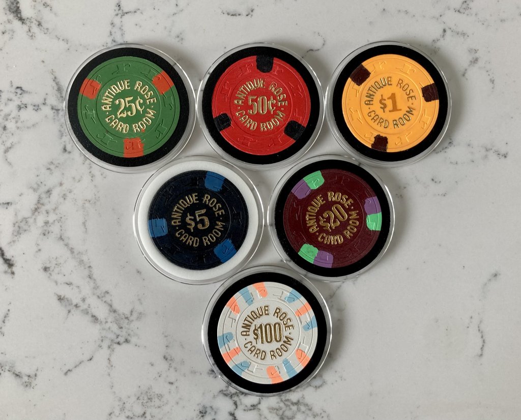
Antique Rose - sample.jpg
 
The white is such an outlier. Perhaps that's a good thing.
It is a dark colored them for sure.
It is certainly a fun set up.
The only improvement to my eye would be a purple $20.
Nice looking though!
 
Fuck y'all if you don't know perfection......

Actually, if I'm being fair, the only knock for me is the spot on the one. You change that to a Arc or a lighter edge that pops and it would mix in the Hundo. But I don't care. Perfection
 
This is all about tastes and opinions, right?
I don’t love hot stamp sets, but I don’t hate them either.
What I do hate is just making up your own color scheme for denominations - Cali colors are one thing, but this set is totally off the rails.
I also really hate having the same spot pattern for the first 4 chips, then progressing from there.
I do like the progression, once it finally starts progressing.

You make good points about spot patterns. However I think the choice of base colors is bold and awesome. Could have been so much more had the $1 and $5 been 3D14.
It works very well overall tho I think. Gave it a 7.
 
Liking the $100. Both the $5 and $20 are super dark which could be hard on a poorly lit table. Overall nice choices though. 7/10.
 
These get a 6. I love the $20 and hundo, but everything else is just decent. I do like the black $5 though, that's unique and I'm sure will tilt the F out of a lot of people. The hundo does seem totally out of place in this set though. It's too good for the rest of the chips IMO.
 
Swapping the $5 and $1 colors would have made more sense, but a mint set of these would've been insane, and the $100 is one of my favorite chips of all time.
 
Spot progression 3 3 3 3 6 9 is lacking. Colors are muted except for $5 and $100. Underwhelming overall, hotstamps wear.off too easy leaving meh behind.
 

Create an account or login to comment

You must be a member in order to leave a comment

Create account

Create an account and join our community. It's easy!

Log in

Already have an account? Log in here.

Back
Top Bottom