- Joined
- Feb 25, 2016
- Messages
- 24,096
- Reaction score
- 48,801
- Rewards
- 2,021
- Location
- America's High-Five
But the Bellagio says "Ten Dollars" twice.
Yours says "$5 Dollars"
Yours says "$5 Dollars"
Ohhh good eye. The N has two humps but it could look more like an upper case N but small. Now I am going to be looking at it annoyed unitl I get it fixed.@SeanGecko Is it supposed to be hardwell or handwell? Type sorta looks like handwell?
I've honestly never seen a cursive z written that way. To me it's missing the bottom loop - that's how we were taught way back when, at least.I’ve been doing my cursive Z wrong for four decades.
I really like the look of yellow and peach!!Hey guys, not sure if this is kosher for this sub-forum or not, but I thought it would be fun to post any random sets you have in your design tool that you think are good enough to share with the world... I'm sure you all have a few
If we contained them to this (or a weekly/monthly thread or something) it wouldn't clutter up the rest of the board, and it might help others come up with ideas for their own sets.
Anyway, this is just something I threw together and have no real intentions of turning into a set, just wanted to see how you guys would improve it. I think I was repressing all my dayglo desire while thinking about the Mayfair set... so this set is pretty bright and busy...
First impressions are maybe too much blue/purp-ish
View attachment 21016
Your blue and dayglo chip really pops. I’m a fan!
Pretty sure the image from SeanGecko is cropped at the bottom -- look at the 'y' right next to it, no descenders.I've honestly never seen a cursive z written that way. To me it's missing the bottom loop - that's how we were taught way back when, at least.
View attachment 1595632
Definitely can't say for sure if that white will stand out, even with the soft proofing. But I think even if it doesn't stand out, it would still look like a nice chip. You could also consider making the chip base color like a really light shade of blue or more of a tan/beige. That might make it stand out a bit more.Hello everyone! I could use some advice on a mockup I have at the moment. On the $1 chip for this design idea that I have, I would like to keep the base color white, but also have the middle color in the spot pattern be a lighter shade of white so that it stands out against the chip. I am assuming that this is wishful thinking, but does anyone have experience with trying something similar with Tina chips and if it can be done successfully? If it helps, I have enabled soft proofing on Chipmatic, and here's a link to the gallery.
https://chipmaticstudio.com/share/uNCvlvJnARBoptVPCDlg7
Looks amazing!I think this is the final product but I'm open to any critiques. I'll be putting these on the Tina textured no molds.
Yep, good call. I was thinking about doing that but was on the fence. I’ll update.Looks amazing!
I haven't played monopoly in a while so I don't remember how large "stacks" get, but I love when edges that have denoms have alternating right side up and upside down denoms so that chips will always have a rightside up edge.
Short Line isn’t real so had to make it up with the next best thing.A couple of weeks ago @BKisback put out a call for a Monopoly chip designer and that sent me down a path to create my own chips.
I think this is the final product but I'm open to any critiques. I'll be putting these on the Tina textured no molds.
Reference paper money from my set. The photo doesn’t reflect the actual colours very well so colour matching has been a bit of a challenge.
View attachment 1625686
Colours have been brightened up / saturated a little for better chip differentiation.
View attachment 1625702
I would lose the wood background and make the "maverick card club" a rustic brown color instead. You will see everything much more clearly if you do that.My first attempt designing chip set I kinda like it. View attachment 1627717
Thank you for the feedback. It looked a lot better before i had to shrink it down to fit the chip LOL Any suggestions for a background color? I don’t know if i could just get rid if it and it just be the color of the chipI would lose the wood background and make the "maverick card club" a rustic brown color instead. You will see everything much more clearly if you do that.
Love the longhorn.

I personally think the colors are too flashy for this theme. Seems like it should feel more old school. And agree with @Himewad I would lose the background. I would make the background a weathered off white to give it an aged feel. Something like this.My first attempt designing chip set I kinda like it. View attachment 1627717
I guess that looks ok. Fine man show me up like that lol. Jk i do like that background i didnt even think about that. That looks good man. Thanks for the guidance it is much appreciated.I personally think the colors are too flashy for this theme. Seems like it should feel more old school. And agree with @Himewad I would lose the background. I would make the background a weathered off white to give it an aged feel. Something like this.
View attachment 1627738
That hundo is sick!My first attempt designing chip set I kinda like it. View attachment 1627717
")
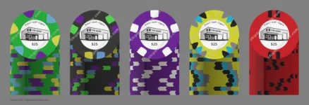
 ) for the new St. Clair apartment building I’m moving into next year.