I appreciate your thoughts. I have color samples, and in my eyes the maroon looks really nice on a black chip. Where would you see danger of not being able to tell chips apart? The black chip is the only real dark chip, and the maroon is a concious decision.
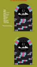
I came up with a version with a spot progression that I really like: (Let me know if you think the version with white spots on the 5c or on the 20c looks better)
1)
View attachment 1292538
2)
View attachment 1292539
However, I still like the idea to have a 312+ spot on the fracs, and 3v12 on the € chips. I think it'd be pretty easy to distinct the chips.
3)
View attachment 1292543
4)
View attachment 1292544
Let me know which of the four versions you like. (I know, in the end it comes down to what I like, but still)


")