I like where this is going so far...

-
PCF is an eBay Partner. If you make a purchase through one of our links, we may earn a commission at no extra cost to you. Thank you for your support!
You are using an out of date browser. It may not display this or other websites correctly.
You should upgrade or use an alternative browser.
You should upgrade or use an alternative browser.
Post mockups for fun/science? (9 Viewers)
- Thread starter lherron
- Start date
eightyWon
Straight
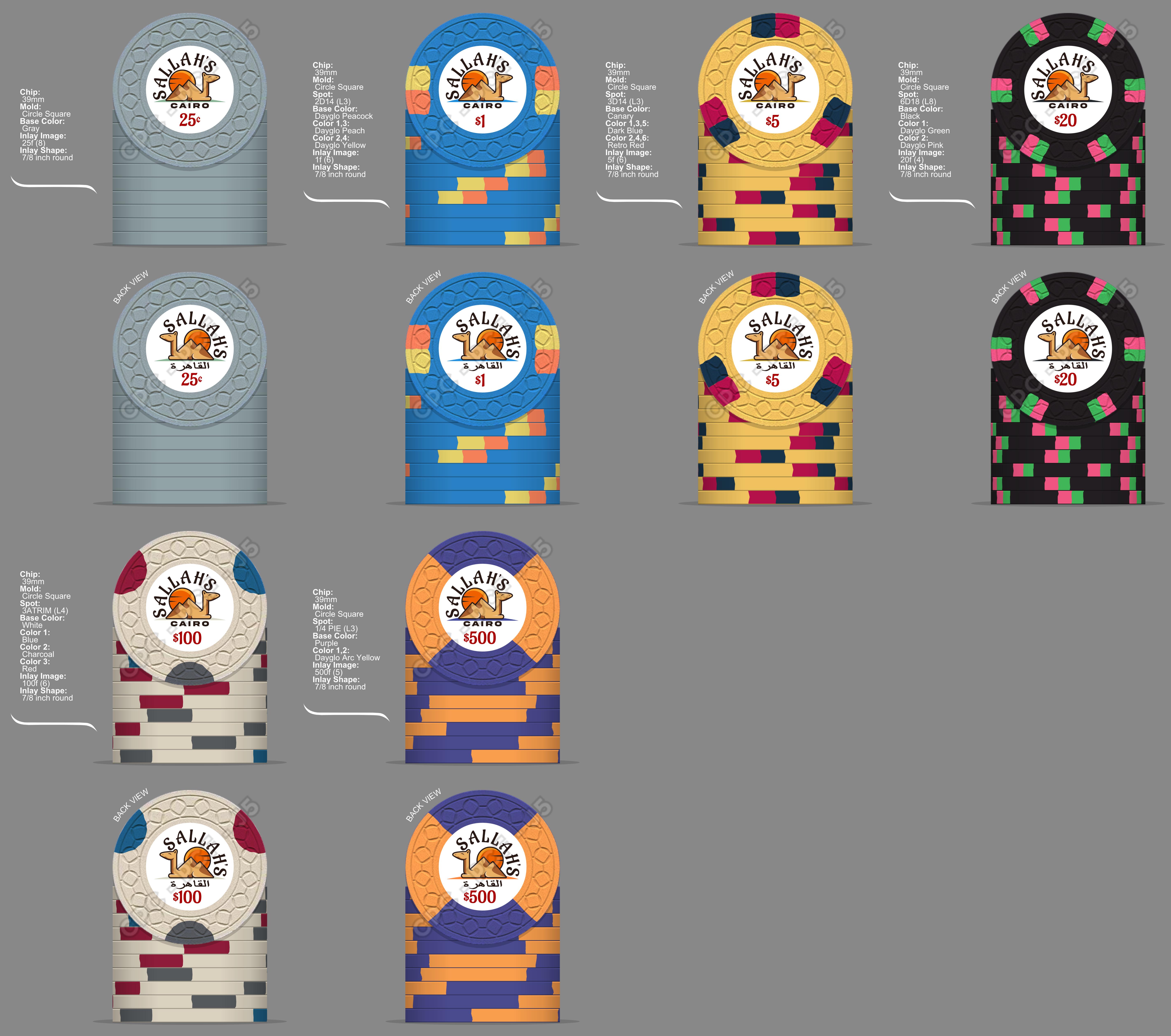
Not sure which I prefer (inlay), though I do think alternating to Cairo in Arabic on the alt side is good:
View attachment 796379
Biggered the arabic and the "sand", did some color matching. I think maybe I'll start looking for that magic font that really puts this over the top (though this one isn't bad necessarily):
I like where this is going so far...
View attachment 796630
Ok, so this was a joke. I was trying to make an ugly set. I think I succeeded.I like where this is going so far...
View attachment 796630

But this is even better...
mattross1313
Full House
Ok, so this was a joke. I was trying to make an ugly set. I think I succeeded.
But this is even better...
View attachment 797187
I’d play with themOk, so this was a joke. I was trying to make an ugly set. I think I succeeded.
But this is even better...
View attachment 797187
So this whole set is great, but that $500 chip is extra fantastic!Biggered the arabic and the "sand", did some color matching. I think maybe I'll start looking for that magic font that really puts this over the top (though this one isn't bad necessarily):
Isthmus_Poker
New Member
Black light blue and purple! I'm stealing that idea.T set
View attachment 21050
Vintage Cali
View attachment 21049
Over the top cash set with 44mm high denoms
View attachment 21048
SeanGecko
4 of a Kind
It's like a camouflage set. "What colors am I using? NO ONE KNOWS!!!"I like where this is going so far...
View attachment 796630
You could produce those and someone would still spend $8+ per chip.I like where this is going so far...
View attachment 796630


mattross1313
Full House
That's reeeeally subtle! I love the little details like thisdid some color matching

Pinball
Full House
- Joined
- Jul 12, 2020
- Messages
- 10,776
- Reaction score
- 16,969
- Rewards
- 378
Send the order in!
Cali cash set, nickel through hundo.

- Joined
- Jul 12, 2020
- Messages
- 10,776
- Reaction score
- 16,969
- Rewards
- 378
that $1 and $5.Cali cash set, nickel through hundo.
View attachment 797960
Right?that $1 and $5.
Pinball
Full House
Do you know when the next run of small crowns is?Send the order in!
- Joined
- Dec 29, 2017
- Messages
- 25,940
- Reaction score
- 35,097
- Rewards
- 0
- Location
- Burnaby (Greater Vancouver), BC
Do you know when the next run of small crowns is?
It just finished. Expect minimum 12 months.
Pinball
Full House
So I have tons of time for changes....It just finished. Expect minimum 12 months.
Plenty of time to really prove your design.So I have tons of time for changes....
Pinball
Full House
Little colour change and new mold

Pinball
Full House
used Blurple instead of purple for $1
Pinball
Full House
eightyWon
Straight
chipinla
Straight Flush
- Joined
- Apr 12, 2018
- Messages
- 9,769
- Reaction score
- 26,443
- Rewards
- 743
That is some tiny lettering at the bottom. Might want to rethink that
Kid_Eastwood
4 of a Kind
")
- Joined
- Dec 29, 2017
- Messages
- 25,940
- Reaction score
- 35,097
- Rewards
- 0
- Location
- Burnaby (Greater Vancouver), BC
Not for Science, but for Science Fiction! (Insert your favourite denoms)

Of course, this is a parody of this:
Of course, this is a parody of this:
Last edited:
Pinball
Full House
I grew up on the East Coast and went to college and worked after college near both Foxwoods and Mohegan Sun. Didn't play poker back in those days, but did frequent both casinos quite often. Had an idea to combine the two into a fictional casino named "Sunfox" or "Sun Fox" and located it where I once lived in Mystic, CT, though I opted for the older spelling of one of the original villages.
Found the perfect line art for a fox, which I tweaked a bit, and then created a gradient sun behind it. You can't really tell at inlay size (though I like that it subtly hints at it), but closeup the circles that make up the different shades of the sun actually adds dimension to the fox as well, with the lighter color "belly", and the snout differentiated by the different shades of yellow, and even the orange tip of the tail...

(Swore since the 90s that I'd never use Papyrus font, but it kinda fits...)
For the colors and edge spots, I'm basing it on Foxwoods colors initially (except the frac, which I just made up), but I'll probably change it around.

Found the perfect line art for a fox, which I tweaked a bit, and then created a gradient sun behind it. You can't really tell at inlay size (though I like that it subtly hints at it), but closeup the circles that make up the different shades of the sun actually adds dimension to the fox as well, with the lighter color "belly", and the snout differentiated by the different shades of yellow, and even the orange tip of the tail...
(Swore since the 90s that I'd never use Papyrus font, but it kinda fits...
)For the colors and edge spots, I'm basing it on Foxwoods colors initially (except the frac, which I just made up), but I'll probably change it around.
Last edited:
Cards Mold version: You get a tri-moon, you get a tri-moon! (Had those edge spots on another mockup I did so just reused them. Probably wouldn't go full tri-moon on an actual set!)
Used another fox line drawing from the same source and colored it and placed it in front, and moved the original line drawing with the gradient sun to the back as a larger version to better see the details. Did some color matching with the fox paw print and "Resort & Casino". De-Papyrus'd the "SUN FOX" font a little and made it look bolder. Improvement from the above or not?

Used another fox line drawing from the same source and colored it and placed it in front, and moved the original line drawing with the gradient sun to the back as a larger version to better see the details. Did some color matching with the fox paw print and "Resort & Casino". De-Papyrus'd the "SUN FOX" font a little and made it look bolder. Improvement from the above or not?
Last edited:
Similar threads
- Replies
- 15
- Views
- 326
- Replies
- 6
- Views
- 791
- Replies
- 17
- Views
- 1K