Post mockups for fun/science? (14 Viewers)

@saleen121212
You 're on a good path IMO.
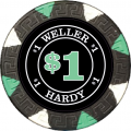
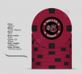
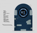
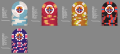
Frac is perfect, and $1 perfect too - and your grail chip, reportedly:).
It's obvious which colors you love, but you should avoid over-using them, to prevent the "salad" or dirty stack effect.
To this aim, I would use another yellow for the $20 (the darker "Yellow" or the more pale "DG Yellow") with absolutely a green and a black or maroon spot.
I would also use the perfectly light orangey DG Arc Yellow for spots on the Charcoal chip, coupled with DG Peacock blue or R Lavender (if you insist) spots.

Theme-wise, my 2c:
The sailing ship concept is great. The Horseshoe mold is great too, but I 'm not sure the two match, concept-wise.
Furthermore, I wouldn't allow turtles anywhere near my chips.:D
If you don't dislike, for some specific reason, the readily available and all time classic A-mold, go for a slave (instead of pirate) ship which turned a symbol of freedom.
A for Amistad.
There can and must be a truckload of other ideas too.
 
@Gear

Updated set idea with new inlay. Working on replacing the ship with something else and need feedback on the whole Cali set. Denoms are quarter, 1, 5 and 20 so far. 1 is based on king one. Label based on bellagio with a small pirate theme. Maybe a treasure chest or capital T instead of the ship? View attachment 217415

Not sold on brown spots on the yellow or spots on the frac

really feeling that blue chip. not so sure about the color of the label though... everything seems so bright then the label seems so dull (in brilliance of color) in comparison.
 
I´ve been working on this design for some time now... Thinking about getting a ceramic set made.
The 5¢ and $500 will probably not be made, but designing is fun anyways...
I put a little "J" at the bottom to be some kind of discreet signature, given there is nothing written on the chips. The fox represents a soccer team.
Thoughts?

Desenho 2.png
 
I´ve been working on this design for some time now... Thinking about getting a ceramic set made.
The 5¢ and $500 will probably not be made, but designing is fun anyways...
I put a little "J" at the bottom to be some kind of discreet signature, given there is nothing written on the chips. The fox represents a soccer team.
Thoughts?

View attachment 219164

I like it but I feel the fox itself needs some sort of shaped boundary around it with a different background color as the white color blends in too much on certain colors such as the yellow.

what team is that anyhow?
 
I like it but I feel the fox itself needs some sort of shaped boundary around it with a different background color as the white color blends in too much on certain colors such as the yellow.

what team is that anyhow?
Thanks, man! I’ll work on some sort of shape.

As for the team, it is Cruzeiro (best Brazilian team IMO, obv :D)
 
Just playing around. Gear did the labels.
 

Attachments

  • Weller Hardy $1 black.png
    Weller Hardy $1 black.png
    117.7 KB · Views: 116
  • (3).png
    (3).png
    440.5 KB · Views: 122
  • (19).png
    (19).png
    398.4 KB · Views: 143
  • (12).png
    (12).png
    401.1 KB · Views: 123
  • (10).png
    (10).png
    76.6 KB · Views: 138
  • (2).png
    (2).png
    156.8 KB · Views: 121
  • (5).png
    (5).png
    82.3 KB · Views: 116
  • (6).png
    (6).png
    74.3 KB · Views: 110
My first try at inlay design and CPC.
Not sure how small you should can go with font size and be readable.

diff numbers.png
 
My first try at inlay design and CPC.
Not sure how small you should can go with font size and be readable.

View attachment 221716
Nice combinations! For your $20 though, there may not be enough contrast between the DG Saturn base (a very greenish yellow, in person) and the DG Green spots. Maybe Dark Green instead? (and Green for the rest, as already). Or, use the DG Light Yellow as a base?
Get the full color sample if you haven't done so.

For readability, a larger inlay (1in or 1plus) is better, with those molds which can allow those. But the downside is less clay surface on the face, so less grip when stacked and probably "inferior" shuffling sound (utterly subjective).
 
Your inlay design goes out way too far over the print safe area. If you have it produced like it is now, a lot of text around the edge (and some of the artwork like the dragon ornament and the outermost trees) will be cut off in a really ugly way. Use the inlay design templates from the design tool's website (linked in footer). They have bleed/cut areas embedded.

Also, the red text below the denom is way too small, and even if it was bigger it will barely be readable - red is already fairly dark, and with a black background around there will not be enough contrast. Black/dark colors tend to "bleed" a little into lighter adjacent colors. Just a tiny bit, but it will tip the scales in such a case.
 
ok thanks I will work on it... but not sure how to translate the template to the CPC design tool. but ill try thanks.
I think I saved the picture at the red line and not the green line from the template me tinks :)
 
Doubt it will look good then, if removing the black ground. It provides a clean, visually separate section on the quite busy chip for the denom that helps quickly recognizing it among the clutter.
 
I made the bot text white and up the size a bit. not sure if its enough.
I save the picture from the green line this time.
I will have to play around with the ground contrast perhaps when i get more time today.
thanks all for input thus far.

7index.png
 
  • Like
Reactions: Nex
Imo the denom font is big enough. Location doesn't really matter if it's too small to read without aid, you don't need to read that during play after all.

You don't have to leave a completely white ring around the edge by the way - it's only important that it does not contain text or anything else you do not want to get cut off in the middle. You can extend the ground all to the edge for example, and the slightly off-white background + the rays as well. But the white border around does have some flair to it too. Somewhat resembles the dot inside the Japanese flag once again.
 
Some w frac. Some without. To $500.
One of these variations will eventually make up my grail cash set.
All bases are weighed.
All spots are unweighed retro or dayglo.
 

Attachments

  • 480ED4FC-3FF9-41B0-AADC-876EFCF88D47.png
    480ED4FC-3FF9-41B0-AADC-876EFCF88D47.png
    284.2 KB · Views: 137
  • BBD0F163-9182-4168-9FCD-6C8ADCC08572.png
    BBD0F163-9182-4168-9FCD-6C8ADCC08572.png
    320.3 KB · Views: 128
  • 56A97166-375D-435E-A681-EB04A1316FDA.png
    56A97166-375D-435E-A681-EB04A1316FDA.png
    319.5 KB · Views: 131
  • 7C2E9602-6715-43E2-96F3-97B2C0E29F77.png
    7C2E9602-6715-43E2-96F3-97B2C0E29F77.png
    317.7 KB · Views: 120

Create an account or login to comment

You must be a member in order to leave a comment

Create account

Create an account and join our community. It's easy!

Log in

Already have an account? Log in here.

Back
Top Bottom