Possible new Stock designs. (3 Viewers)

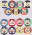
Maybe the 'gift card' should be an actual chip?

That would be pretty cool.

The denom would be the value of the gift card.

Edit: I'm a slow reader or just plain slow - lol. Missed that this suggestion was made several times prior to my post.
 
Last edited:
Just played around on my mobile for a tournament set :

35E6B94B-B6D4-4217-A00C-ABAC5A809A81.png


T25 / T100 / T500 / T1000 / T5000

I tried to reuse all colors and not have a same color used in 2 consecutive chips as far as I can (only Blurple I used it on the T100 and T500 and Yellow on the T500 and T1000) ...

I envision this with a simple inlay (denomination without currency + denomination text on the sides) color matching the chip.

I also tried a Cali cash set with some edge spot progression :

F7A92536-D50C-4F11-94ED-E52F6E5E0EA1.png


25c / $1 / $5 / $20 / $100

For the inlay, I could see a faux-shaped one to compensate simple edge spots. Again something very basic with denom, currency and denom as text.
 
Last edited:
And for those folks that indicated they don't like the circus theme, curious if you thought the same about the BT poker chips?
 
Last edited:
And for those folks that indicated they don't like the circus theme, curious if you thought the same about the BT poker chips?

I respect those who love it, but Imo I do not like the circus theme at all.
I think there is better things to do with poker theme.
And also i'm not a fan of BTP theme.
 
I had no idea this thread was still going.

I’ll say it again, I believe any chip with a fantasy casino or anytime of theme creates a deterrent for a large section of the potential market of people that have the cash to spend on a quality clay chip. The majority of that market is not on this forum. For some reason chip nerds (haha sorry) have come to accept these designs but I think they are a turn off to most.

A simple but classy denomination based inlay on even the 312 pattern with a single edge spot color would probably sell.
Scrown tri moons with 1” color matched inlays!
 
I like Circus Maximus design, mayby apart labels but they can be redone. Very mellow, quiet, not to tired some for eyes.
 
I had no idea this thread was still going.

I’ll say it again, I believe any chip with a fantasy casino or anytime of theme creates a deterrent for a large section of the potential market of people that have the cash to spend on a quality clay chip. The majority of that market is not on this forum. For some reason chip nerds (haha sorry) have come to accept these designs but I think they are a turn off to most.

A simple but classy denomination based inlay on even the 312 pattern with a single edge spot color would probably sell.
Just curious if this is merely your opinion, or if based on some type of data analysis of popular-selling chip designs.
 
Just curious if this is merely your opinion, or if based on some type of data analysis of popular-selling chip designs.

One might think it’s just my opinion base on the fact I use the terms “I believe” and “I think” but I actually used an
extremely complex computer model based on an algorithm design by NASA.
 
Last edited:
I have got the same general consensus from my regular players that they prefer big clear denominations without overly designed inlays. They don’t seem to “get” the faux casino thing. But they also don’t buy poker chips and if they did they would buy dice chips or the next level up from dice on Amazon.

But I think there is something to be said about an inlay well designed around an easy to read denom. Something like CDI without the actual “casino de isthmus” which is hard to read anyway and trivial to the overall design.
 

Create an account or login to comment

You must be a member in order to leave a comment

Create account

Create an account and join our community. It's easy!

Log in

Already have an account? Log in here.

Back
Top Bottom