OP
OP
12thMan
Full House
With that I totally agree.
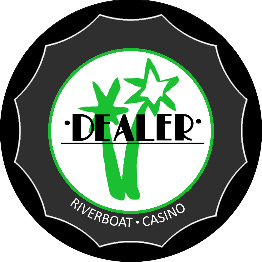
Any thoughts on having both "dealer" texts oriented outward?
Can you try to flip the text facing outward? The first part of a button you see is the leading edge, and then that text is upside down no matter which way you look at it in the given example ^
Also, for those purists, can't we include more text on the rolling edge? "Point Defiance Cafe and Casino * DEALER. * (repeat)
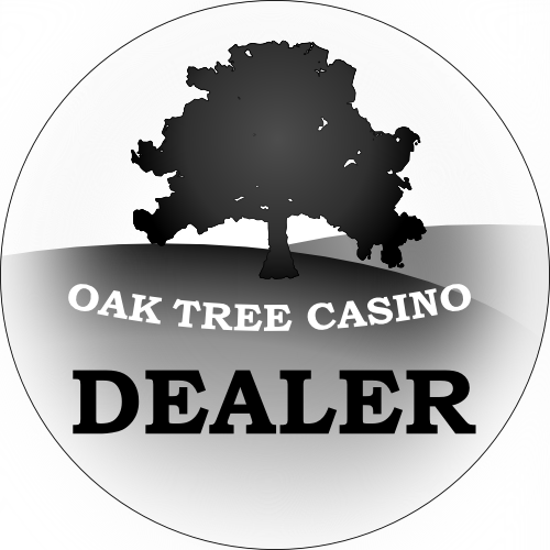
Most I have seen had the name on the face and dealer on edge. Looks too plain Jane imo. Being a purist the words dealer should be on less emphasized. Too generic. Being the size it is most everyone would know this is a dealer button but no one would know what the boat was for.
My .02:
I was liking the mock ups with PD on top and CC on the bottom, but then trihonda pointed out that dealer needs to be on there and I agreed, but after seeing the designs something isn't sitting right about "dealer" to me and I think I figured it out: whenever I see a dealer button the dealer is always in a straight font where this design (because of the boat in the middle) calls for it to be curved. The problem is to me, taking the latest posted concept for instance, is that "dealer" really blends in with the name because it's the same font and style. It may be just me but all the dealer buttons I can think of the text is straight and it almost sets it apart from the rest of the design, the "dealer" is more utilitarian to the design than part of it.
I don't "have" to have dealer on the front, I don't think there will ever be any confusion to what it is when being used, but I thought I liked the idea...now, i'm not sure if it can work like this?
"dealer" repeating on the rolling edge would be good for me I'm thinking , with Point Defiance above the boat and cafe and casino below it, doesn't need to say Rushton, WA.... Is that to plain??
Also, I read Davids post a few times and it took me a second to realize that I am op in this thread...but I want to emphasize that I just wanted to throw the idea out there. I offer my opinion only and it counts no more than anybody else's, the only goal I had in mind when I started this thread was to get a dealer button for my Point Defiance set because I had dealer button envy seeing all the cool shit atomik and owps did...
Whatever is decided will be fine, I will be happy just to get something done and meet the minimums!!
Compromise? The RUSTON, WA ate a lot of space.
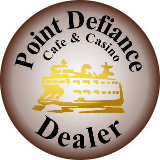
I like this one a lot, but I'd use all uppercase for DEALER (but lowercase height). Looks unbalanced as-is.
It takes too long to do it for every concept. The space after the P was huge though.Font spacing looks much better. I never said anything, 'cuz I figured you would fix it eventually. Great job.
Dealer in red? Thoughts?